Summary: In today's article, I've picked out 25 awesome Google fonts that can transform your project's aesthetic. And first, let me show you my top 3 favorites:
- Montserrat: Super modern and flexible, it’s great for almost anything.
- Open Sans: Easygoing and great for both websites and printed stuff.
- Oswald: A bit more edgy and cool, perfect for making headlines pop.
Google fonts are all free for any kind of use – I’m talking personal, commercial and so on. That’s what makes them so attractive. You can use them for your website, app, design project, offline publication or print, or anywhere else you wish to. And naturally, picking the best Google font can be challenging. That’s why I made this article. Dive with me into these top 25 Google fonts and discover the perfect one for your next project!
Montserrat
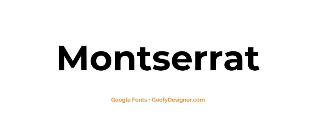
- About: It's incredibly versatile, making it perfect for anything from bold headlines to subtle body text. Its my go-to choice for a sleek, professional look.
Open Sans
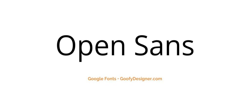
- About: Open Sans is ideal for both print and digital media. Its simplicity and clarity are what makes it a staple in design, ensuring that your content is accessible and engaging.
Oswald
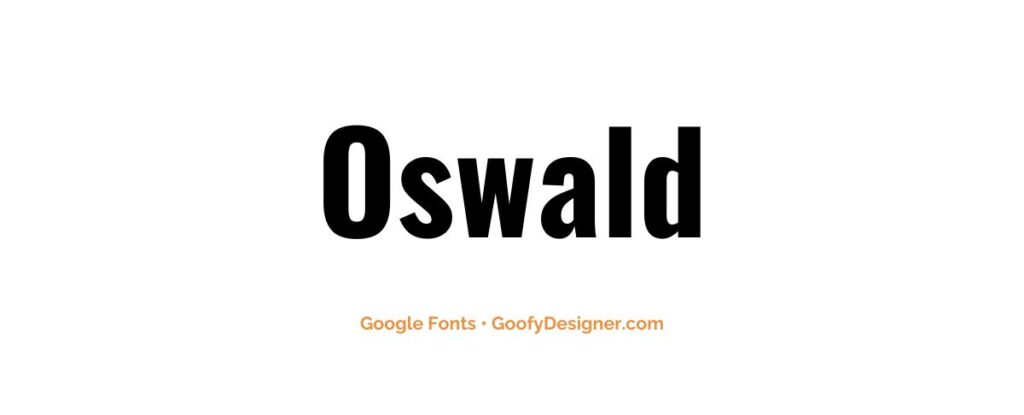
- About: Oswald's got a unique character, slightly condensed with a nod to classic print. It's fantastic for headers and online media, bringing a touch of elegance and sophistication.
Satisfy
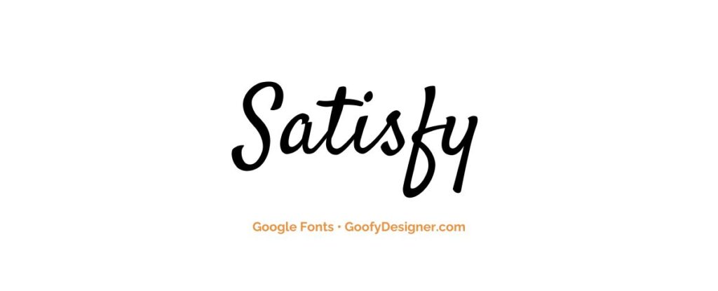
- About: Perfect for invitations and branding, Satisfy adds a personal, handwritten touch with its elegant, flowing script style.
Lilita One
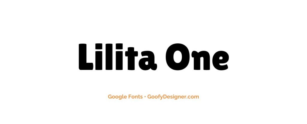
- About: Ideal for headlines and logos, Lilita One brings a bold and playful character with its chunky, rounded letterforms.
Playfair Display
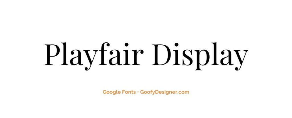
- About: With its high contrast and distinctive style, Playfair Display is best suited for elegant, upscale designs like magazine headers and luxury branding.
Merriweather
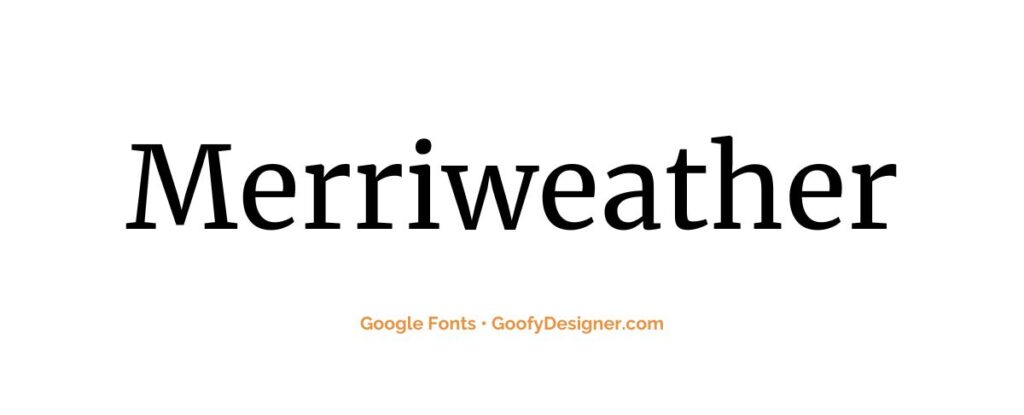
- About: Designed for readability on screens, Merriweather is great for long-form online content, offering a comfortable reading experience.
Dancing Script
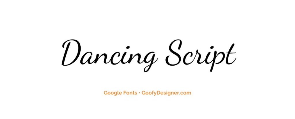
- About: A casual, informal choice, Dancing Script is perfect for invitations, greeting cards, and other personal communications that require a friendly touch.
Roboto
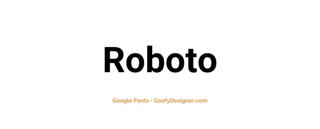
- About: A versatile sans-serif, Roboto works well in both digital and print mediums, making it suitable for website text and printed documents alike.
Roboto Slab
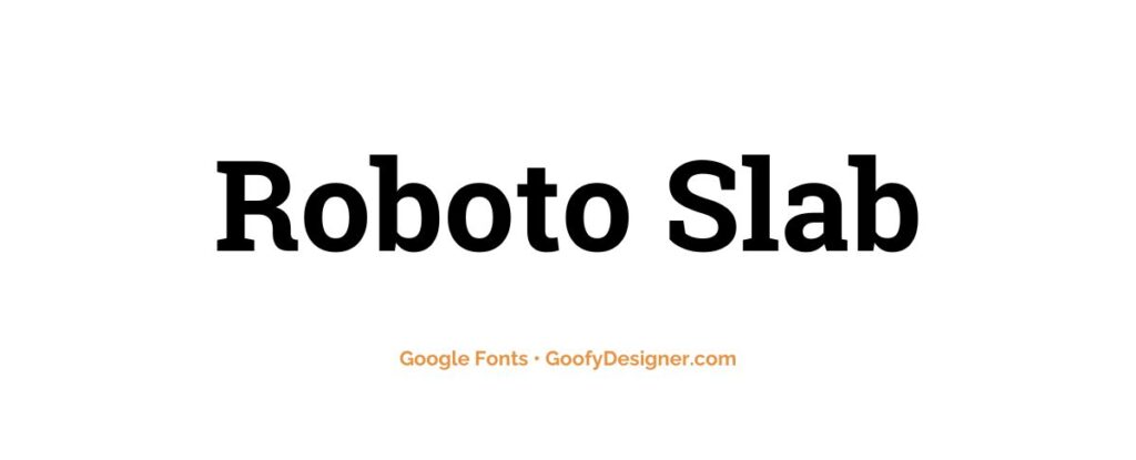
- About: Combining readability with a modern feel, Roboto Slab is excellent for web content, e-books, and any medium requiring a touch of formality without losing approachability.
Indie Flower
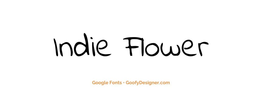
- About: Great for casual, creative, and youthful designs, Indie Flower adds a playful and hand-drawn feel to graphics and informal text.
Lora
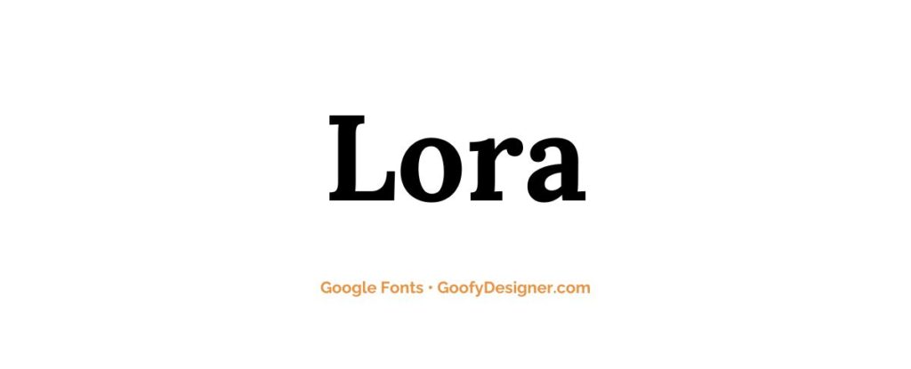
- About: Lora's balanced, classic style makes it well-suited for digital and print editorial content, providing an elegant and readable serif option.
Bebas Neue
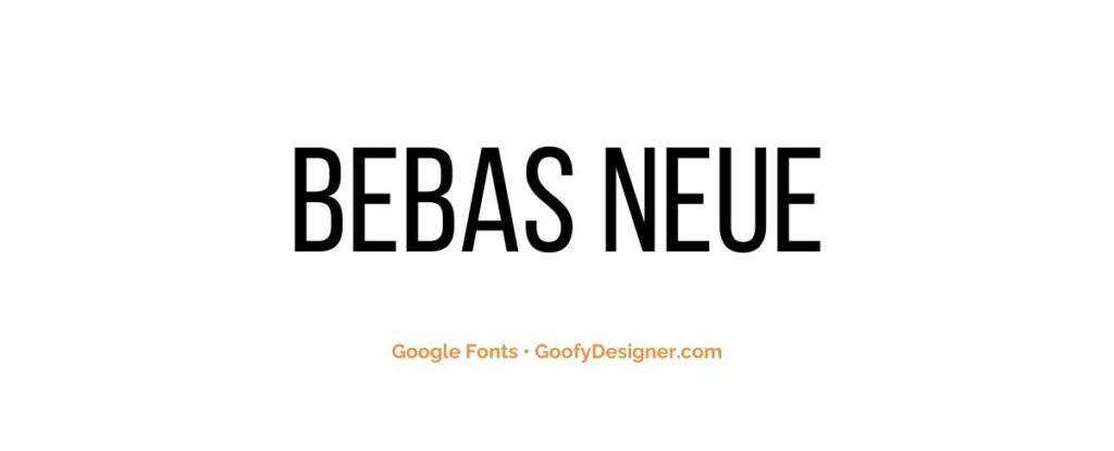
- About: With its tall, narrow lettering, Bebas Neue is ideal for impactful headlines, posters, and any graphic design needing a clean, strong presence.
Anton
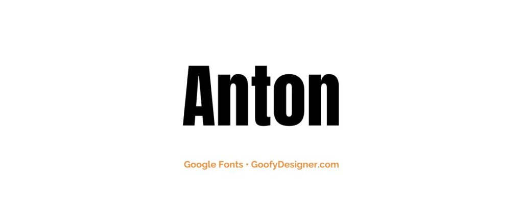
- About: Best used for bold headers and slides, Anton offers a modern, geometric feel that's perfect for tech and sports-related content.
Libre Baskerville
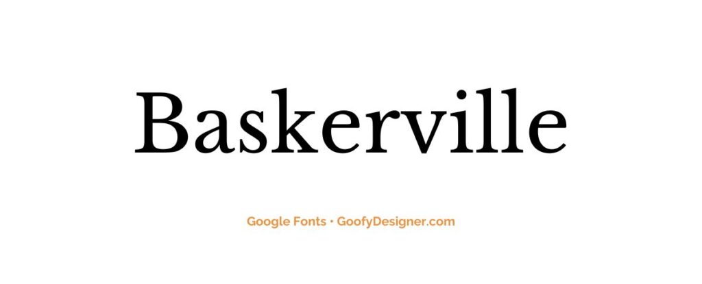
- About: A classic choice for digital body text, particularly in e-books and online articles, Libre Baskerville offers excellent readability and a timeless style.
Pacifico
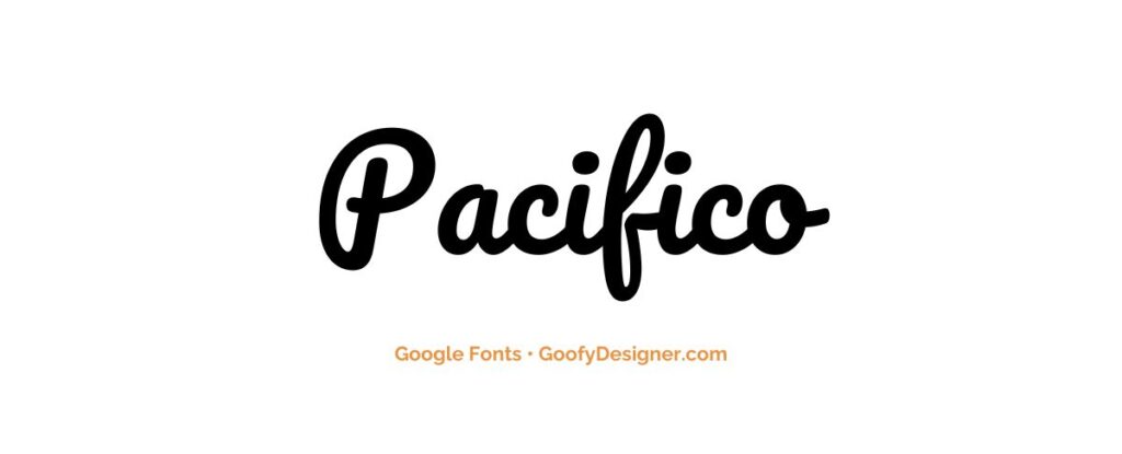
- About: Perfect for designs needing a retro, laid-back vibe, Pacifico is great for logos, titles, and branding that require a touch of whimsy.
Raleway
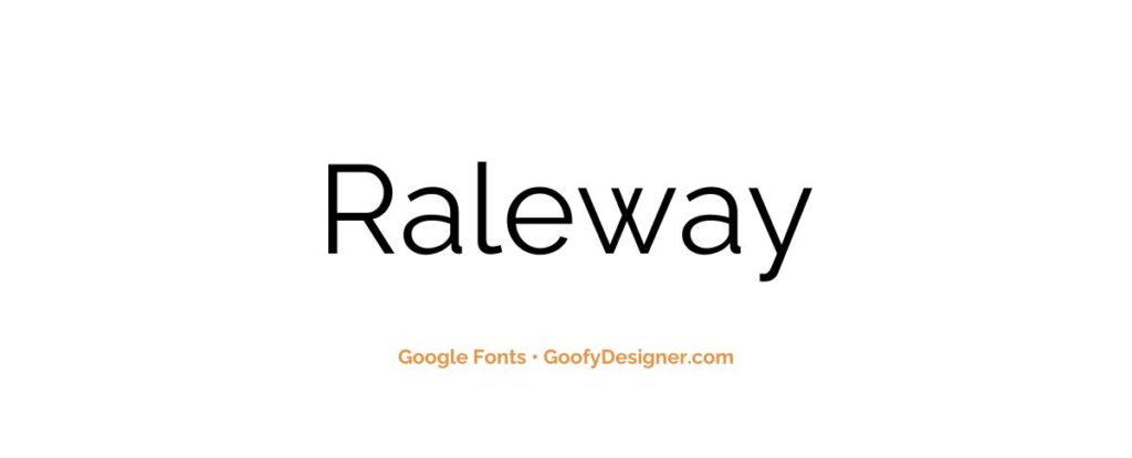
- About: Raleway's clean, elegant lines make it ideal for minimalist designs, including logos, headers, and any content where a chic, modern look is desired.
Noto Serif
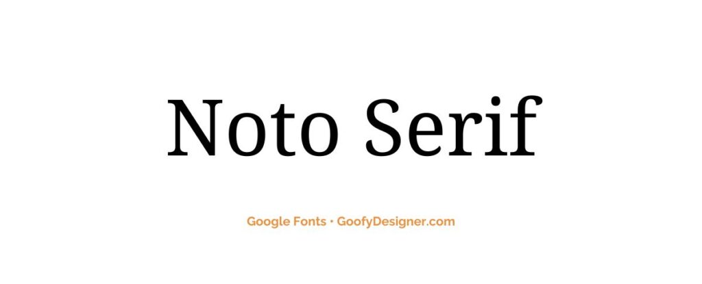
- About: With its aim to support all languages with a harmonious look and feel, Noto Serif is excellent for multilingual projects and diverse web content.
Abril Fatface
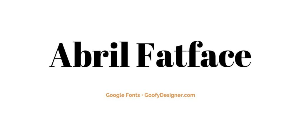
- About: Abril Fatface, with its bold, attention-grabbing style, is perfect for fashion and lifestyle headers, bringing a touch of drama and luxury.
Caveat
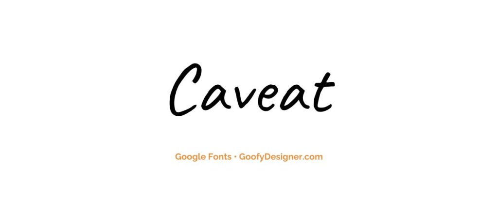
- About: Great for informal notes and annotations, Caveat brings a personal, handwritten feel to digital graphics and text that require a touch of individuality.
Black Ops One
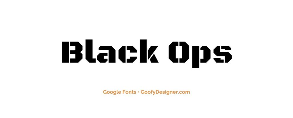
- About: Ideal for gaming and entertainment-related content, Black Ops One adds a strong, impactful character to titles and headers.
Quicksand
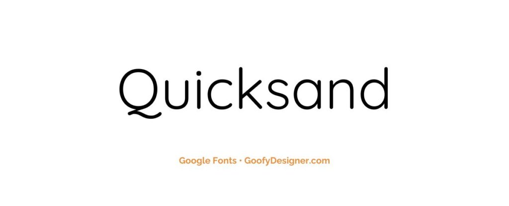
- About: With its clean, geometric form, Quicksand is excellent for children's websites, educational materials, and any design seeking a friendly, approachable look.
Permanent Marker
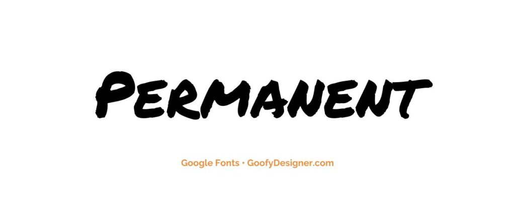
- About: Perfect for emulating a handwritten, bold marker look, Permanent Marker is great for casual, eye-catching headers and branding elements.
Shadows Into Light
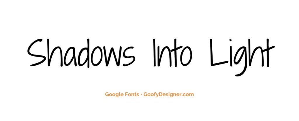
- About: This font is best for intimate, personal designs, giving a warm, handwritten feel to invitations, personal blogs, and creative projects.
Nunito
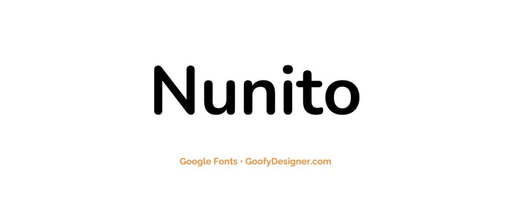
- About: A well-balanced, rounded sans-serif, Nunito is excellent for user interfaces, digital content, and applications requiring a friendly, approachable look.
Want more amazing fonts?
Browse tons of fonts & design elements!
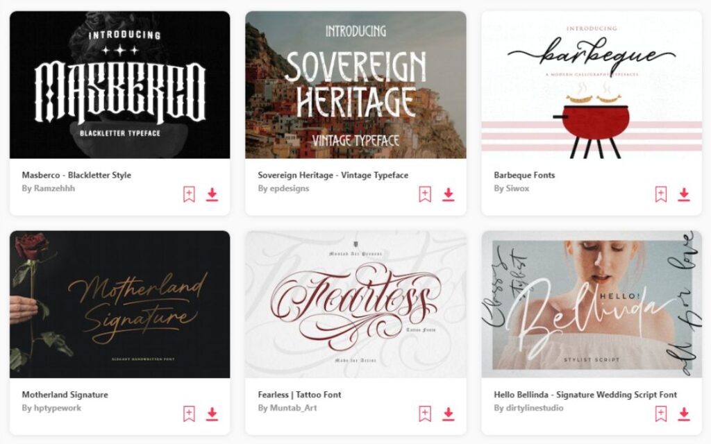
- If you want to find more fonts, browse my favorite site: Envato Elements.
- On Envato, you can get unlimited downloads of thousands of design assets just with 1 subscription.
- I personally use Envato for all my designs and couldn’t be happier – it helps me save so much time.
- They have literally millions of stock photos, videos, fonts, templates, music, and much more!
How to choose the best Google fonts?
- Readability: Focus on fonts that offer good readability, especially for body text. Look for clear letterforms and adequate spacing, which ensures that the text is easy to read on various devices and screen sizes.
- Purpose and Tone: Consider the purpose of your project and the tone you wish to convey. For instance, serif fonts often suit formal or traditional content, while sans-serif fonts are more modern and casual.
- Font Pairing: Think about how fonts will work together if you plan to use more than one. Google Fonts provides pairing suggestions which can be a great starting point.
- Load Times: Pay attention to the font's load time, as some fonts are heavier than others. A faster loading font is generally better for web performance and SEO.
- Language Support: Ensure the font supports all the characters and language scripts your content needs. Some Google Fonts offer extensive language support, while others are more limited.
What are Google fonts usually used for?
- Web Design: Google Fonts are widely used in web design due to their versatility and web-optimized performance. They enhance the visual appeal of websites and improve user experience.
- Branding: Companies often use Google Fonts for branding purposes, as the right font can effectively convey a brand’s personality and values.
- Digital Marketing: These fonts are used in various digital marketing materials like banners, email campaigns, and social media posts to grab attention and convey messages clearly.
- Print Media: Despite being optimized for digital use, many Google Fonts are also suitable for print media, such as brochures, business cards, and flyers, due to their high readability and aesthetic diversity.
- UI/UX Design: User Interface (UI) and User Experience (UX) designers frequently use Google Fonts for their clear legibility and compatibility across different devices and platforms.
Conclusion
To wrap up, among the 25 best Google Fonts we've explored, three particularly shine: Montserrat, Open Sans, and Oswald. Montserrat offers a sleek, contemporary look that's great for both professional and creative designs. Open Sans, known for its readability, is a versatile choice for everything from websites to print. Oswald stands out with its modern, bold style, perfect for eye-catching headlines. These three fonts are essential tools for creating impactful, stylish typography in a variety of projects. Try them out and see the difference they make in elevating your design's aesthetic.
