Summary: Exploring the best fonts for After Effects, I've picked out 25 top options to elevate your motion graphics. Here are my top three choices:
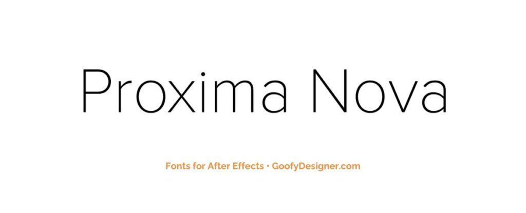
- Proxima Nova: My favorite font that’s sleek and modern, perfect for a professional tone.
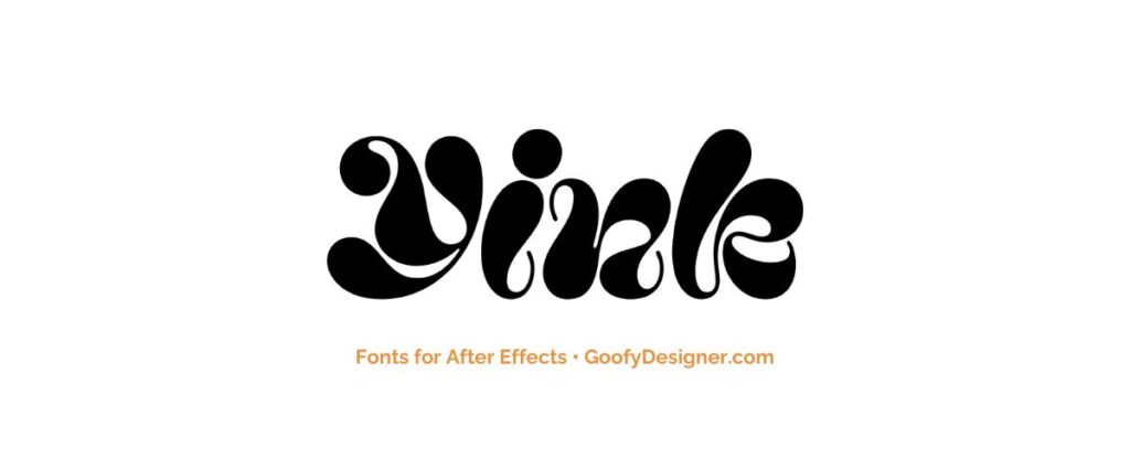
- Yink: Playful and thoughtful font that brings creativity and freshness.
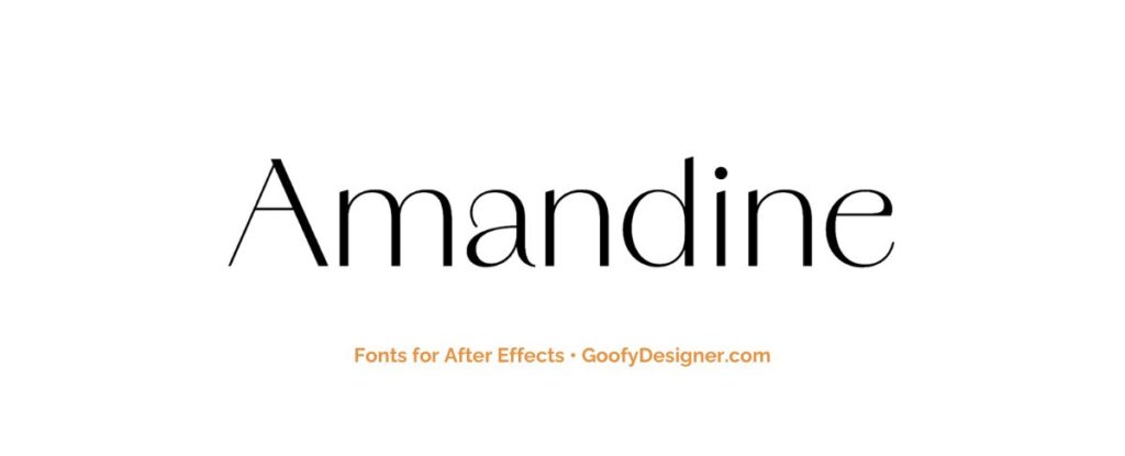
- Amandine: With timeless elegance, it suits a variety of projects, adding a touch of class.
These fonts are easy to use in After Effects, helping you create captivating visuals that resonate with your audience. Whether making captivating title sequences or overlaying text onto footage, selecting the right font is essential for conveying your message effectively. Explore these top choices and elevate your motion graphics projects to new levels of professionalism and visual appeal.
Proxima Nova
- About: Renowned for bringing a touch of sophistication to any After Effects project, Proxima Nova is the ideal choice for creating sleek title sequences and modern graphic overlays.
Yink
- About: With its creative flair and innovative design elements, Yink stands out as the perfect option for adding a fresh perspective and artistic charm to motion graphics and animated text in After Effects.
Amandine
- About: Offering a timeless elegance and refined aesthetics, Amandine emerges as the top contender for creating classy and sophisticated typography in After Effects compositions that exude style and grace.
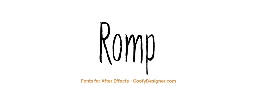
Romp
- About: Infusing motion graphics with a playful and energetic vibe, Romp injects dynamism into vibrant text effects and dynamic animations, making it the go-to choice for After Effects projects that demand excitement and movement.
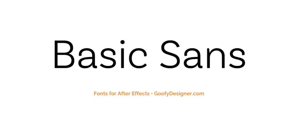
Basic Sans
- About: Known for its versatility and clean lines, Basic Sans is highly adaptable, making it suitable for a wide range of projects in After Effects, from minimalist designs to informative titles and graphics that convey clarity and simplicity.
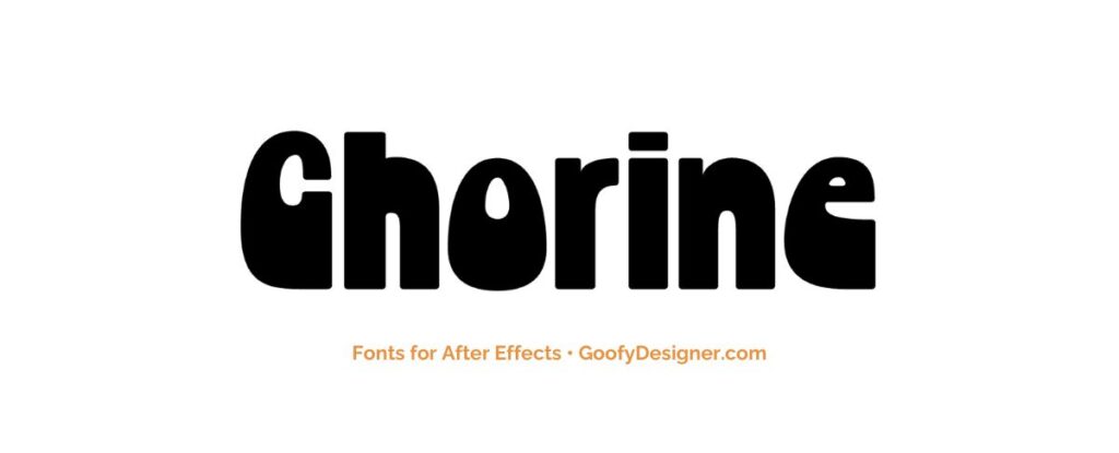
Chorine
- About: With its bold and dramatic style, Chorine makes a statement in impactful title sequences and attention-grabbing text overlays, offering After Effects projects a touch of boldness and flair.
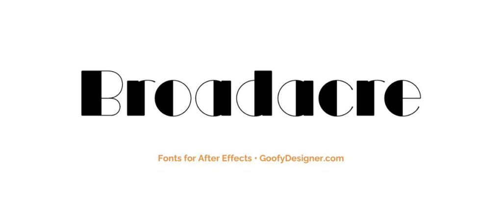
Broadacre
- About: Evoking a sense of nostalgia with its retro charm, Broadacre adds a vintage-inspired touch to motion graphics and animations in After Effects, creating compositions that resonate with a timeless aesthetic.
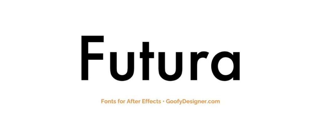
Futura PT
- About: Defined by its geometric shapes and modernist design, Futura PT stands as an excellent choice for creating futuristic and cutting-edge typography in After Effects projects that push the boundaries of innovation.
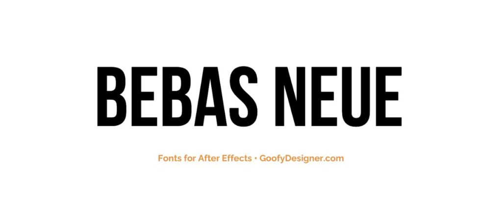
Bebas Neue
- About: Bold and assertive, Bebas Neue commands attention with its large titles and impactful text animations, making it the preferred font for After Effects projects that demand bold statements and powerful visuals.
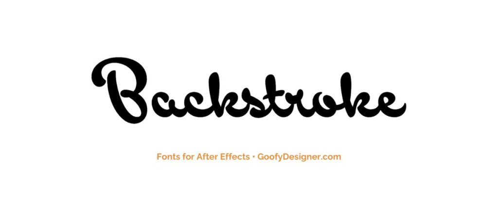
Backstroke
- About: Infused with a handwritten style that adds a personal touch and whimsical vibe, Backstroke brings playfulness to text animations in After Effects projects, injecting fun and creativity into compositions that captivate viewers.
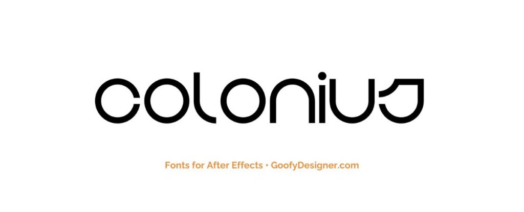
BD Colonius
- About: BD Colonius's condensed and bold design ensures it stands out in headlines and attention-grabbing text overlays, making it a versatile choice for After Effects compositions that require clarity and impact.
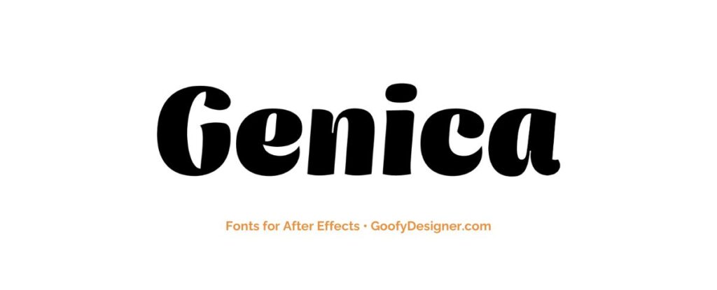
Genica
- About: With its elegant script font, Genica adds a touch of sophistication and refinement to titles, lower thirds, and animated text, elevating After Effects projects with a sense of grace and style.
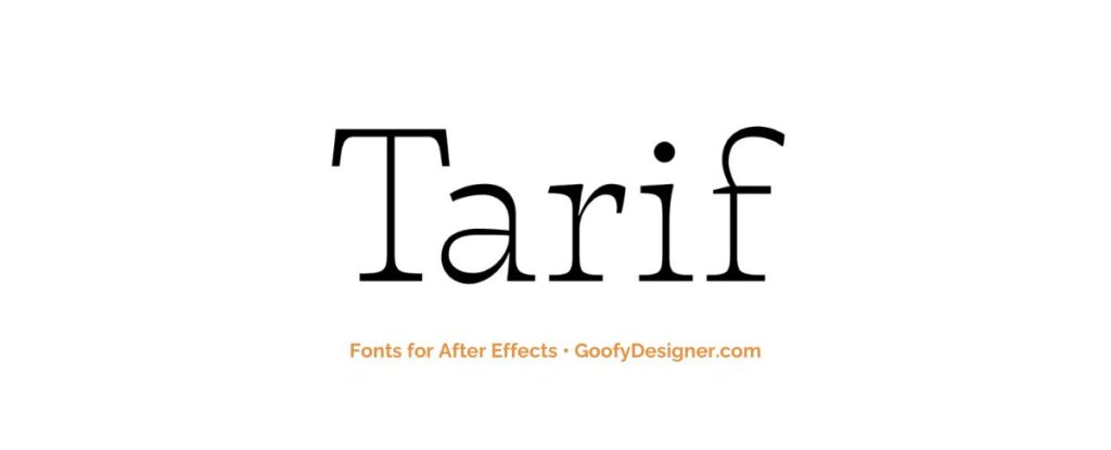
Tarif
- About: Exuding classic elegance and timeless appeal with its serif font style, Tarif is the perfect choice for creating stylish and tasteful typography in After Effects compositions that exude sophistication and class.
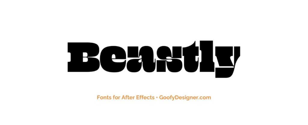
Beastly
- About: With its rugged and bold design, Beastly brings grit and impact to text animations, making it the preferred font for After Effects projects that aim to convey a raw and powerful aesthetic.
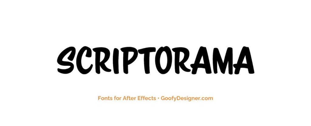
Scriptorama Markdown JF
- About: Scriptorama Markdown JF infuses romantic and playful text animations with whimsy and charm, creating engaging motion graphics in After Effects that resonate with emotion and creativity.
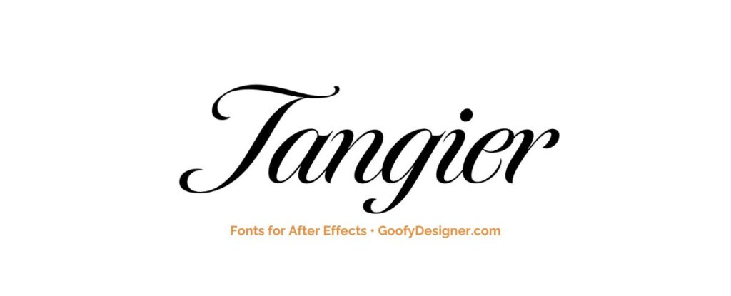
Tangier
- About: With its exotic and decorative style, Tangier adds flair to titles and text overlays, creating visually striking motion graphics in After Effects projects that captivate and inspire viewers.
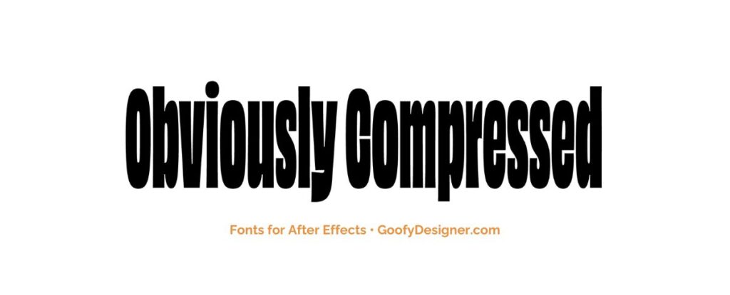
Obviously Compressed
- About: The ‘Obviously Compressed' font, with its narrow and tall letterforms, is ideal for After Effects projects that require a modern, condensed typeface for dynamic titling in limited spaces or for creating a striking visual impact.
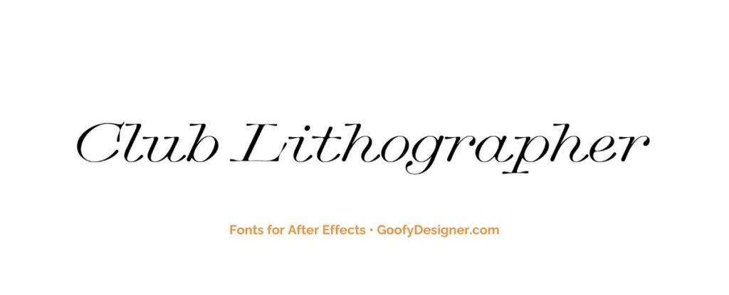
Club Lithographer
- About: Drawing inspiration from vintage aesthetics, Club Lithographer adds retro flair to motion graphics and title sequences, evoking nostalgia and atmosphere in After Effects compositions that harken back to a bygone era.
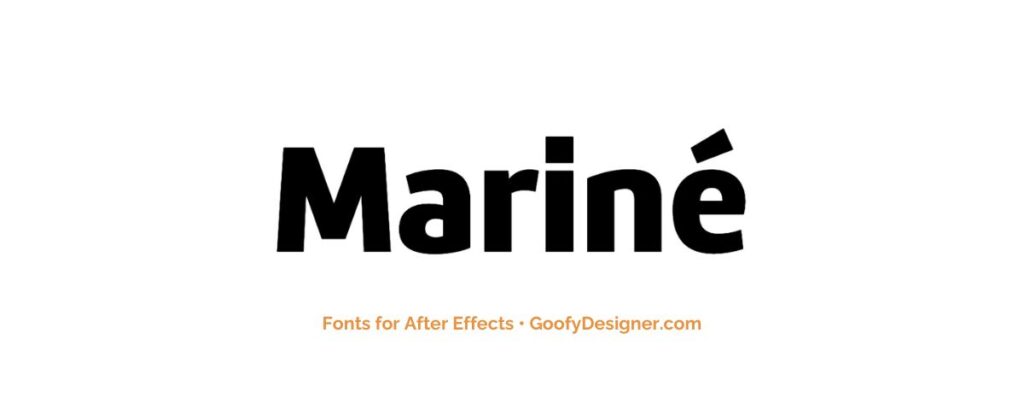
Mariné
- About: Mariné's clean and modern sans-serif font style is minimalist and elegant, making it the perfect choice for creating sophisticated typography in After Effects projects that exude simplicity and refinement.
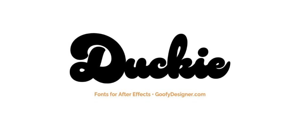
Duckie
- About: With its playful and quirky design, Duckie injects personality and charm into text animations, adding a fun and lighthearted touch to After Effects projects that delight and entertain viewers.
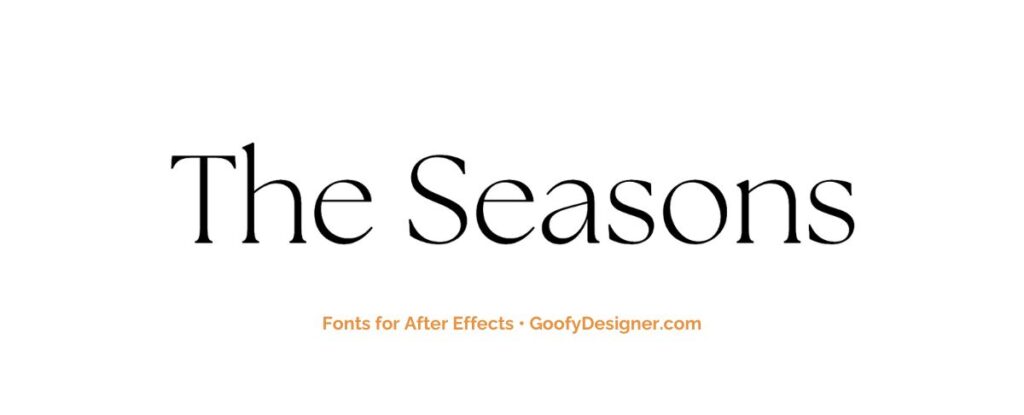
The Seasons
- About: The elegant serif font displayed, ‘The Seasons', excels in After Effects for crafting sophisticated and timeless motion graphics, perfect for thematic visual narratives and seasonal event promotions.
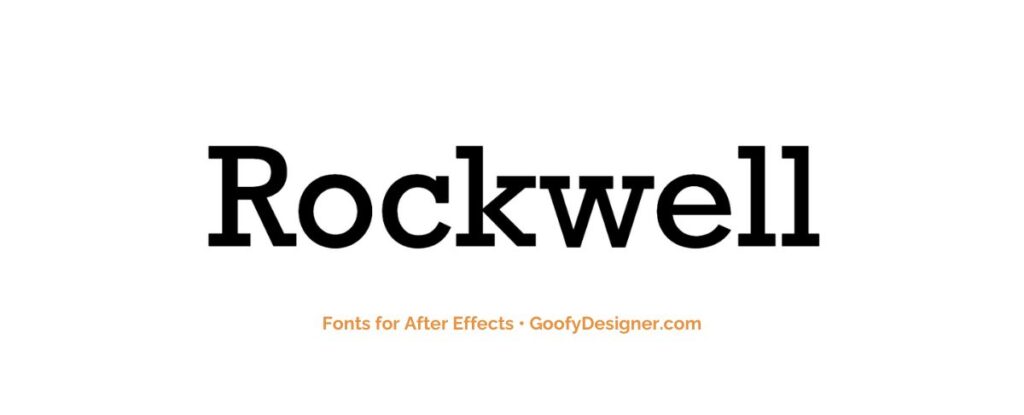
Rockwell Nova
- About: The Rockwell font, with its strong and bold serifs, is particularly effective for After Effects motion graphics that demand a clear, authoritative typographic presence for titles and headers.
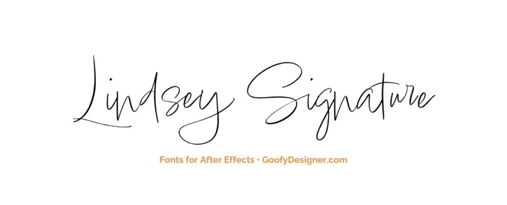
Lindsey Signature
- About: Infusing text animations with warmth and intimacy, Lindsey Signature's handwritten script font conveys emotion and personality in After Effects compositions, creating engaging motion graphics that resonate with viewers on a personal level.
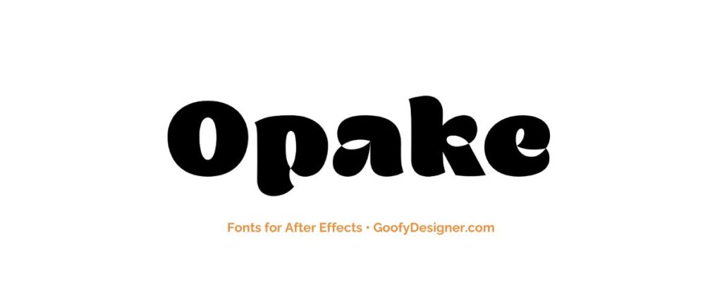
Opake
- About: Opake's unique and futuristic design adds intrigue and mystery to motion graphics and title sequences, captivating viewers with After Effects projects that push the boundaries of creativity and imagination.
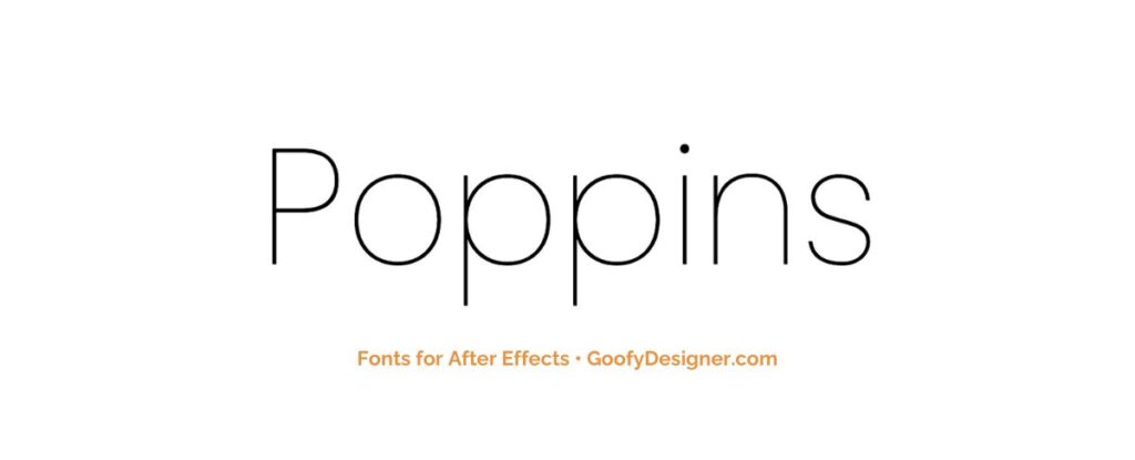
Poppins
- About: Poppins's clean and versatile font style is suitable for a wide range of projects, from informational graphics to stylish title sequences, in After Effects compositions that demand clarity and versatility in design.
Want more amazing fonts?
Browse tons of fonts & design elements!
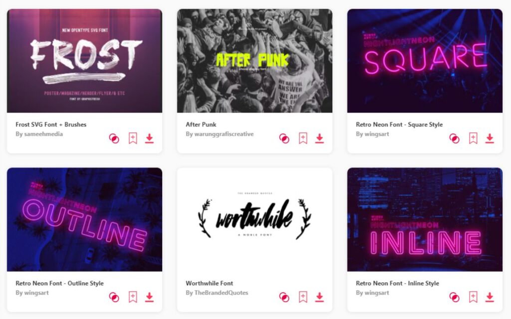
- If you want to find more fonts, browse my favorite site: Envato Elements.
- On Envato, you can get unlimited downloads of thousands of design assets just with 1 subscription.
- I personally use Envato for all my designs and couldn’t be happier – it helps me save so much time.
- They have literally millions of stock photos, videos, fonts, templates, music, and much more!
Why is it important to choose the right font for After Effects?
- Readability and Clarity: The right font ensures that your text is easy to read and understand, which is crucial for conveying your message effectively in videos and animations.
- Tone and Mood: Fonts have the power to evoke emotions and set the atmosphere of your project, whether it's professional, whimsical, or dramatic, aligning the visual tone with your content's intention.
- Audience Engagement: A well-chosen font can capture and keep the viewer's attention, making your content more engaging and memorable.
- Brand Identity: Consistent use of a specific font or font style can reinforce your brand identity, making your content instantly recognizable to your audience.
- Design Aesthetics: The right font complements your design, contributing to a cohesive and visually appealing project that stands out in a crowded media landscape.
How to choose the best font for After Effects?
- Consider the Project's Purpose: Identify the goal of your project (e.g., informative, entertainment, commercial) and choose a font that aligns with this objective, enhancing the message you want to convey.
- Understand Your Audience: Tailor your font choice to your target audience's preferences and expectations, considering factors like age, interests, and cultural background to ensure your message resonates.
- Evaluate Readability on Different Devices: Choose fonts that are legible across various screen sizes and resolutions, ensuring your content is accessible to all viewers, regardless of how they access it.
- Test Compatibility and Performance: Ensure the font works well within After Effects, checking for any technical issues that might affect rendering times or overall project performance.
- Experiment with Contrast and Pairing: Use contrast in font weights, styles, and pairings to create visual interest and hierarchy in your text, making your content dynamic and easier to navigate.
Conclusion
In wrapping up my exploration of fonts for After Effects, I've uncovered a rich tapestry of options to add flair to your motion graphics. Among these gems, Proxima Nova boasts a sleek, modern vibe, while Yink injects a burst of fresh creativity, and Amandine brings timeless elegance to the table. Just like an artist carefully selects their tools, choosing the right font can truly elevate your work. Whether you're crafting a cinematic masterpiece or a promotional video, your font choice shapes the way your message is received. So, as you embark on your creative journey, may your font selections be inspired and your projects truly stand out!
