Summary: Today we’ll go over 20 typefaces that can be used as alternatives to the infamous Helvetica font. The best ones are in my opinion:
- Neue Haas Grotesk – original form of Helvetica, practically similar font
- Inter – very similar & free google font – honestly, it’s like they’re twins
- Proxima Nova – similar shapes with a slightly thinner look
- Montserrat – a bit more round & wide, free, modern
- Raleway – more elegant shapes, simple & clean typeface
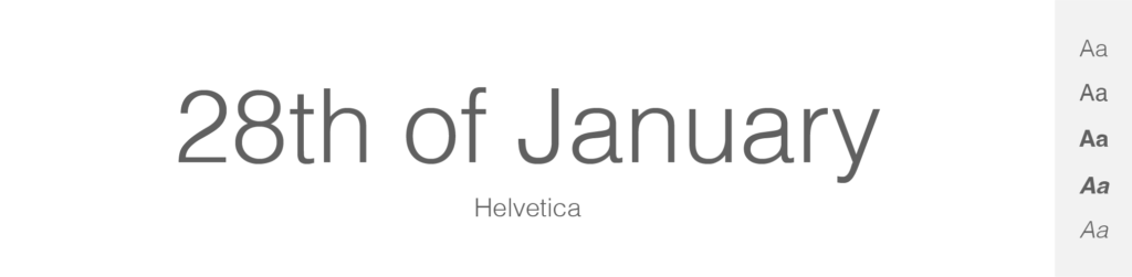
Helvetica is kind of an old news. Some people love it, others hate it, and who is the loudest when it comes to this sans-serif masterpiece? Designers.
As for me, I think Helvetica is marvelous font. It has definitely gained its name in the history of typography. But yes, it is kind of overused, I think we can agree on this one. And that’s why I came up with this article, where we’ll go over 20 Helvetica alternatives, which you can use online, in print, or anywhere else. Shall we?
TOP 20 fonts similar to Helvetica
- Neue Haas Grotesk – Paid
- Inter – Free (Google Fonts)
- Proxima Nova – Paid
- Montserrat – Free (Google Fonts)
- Akzidenz-Grotesk – Paid
- Aktiv Grotesk – Paid
- Univers – Paid
- Gotham – Paid
- National – Paid
- Brandon Grotesque – Paid
- Futura – Paid
- Roboto – Free (Google Fonts)
- ARS Maquette – Paid
- Open Sans – Free (Google Fonts)
- Poppins – Free (Google Fonts)
- Lato – Free (Google Fonts)
- Quicksand – Free (Google Fonts)
- Slate – Paid
- FF Bau – Paid
- Raleway – Free (Google Fonts)
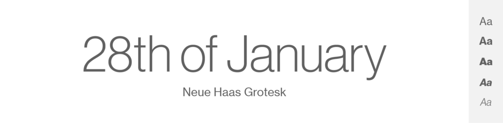
Neue Haas Grotesk
- Free or Paid: Paid – by Monotype
- How many styles: Total 16 styles = 8 weights + all in matching italics (ultrathin, thin, extralight, light, roman, medium, bold & black).
- Usually used for: Corporate branding and advertising for its sophisticated and timeless design. This font is a predecessor of Helvetica and is also commonly used in print materials.
Have you ever wondered why there is something called “Helvetica Neue”? Now you’ll see: The first typeface I wanna show you is called “Neue Haas Grotesk”.
And you might not know it, but Neue Haas Grotesk and Helvetica are actually intimately related, as they are essentially the same typeface, only with minor differences and under different names due to various historical and marketing reasons. Cool, right?
So Neue Haas Grotesk is the original name of what we now commonly know as Helvetica. The typeface was designed in 1957 by Max Miedinger and Eduard Hoffmann in Switzerland. The aim was to create a neutral typeface with great clarity, devoid of any individualistic characteristics.
When the typeface was licensed for international distribution by the German company Stempel, the name was changed to Helvetica (derived from “Helvetia,” the Latin name for Switzerland) in order to make it more universally marketable.
So, Neue Haas Grotesk and Helvetica, in their original forms, are virtually identical. So even though Neue Haas Grotesk is an old typeface, it still remains one of the best options when trying to find Helvetica’s “copy”, as they are originally one and the same font.
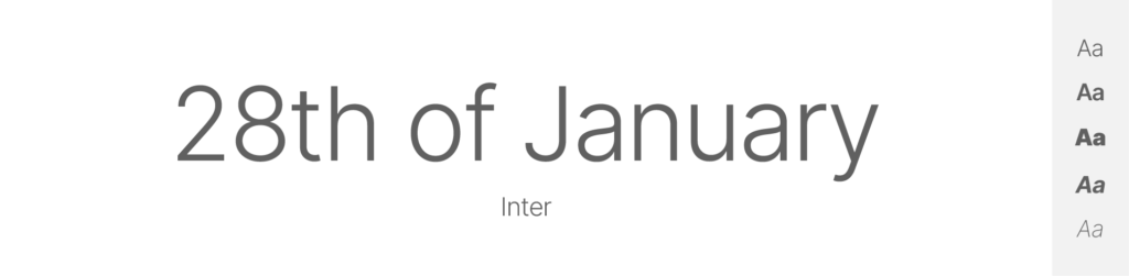
Inter
- Free or Paid: Free – Google Font
- How many styles: Total 9 styles = 9 weights (thin, extralight, light, regular, medium, semibold, bold, extrabold & black) – only upright, no italics.
- Usually used for: Digital interfaces and web design because of its readability at small sizes. It's also commonly used in software and application design.
Inter is a versatile sans-serif typeface designed by Rasmus Andersson for digital environments. It is relatively young, released in 2019, but it has already gained popularity.
One of Inter's key features is its adaptability. It has a tall x-height and relatively short ascenders and descenders, optimizing space efficiency in digital interfaces. Also noteworthy are its open counters and generous letter-spacing, which boost readability at small sizes.
When compared to Helvetica, both are sans-serif and known for their versatility, but their design philosophies differ. Inter was explicitly designed for computer screens and to be legible at small sizes, with features like larger apertures and higher x-height. Meanwhile, Helvetica, created in a pre-digital era, is more uniform and neutral, balancing its stroke widths and character shapes for a wide range of uses, from print to digital.
In terms of aesthetics, Inter might appear slightly more modern due to its open forms and space-efficient design. On the other hand, Helvetica maintains a classic, timeless quality due to its balanced and neutral design. So eventually it’s up to you, but I think that Inter is one great Helvetica alternative.
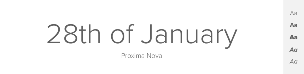
Proxima Nova
- Free or Paid: Paid – by Adobe
- How many styles: Total 80 styles = But there are 16 “classic” Proxima Nova fonts – 8 upright and 8 italics (thin, light, regular, medium, semibold, bold, extrabold & black). Then it has more styles – like condensed, extra condensed, wide and extra wide + all of these come in different weights & both italics and upright.
- Usually used for: Web design and digital applications because of its balance between modern proportions and geometric appearance. It's also often used in graphic design and signage.
This is one of my favorites – Proxima Nova: a sans-serif typeface, designed by Mark Simonson in 2005. And it's actually a reworking and extension of an earlier typeface, Proxima Sans, which was released in 1994.
Proxima Nova is pretty famous. Just like Helvetica, is known for its clarity and simplicity, making it highly versatile for a wide range of applications. It has a geometric feel but also incorporates some features from humanist and grotesque typefaces, leading to a balance between mechanical geometry and organic letterforms.
Compared to Helvetica, Proxima Nova is a bit more geometric. It has rounder, fuller characters, with some letters, like ‘a' and ‘g', having a single-storey design rather than the double-storey found in Helvetica. Proxima Nova also has a larger x-height, which can improve readability at small sizes.
I really like this font. As a designer, I often go with “the feel” and Proxima Nova gives me a bit of a goosebumps only upon hearing the name. When looking for an alternative to the over-used Helvetica, Proxima Nova might be a great choice.
Montserrat
- Free or Paid: Free – Google Font
- How many styles: Total 18 styles = 9 upright weights & 9 italics (thin, extralight, light, regular, medium, semibold, bold, extrabold & black).
- Usually used for: Contemporary designs like logos and headlines. Also commonly used for website and app interfaces.
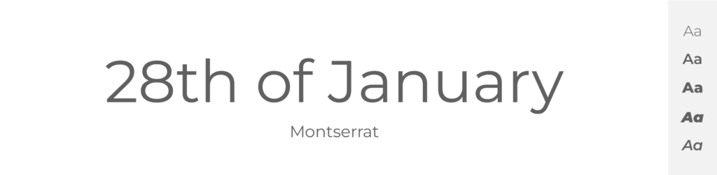
This is by far my most favorite font. Montserrat is simply super clean, minimalist and beautiful.
It is a geometric sans-serif typeface designed by Julieta Ulanovsky. Inspired by the old posters and signs in the traditional Montserrat neighborhood of Buenos Aires, she sought to rescue the beauty of urban typography that emerged in the first half of the twentieth century. Montserrat is characterized by rounded shapes, well-defined edges, a large x-height, and its quite distinctive ‘Q' character, which has a tail that dips below the baseline. This font was designed to be highly legible even at small sizes, making it very versatile for different uses.
On the other hand, Helvetica is a classic sans-serif typeface popular for its versatility and neutral design, which allows it to be used in a wide range of applications, from corporate identities to signage and small text.
Both fonts share the characteristic of being sans-serif and having high legibility at different sizes. However, while they might seem similar at first glance, there are a few subtle differences that set them apart. Montserrat is influenced by the geometric style of fonts, which is characterized by simplicity and a focus on geometric shapes. It has more rounded shapes compared to Helvetica.
I personally love Montserrat and think it is a beauty between typefaces, so I would definitely recommend this font when looking for Helvetica alternative. But bear in mind that they are a bit different from each other.
Akzidenz-Grotesk
- Free or Paid: Paid – by Berthold
- How many styles: Total 30 styles = But there are 12 primary variants – 6 “classic” upright weights + matching italics (light, regular, medium, bold, extrabold & super). Then it has also different weights of condensed and extended variations in both upright & italics.
- Usually used for: Print and commercial media due to its influential design in the history of typography. It's also seen in corporate branding and signage.
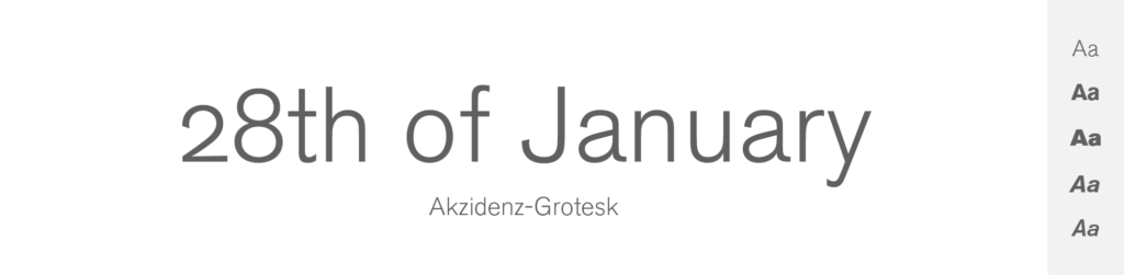
Akzidenz-Grotesk is a sans-serif typeface that dates back to the late 19th century. It was one of the first sans-serif typefaces to be widely used, and its design has influenced a broad range of other typefaces – including Helvetica and of course Neue Haas Grotesk. In fact, Neue Haas Grotesk and Helvetica are often considered derivatives of Akzidenz-Grotesk.
Helvetica and Akzidenz-Grotesk share many design characteristics: clean, simple lines; a lack of adornment; and excellent legibility. However, they have subtle differences. Akzidenz-Grotesk is less uniform, with slight irregularities in stroke width and more ‘humanist' qualities. Helvetica, on the other hand, is known for its geometric precision and consistent stroke width.
Aktiv Grotesk
- Free or Paid: Paid – by Dalton Maag
- How many styles: Total 54 fonts = But is has 18 primary variants – 9 upright + matching italics (hair, thin, light, regular, medium, semibold, bold, Xbold & black). Then it has also condensed and extended versions.
- Usually used for: Brand identities and digital interfaces for its clean, modern design. It's also often seen in print materials and advertising.
Here we have another sans-serif typeface, this one designed by David Marshall, Ron Carpenter, Bruno Maag, and Fabio Luiz Haag.
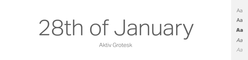
It was created in 2010 as an alternative to the ubiquitous Helvetica and other similar sans-serif fonts.
Just like Helvetica, Aktiv Grotesk is a grotesque sans-serif typeface, and it shares Helvetica's clean, neutral aesthetic. The designers created this font to address what they saw as the overuse and limitations of Helvetica in design, aiming to create a font that maintained the neutrality and versatility of Helvetica but was better suited for modern digital design.
Several design elements set Aktiv Grotesk apart from Helvetica. The terminals of the ‘c' and ‘s' in Aktiv Grotesk, for example, terminate horizontally rather than diagonally as in Helvetica. This gives Aktiv Grotesk a more geometric feel. Also, Aktiv Grotesk generally has a more uniform stroke width than Helvetica. Some of the characters in Aktiv Grotesk, such as the lowercase ‘a' and ‘g', are single-storey, unlike their double-storey counterparts in Helvetica.
So, should you use Aktiv Grotesk instead of Helvetica? I personally think it is a great choice since this font was designed exactly as Helvetica alternative. I think it suits its purpose very well.
Univers
- Free or Paid: Paid – by Linotype
- How many styles: Total 27 styles = But is has 10 primary variants – 5 upright + matching italics (light, roman, bold, black & extrablack). It also has condensed and extended versions in many weights & both upright and italics.
- Usually used for: Corporate communication and advertising because of its comprehensive font family and clear legibility. It's also popular in digital design and typography.
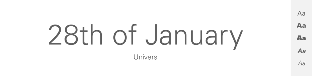
Univers was designed by Adrian Frutiger in 1954 and released in 1957. It is known for its clean and neutral aesthetic, akin to other Swiss-style designs.
The design of Univers was innovative for its time, featuring almost identical x-heights across all weights and widths. This feature made it easier for designers to mix and match different weights and widths in the same piece of work.
Univers is similar to Helvetica in its clean, minimalist design. However, they do have some differences. For example, Helvetica's terminal ends are typically horizontal or, in some cases, slightly angled, while Univers' terminal ends are slightly curved. Another difference is that Univers tends to have a more uniform stroke width, while Helvetica has slightly varying stroke widths.
Despite these subtle differences, both typefaces are known for their excellent legibility, adaptability, and timeless design. Univers remains a popular choice especially when picking a font similar to Helvetica.
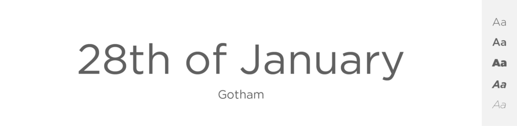
Gotham
- Free or Paid: Paid – Hoefler & Co
- How many styles: Total 66 styles = But there are 16 “classic” Gotham fonts – 8 upright and 8 italics (thin, extralight, light, book, medium, bold, black & ultra). Then there are 50 more styles of this font – like Narrow, Extra Narrow or Condensed, and all of these come in different weights and both italics and upright.
- Usually used for: Corporate identities and logos. It's often used in graphic designs and architectural presentations.
Gotham is a geometric sans-serif typeface designed by Tobias Frere-Jones and released in 2000 by Hoefler & Co. It was inspired by the New York architecture, which gives it a uniquely American feel.
Compared to Helvetica, Gotham is a more geometric sans-serif, drawing from the style of the 20th-century American sign maker tradition. The most noticeable characteristic of Gotham is its broad, open letters and ample counterspaces which help ensure legibility and clarity at various sizes and distances.
In terms of individual letterforms, Gotham's ‘G' doesn't have a spur, and the ‘a' and ‘g' are single-story, unlike Helvetica's double-story versions. Gotham's characters also have a consistent stroke width, whereas Helvetica has slight variations in stroke width. The terminals in Gotham are more horizontally cut compared to Helvetica.
Like Helvetica, Gotham has a range of weights, from Thin to Ultra, each of which is available in italic, making it a versatile typeface for a wide array of uses. Despite the differences, both Gotham and Helvetica are popular for their clean, modern aesthetics and excellent legibility.
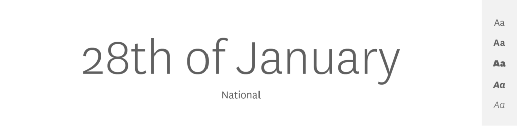
National
- Free or Paid: Paid – by Kris Sowersby
- How many styles: Total 16 styles = 8 upright + matching italics (light, book, regular, medium, semibold, bold, extrabold & black).
- Usually used for: Graphic design and editorial works for its unique character and legibility. It's also often used in corporate branding and signage.
National is a sans-serif typeface designed by Kris Sowersby in 2007 that quickly gained popularity.
Compared to Helvetica, it has a noticeably different aesthetic, inspired by the British and European grotesque typefaces that predate Helvetica. This gives it a slightly less neutral look than Helvetica, with more personality and warmth.
National's letterforms have a higher x-height and narrower width compared to Helvetica. This results in excellent readability and efficient use of horizontal space. It also includes some unique details like the angled terminal on the ‘c' and the curved tail on the ‘l', which give it a distinctive character.
Furthermore, unlike Helvetica's almost uniform stroke thickness, National exhibits subtle variations in stroke width and tapers, providing a sense of fluidity and dynamism. These features also imbue it with a touch of humanist flair.
National comes in a wide range of weights, from thin to black, making it suitable for various typographic needs, from body text to headlines.
I do like both of these fonts. And even tho National is not completely the same as Helvetica, it is definitely similar and makes a great alternative.
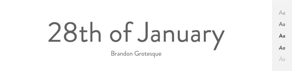
Brandon Grotesque
- Free or Paid: Paid – by HVD Fonts
- How many styles: Total 12 styles = 6 upright weights & 6 matching italics (thin, light, regular, medium, bold & black).
- Usually used for: Logos, branding, and advertising due to its geometric style and versatility. It's also often found in headlines and print materials.
This German typeface, Brandon Grotesque is a sans-serif designed by Hannes von Döhren and released in 2010.
It is often noted for its geometric style, reminiscent of the sans-serif typefaces that were popular during the 1920s and 1930s. The letters have a certain degree of roundness and the corners are slightly rounded to give it a warmer feel.
Compared to Helvetica, Brandon Grotesque has a higher x-height, and the letters are rounder, which gives it a more geometric feel. Additionally, the thin forms of Brandon Grotesque are much thinner than those of Helvetica, and the stems of the uppercase ‘A', ‘V', ‘W', and ‘w' are noticeably thinner than the outside, creating a distinctive look.
The typeface also features a single-story ‘g' and ‘a' in its default set, in contrast to the double-story ‘g' and ‘a' found in Helvetica.
One unique characteristic of Brandon Grotesque is the distinct contrast between the thick and thin stroke weights within its letterforms, especially visible in the heavier weights. This is unlike Helvetica, which maintains relatively consistent stroke widths.
While Brandon Grotesque shares Helvetica's sans-serif classification and focus on clarity and legibility, it has a more distinctive, geometric style and contains more contrast in stroke weights. But it still makes a great alternative to this overused popular typeface.
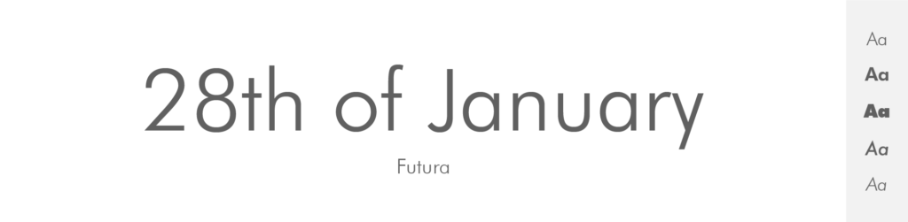
Futura
- Free or Paid: Paid – by Linotype
- How many styles: Total 22 styles = It has 12 primary fonts – 6 weights + matching obliques (light, book, medium, heavy, bold, extrabold). Then it has some condensed styles – both upright and oblique. And 2 extra fonts – Futura Black and Futura Display.
- Usually used for: Logos and branding because of its clean, geometric shapes. It's also seen in posters and advertising.
Futura is a geometric sans-serif typeface designed by Paul Renner in 1927. It is characterized by its geometric shapes; circles, triangles and squares form the backbone of every character. Notably, the ‘o' is a perfect circle and the ‘e' has a distinctively wide aperture.
In comparison to Helvetica, Futura is more stylistically defined. Its design is more strictly geometric and this imparts a distinctive, somewhat stylized look to text set in Futura. This makes it more expressive, but potentially less versatile than Helvetica.
Helvetica, on the other hand, has a more neutral and adaptable look. Its characters are slightly more organic, and its overall form is less strictly geometric than Futura. This neutrality, combined with its clean lines and high legibility, makes Helvetica a go-to choice for many designers across a broad range of applications.
I think that both Futura and Helvetica are popular sans-serif fonts, but Futura's strong geometric forms give it a bit more stylized look compared to the neutral and adaptable Helvetica. In my opinion, Futura still makes a great Helvetica alternative.
Roboto
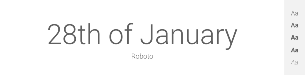
- Free or Paid: Free – Google Font
- How many styles: Total 12 styles = 6 classic upright & 6 matching italics (thin, light, regular, medium, bold & black).
- Usually used for: Android OS and Google services typography. Also often used in modern website and app designs.
Roboto is a sans-serif typeface developed by Google as the system font for its Android operating system. It was designed by Christian Robertson and officially released in 2011.
Roboto is characterized by a dual nature. It combines mechanical, geometric forms with friendly, open curves, which gives it a more natural reading rhythm. For instance, the straight-sided capitals and square-shaped characters like ‘o' suggest mechanical origins, while the open curves of letters like ‘b' and ‘p' add a more humanist touch.
Compared to Helvetica, Roboto has more geometric forms. Its characters have more uniform stroke widths, and its round characters (‘o', ‘b', ‘p', etc.) are based on perfect circles, which give Roboto a certain mechanical aesthetic. On the other hand, Helvetica tends to have more variation in its stroke widths, and its characters have a less geometric and more humanist appearance.
When it comes to usage, Roboto is widely used in the digital space, especially in Android-based systems. Meanwhile, Helvetica has a longer history, so you can basically see it everywhere as it is one of the number 1 typefaces in the world.
I think that both are great typefaces and if you wanna replace Helvetica, trying Roboto is a great option.
ARS Maquette
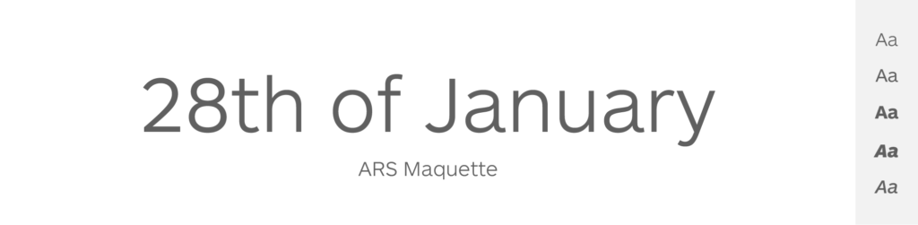
- Free or Paid: Paid – by Angus R. Shamal
- How many styles: Total 10 styles = 5 weights + all in matching italics (light, regular, medium, bold & black).
- Usually used for: Corporate identities and branding because of its balanced and neutral character. It's also commonly used in print and digital design.
ARS Maquette is a sans-serif typeface designed by Angus R. Shamal in 2001. It was intended to be a versatile typeface, with a clean and modern aesthetic. To be a neutral typeface that could be easily used in various design contexts, from body text to headlines.
Similar to Helvetica, ARS Maquette is characterized by its clarity, legibility, and simplicity. Both are neo-grotesque typefaces, drawing from the grotesque typefaces of the 19th and early 20th centuries.
But, while Helvetica leans towards a uniform stroke width, ARS Maquette has subtle contrasts in stroke width, which give it a slightly more humanist, warmer quality. Additionally, some of the characters in ARS Maquette have distinct features. For example, the tail of the ‘y' is curvy and the ‘g' is a single-storey, unlike the ‘y' and ‘g' in Helvetica.
I’d say that ARS Maquette and Helvetica are both great fonts and even tho they have some differences, they share a similar neo-grotesque style, emphasizing clarity and simplicity.
Open Sans
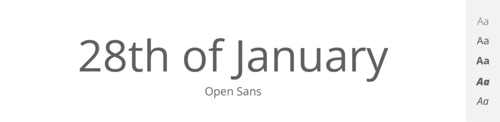
- Free or Paid: Free – Google Font
- How many styles: Total 12 styles = 6 upright & 6 italics (light, regular, medium, semibold, bold & extrabold).
- Usually used for: Web and mobile interfaces due to its legibility at small sizes. Also, it's a popular choice for print materials.
Here we have another sans-serif typeface: Open Sans. It was designed by Steve Matteson and commissioned by Google in 2011. When thinking of Open Sans, I usually feel like „this is the perfect font“. And it is not my favorite. It just feels so professional for some reason. But maybe that’s just my opinion.
Open Sans is characterized by an upright stress, open forms, and a neutral, yet friendly appearance. It has been optimized for print, web, and mobile interfaces, providing a consistent reading experience across various devices.
Comparing Open Sans to Helvetica, both are considered neutral and versatile. However, Open Sans leans towards a more humanist style, with wider, more open shapes, and a larger x-height which contributes to readability, especially in digital formats.
Helvetica, on the other hand, is often seen as the epitome of a neutral sans-serif with slightly less open forms and a more uniform stroke width. Its characters have a somewhat squarer, more condensed appearance than those of Open Sans.
And while both fonts are neutral and suitable for everything, Open Sans may be slightly more casual as it even is kind of optimized for on-screen reading, while Helvetica maintains a bit more corporate, print-oriented neutrality. So there you have it, great Helvetica Alternative, right?
Poppins
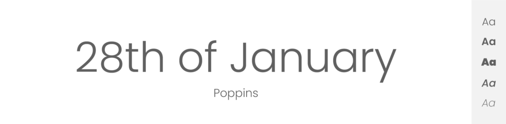
- Free or Paid: Free – Google Font
- How many styles: Total 18 styles = 9 upright weights & 9 italics weights (thin, extralight, light, regular, medium, semibold, bold, extrabold & black).
- Usually used for: Creative designs due to its geometric design and monolinear letterforms. It's also popular for children's media and advertising.
Poppins is a geometric sans-serif typeface designed by Indian Type Foundry and published by Google Fonts. It is characterized by its near-monolinear letterforms, which maintain the same line thickness throughout. Poppins is known for its modern and clean design, making it suitable for a range of applications.
The most defining feature of Poppins is its strict adherence to geometric shapes. The characters in Poppins, such as ‘O', are perfect circles, not ovals. Letters like ‘E' and ‘F' have square proportions, giving the font a very balanced and harmonious appearance.
Comparing Poppins to Helvetica, they are both sans-serif typefaces but they have different design approaches. Poppins is geometric, with perfect circles and uniform stroke width giving it a clean, modern, almost futuristic feel. On the other hand, Helvetica is more humanist in its design, with characters that are less strictly geometric, and slight variations in stroke width, which provide a more natural rhythm.
Both fonts are modern and widely used, and even though they have their differences (Poppins being a bit more geometric), Poppins still makes an excellent Helvetica alternative.
Lato

- Free or Paid: Free – Google Font
- How many styles: Total 10 styles = 5 upright & 5 italics weights (thin, light, regular, bold & black).
- Usually used for: Corporate designs and digital media due to its semi-rounded details and structure. It's a preferred choice for user interfaces and web design.
Another font I wanna show you is Lato – a sans-serif typeface family. This one comes from Warsaw, designed by Łukasz Dziedzic in 2010. The name “Lato” means “Summer” in Polish.
Comparing Lato to Helvetica, both are sans-serif typefaces, but they have distinct personalities. Lato is known for its semi-rounded details of the letters and diagonal ends, which can give a text a warmer, more friendly feel. It leans towards a humanist style, offering a slightly more casual and approachable aesthetic.
In contrast, Helvetica, with its near perfect vertical and horizontal strokes and tight apertures, conveys a more neutral and somewhat formal appearance. Helvetica has more uniform stroke widths and is generally seen as the epitome of Swiss precision and neutrality in type design.
Both of these are great fonts, but as its name suggest, Lato has a bit more “warm” feeling. Just like summer.
Quicksand
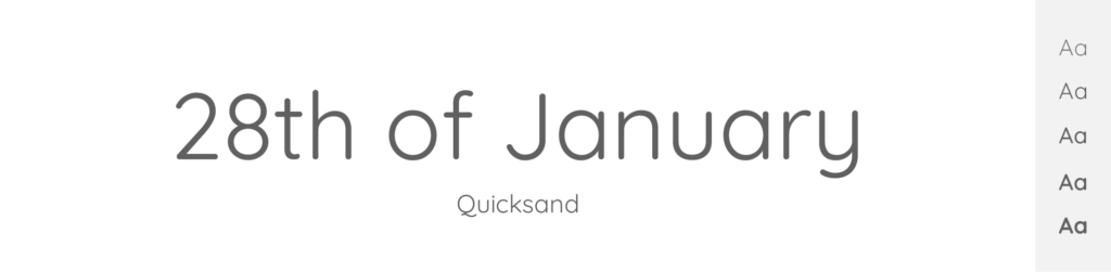
- Free or Paid: Free – Google Font
- How many styles: Total 5 styles = 5 weights – only upright & no italics (light, regular, medium, semibold & bold).
- Usually used for: Display and children's products due to its rounded, friendly letterforms. It's also often used in web design and digital media.
Quicksand is a sans-serif typeface with rounded geometric letterforms, designed by Andrew Paglinawan in 2008.
Its characters are designed with rounded strokes (unlike most of the other typefaces in this list), which gives it a friendly and approachable appearance. It's quite popular in design projects that aim to convey a casual, playful, or modern aesthetic.
When compared to Helvetica, both are sans-serif fonts, but their personalities diverge. The main difference is definitely Quicksand's rounded edges, as they make the font feel very different. But at the same time, the letters and style are kinda similar, that’s why I included Quicksands in this list anyway.
Quicksand is more stylized than Helvetica and might be a good choice for designs that require a less formal and more playful vibe. On the other hand, Helvetica, known for its neutral and versatile design, has less pronounced roundness and more uniform stroke widths.
While I like both fonts, Quicksand leans toward a more playful aesthetic, while Helvetica offers a neutral and universal look.
Slate
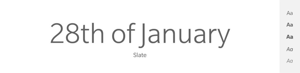
- Free or Paid: Paid – by Monotype
- How many styles: Total 24 styles = 8 upright weights & 8 matching italics (thin, extralight, light, book, regular, medium, bold & black) + it has condensed variations.
- Usually used for: Digital media and user interfaces due to its excellent screen legibility. It's also commonly used in print materials.
Slate is a sans-serif typeface designed by Rod McDonald around 2006. It was intended to be a highly legible typeface that could be used in a variety of applications, from print to screen.
One of the design goals of Slate was to create a typeface that was friendly and approachable, yet professional. To this end, Slate incorporates some design features of humanist typefaces, such as a greater variation in stroke width and more open shapes, which can make it feel warmer and more inviting than some neo-grotesque typefaces like Helvetica.
In terms of specific design details, Slate has a large x-height, which aids in legibility, especially at small sizes. Unlike Helvetica, which features straight terminals, Slate’s terminals are slightly curved. Slate includes a range of weights and styles, including small caps, old-style figures, and more, making it a flexible typeface suitable for a wide array of uses.
I think that compared to Helvetica, Slate provides a slightly warmer and more humanistic feel due to its design features. It is a modern, screen-friendly typeface that balances personality and professionalism. Definitely a great Helvetica alternative.
FF Bau
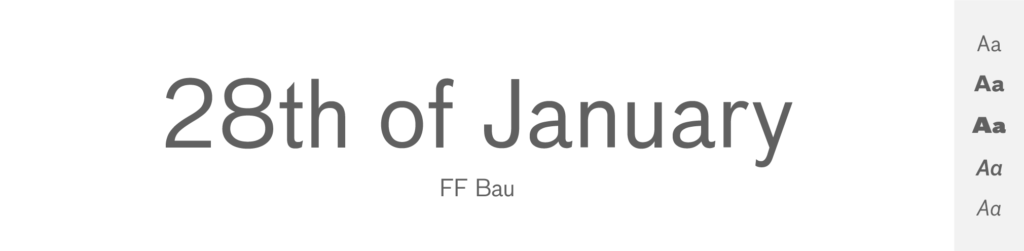
- Free or Paid: Paid – by FontFont
- How many styles: Total 8 styles = 4 upright weights & 4 italics (regular, medium, bold & super).
- Usually used for: Editorial and advertising design due to its geometric shapes and wide range of styles. It's also a popular choice for signage and branding.
FF Bau is another sans-serif typeface which was designed by Christian Schwartz, released in 2002.
In terms of similarity to Helvetica, FF Bau shares its clean, minimalist aesthetic and high legibility. However, it is distinguished by its more geometric design, which includes features like a perfect round ‘O' and more squared-off curves. FF Bau also has a double-storey ‘g,' unlike Helvetica's single-storey ‘g'.
I think that FF Bau is a distinctive typeface with its own character, but its geometric simplicity and lack of ornate features make it somewhat comparable to Helvetica in terms of its overall aesthetic.
Raleway

- Free or Paid: Free – Google Font
- How many styles: Total 18 styles = 9 upright & 9 italics (thin, extralight, light, regular, medium, semibold, bold, extrabold & black).
- Usually used for: Elegant and stylish headings. It is also popular for use in website body text.
I’ll finish my list with my all-time favorite typeface: Raleway. It is an elegant sans-serif family initially designed by Matt McInerney and later expanded by Pablo Impallari and Rodrigo Fuenzalida around 2010. The design is influenced by the geometric-style sans-serif faces that were popular during the 1920s and 1930s.
Raleway is characterized by its simple yet sophisticated style and a neat, professional appearance. It's notable for its unique ‘w' and ‘v' characters which have non-traditional, off-center apexes.
When comparing Raleway and Helvetica, both are sans-serif, but they have different design philosophies. Raleway leans towards a more geometric aesthetic and has some distinct design elements (like the ‘w' and ‘v'). In contrast, Helvetica is again celebrated for its neutrality and simplicity.
So if you’re looking for something not completely the same as Helvetica in a look, but similar powerful-feeling typeface, I’d definitely go with Raleway. It is, after all, also font of this very website, the Goofy Designer.
Is Helvetica free or paid?
Helvetica is a paid font.
To use it, especially in commercial projects, you need to purchase a license from a licensed distributor which in the Helvetica’s case, company called Monotype – they own the rights to Helvetica.
How many styles does Helvetica have?
Original Helvetica has a total of 16 styles. That means 8 classic weights + all in matching italics (ultrathin, thin, extralight, light, roman, medium, bold & black).
What is Helvetica mostly used for?
Oh – everything. Helvetica has such a broad variety of use it’s ridiculous. No wonder, it is one of the top 10 most famous and used fonts. Some of the most common uses include:
- Corporate Identity: Many companies use Helvetica in their logos and branding because of its clean and professional look.
- Signage: Helvetica is often used in public signage, like in transportation systems (including New York City's subway system) and road signs, because it's easy to read at a distance.
- Print and Digital Media: Its high legibility makes it a popular choice for both print (books, newspapers, etc.) and digital media (websites, apps, etc.).
- Advertising: Its simplicity and neutrality make it a common choice for advertisements.
- Government Documents: Because of its high readability and neutrality, Helvetica is often used in official documents or forms by various governments.
- Any Graphic design: from packaging, branding, print and many more.
- Typography in Film and TV: Helvetica is often used in film and TV for on-screen text because it's so easy to read. It has even been used in movie titles and promotional materials.
- Software UI Design: Due to its clarity and simplicity, Helvetica is frequently used for user interfaces in software applications.
A bit of history about Helvetica
Helvetica is a font that was made back in 1957 in Switzerland by two guys named Max Miedinger and Eduard Hoffmann. They wanted to create a new font that was very clear, simple and easy to read.
The name “Helvetica” actually comes from “Helvetia”, which is the Latin name for Switzerland, but they decided to call it Helvetica because it sounded more universal.
Since it was created, Helvetica has become super popular around the world because of its clean and neutral style. It's been used for all kinds of things, like company logos, signs, and even the letters on your computer keyboard!
Conclusion
I think we can all agree on the fact that Helvetica is a masterpiece, that will always be written in the history of typography. But lately – and I mean years – it has become over popular and kinda mainstream. So I completely understand that you’re looking for an alternative, because in design, we always want to be original, and with Helvetica we are more of an “another Helvetica website” or “another Helvetica logo”.
So be creative, be original and if you’re looking for a new sans-serif font similar to Helvetica, try using Inter, Raleway, Proxima Nova, Montserrat, or any other of the beauties in this list.