Summary: In this article, I created a list of amazing alternatives to Montserrat. My absolute winners are these 4:
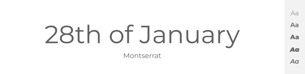
Montserrat is amazing font. In fact, it has been my favorite for years – I’ve built logos, posters, and even websites with this masterpiece. But, it seems that these magical sans-serif round and long letters have lately become more and more popular and it is becoming a little bit mainstream.
And what do most designers do in this situation? Look for other alternatives. Because our clients want something original. And we don’t want our designs to be just another copy of someone else's work.
That is why I made this list of 21 fonts, that are in my opinion similar to Montserrat and perfectly serve as it’s alternative or font replacement. I‘m sure that in this list, you can choose typeface you like, and maintain originality but still keep it simple and modern – just like our favorite Montserrat.
TOP 21 fonts similar to Montserrat
- Gotham (Paid – Hoefler&Co.)
- Work Sans (Free – Google Fonts)
- Poppins (Free – Google Fonts)
- Raleway (Free – Google Fonts)
- Roboto (Free – Google Fonts)
- Proxima Nova (Paid – Mark Simonson Studio)
- Helvetica (Paid – Linotype)
- Open Sans (Free – Google Fonts)
- Lato (Free – Google Fonts)
- Fira Sans (Free – Google Fonts)
- Alegreya Sans (Free – Google Fonts)
- PT Sans (Free – Google Fonts)
- Exo (Free – Google Fonts)
- Source Sans (Free – Google Fonts)
- Futura (Paid – Linotype)
- Avenir (Paid – Linotype)
- Maven Pro (Free – Google Fonts)
- Gill Sans (Paid – Monotype)
- Akzidenz Grotesk (Paid – Berthold Types Ltd)
- Quicksand (Free – Google Fonts)
- Univers (Paid – Linotype)
Gotham
- Free or Paid: Paid – Hoefler & Co
- How many styles: Total 66 styles = But there are 16 “classic” Gotham fonts – 8 upright and 8 italics (thin, extralight, light, book, medium, bold, black & ultra). Then there are 50 more styles of this font – like Narrow, Extra Narrow or Condensed, and all of these come in different weights and both italics and upright.
- Usually used for: Corporate identities and logos. It's often used in graphic designs and architectural presentations.
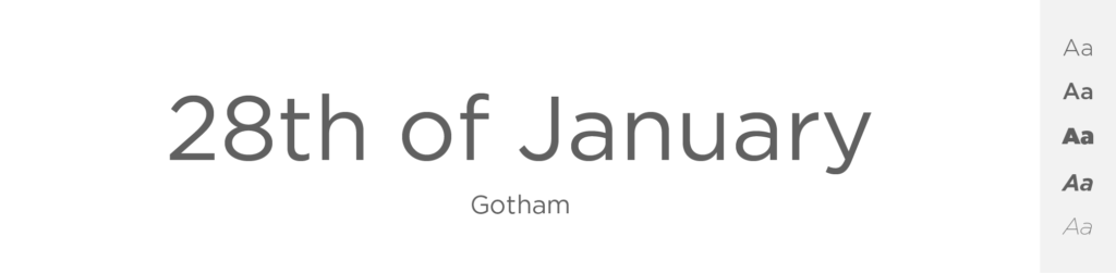
Let’s start with font that is incredibly similar to Montserrat that it can honestly be it’s twin.
Gotham, a beautiful and popular geometric sans-serif typeface, was designed by Tobias Frere-Jones in 2000. Its design draws heavily from the architectural signage seen around New York City, offering a distinctly American aura.
Much like Montserrat, Gotham adheres to geometric principles, with characters built around simple geometric shapes.
Both Gotham and Montserrat possess broad, open letters with generous counterspaces, enhancing legibility at varying sizes and distances.
Additionally, Gotham has a consistent stroke width across all its characters, similar to Montserrat.
I think they may have some small design distinctions, but both Gotham and Montserrat carry a clean, modern aesthetic and they are in base very, very similar. That alone makes Gotham a great typeface for similar purposes as Montserrat.
Work Sans
- Free or Paid: Free – Google Font
- How many styles: Total 18 styles = 9 classic upright & 9 italics weights (thin, extralight, light, regular, medium, semibold, bold, extrabold & black).
- Usually used for: Text in digital interfaces and lower-resolution displays. It is frequently used for creating clean and minimalist designs.
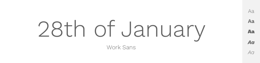
We will continue with this free and beautiful typeface called Work Sans. If you look at the picture, you’ll probably agree with me, that it resembles of Montserrat in many ways. Some letter shapes differ, especially in heavier weights, so that might make an overall difference in a big pile of text. But overall shapes of each letter are very similar to Montserrat, especially in its thinner forms.
Designed by Wei Huang with an emphasis on being optimized for screens & drawing inspiration from early grotesques, Work Sans manages to balance a certain level of neutrality with friendly, approachable undertones.
Both fonts share a propensity for open, clear letterforms, contributing to their readability and functionality at various sizes. Work Sans' stroke width is more uniform, whereas Montserrat allows for subtle contrasts in thickness.
They both bring certain elegance and modernity to their designs, so if you want to try a new and clean font similar to Montserrat yet unique in some way, try using Work Sans.
Poppins
- Free or Paid: Free – Google Font
- How many styles: Total 18 styles = 9 upright weights & 9 italics weights (thin, extralight, light, regular, medium, semibold, bold, extrabold & black).
- Usually used for: Creative designs due to its geometric design and monolinear letterforms. It's also popular for children's media and advertising.
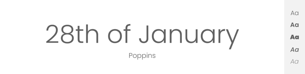
Poppins, a geometric sans-serif typeface designed by Indian Type Foundry, is primarily used for display purposes. Its letterforms are governed by geometry, similar to Montserrat.
One of the striking features of Poppins is its near perfect circles and squares, which give it a unique character when compared to other geometric fonts.
Montserrat, on the other hand, while being a geometric sans-serif, exhibits more variation in its letterforms, showing a slight influence of traditional typefaces. However, both share a similar spirit of modernism, simplicity, and functionality. Despite these similarities, each typeface brings its unique flavor to the table. Poppins, with its almost monolinear stroke thickness, offers a distinct contrast to Montserrat's varying stroke thickness, which adds depth and character to the overall typography.
But if you’re looking for a Montserrat alternative, I think you should give Poppins a try.
Raleway

- Free or Paid: Free – Google Font
- How many styles: Total 18 styles = 9 upright & 9 italics (thin, extralight, light, regular, medium, semibold, bold, extrabold & black).
- Usually used for: Elegant and stylish headings. It is also popular for use in website body text.
Raleway is one of my favorite fonts. I personally use it quite a lot, because it just fits anywhere.
Some history: Raleway is originally a single-weight display font designed by Matt McInerney, and was later expanded into a full nine-weight family by Pablo Impallari and Rodrigo Fuenzalida.
It brings an air of elegance and sophistication that differs from Montserrat's more straightforward, utilitarian style. Raleway's letterforms are slender, similar to Montserrat's regular weight, but Raleway's capitals are significantly more extended, which gives the font a more stylized look. While Montserrat is known for its unique double-story ‘g', Raleway features a single-story ‘g' with a distinctive curled ear. Raleway's ‘Q' also sets it apart with its crossed tail, while Montserrat's ‘Q' tail is short and curled. However, both fonts have wide apertures and large x-heights, making them readable and flexible in various design contexts.
Raleway, like Montserrat, has a substantial range of weights, which makes it an adaptable typeface and in my opinion great Montserrat alternative.
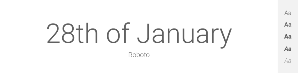
Roboto
- Free or Paid: Free – Google Font
- How many styles: Total 12 styles = 6 classic upright & 6 matching italics (thin, light, regular, medium, bold & black).
- Usually used for: Android OS and Google services typography. Also often used in modern website and app designs.
Designed by Christian Robertson for Google, Roboto is a typeface that combines mechanical structure and geometric form with more open, natural curves. This balance is similar to Montserrat's blend of geometric shapes and humanistic letterforms.
Roboto uses geometric construction as its core but tends to implement a softer and more open curve than Montserrat, making it appear a little more informal. This is apparent in letters like ‘R', where Roboto's leg curves outward more than Montserrat's, and ‘B', where Montserrat's vertical stem is perfectly straight, while Roboto's has a subtle curve. Another critical difference is in their ‘a' and ‘g' characters: Roboto opts for a single-story ‘a' and a double-story ‘g', the opposite of Montserrat's choices.
Despite these differences, Roboto maintains a modern, friendly quality and it also offers a comprehensive range of weights, from Thin to Black, matching Montserrat's breadth of styles. All of these characteristics align with Montserrat's overall feel and therefore I think it’s really a great Montserrat alternative.
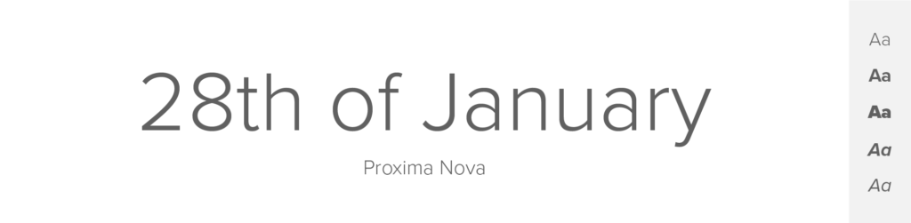
Proxima Nova
- Free or Paid: Paid – by Adobe
- How many styles: Total 80 styles = But there are 16 “classic” Proxima Nova fonts – 8 upright and 8 italics (thin, light, regular, medium, semibold, bold, extrabold & black). Then it has more styles – like condensed, extra condensed, wide and extra wide + all of these come in different weights & both italics and upright.
- Usually used for: Web design and digital applications because of its balance between modern proportions and geometric appearance. It's also often used in graphic design and signage.
Ah, how I love Proxima Nova. It is clean, modern, readable and simply amazing. On the other hand it’s also paid.
Designed by Mark Simonson, this magical typeface combines the geometric style of modern sans-serifs with the proportions and spacing of old-style grotesques. Its letterforms are similar to Montserrat in terms of x-height and letter-spacing, which results in a similar level of readability. It mirrors Montserrat's balance of classic proportions and modern, minimalist sensibilities.
One difference between the two is the single-story ‘a' in Proxima Nova, compared to the double-story ‘a' in Montserrat. Proxima Nova's ‘M' is also narrower with a lower vertex, while Montserrat's ‘M' is wider with a high vertex. Despite these differences, both typefaces have a clean, modern aesthetic and a large family of weights and widths. Proxima Nova's comprehensive set of styles and weights makes it a valuable asset for designers, much like Montserrat.
It feels really good comparing these 2, as both are my very favorite typefaces. I definitely think that Proxima Nova makes a great Montserrat alternative.
Helvetica

- Free or Paid: Paid – by Max Miedinger
- How many styles: More than 50 = But there are 8 “classic” Helvetica fonts – 4 upright + matching italics (light, roman, bold & black). And it has more styles – like condensed, compressed, narrow, rounded and more + all of these come in different weights & both italics and upright.
- Usually used for: A wide variety of applications from branding to signage due to its neutral and clean design. It's also one of the most popular fonts in both print and digital media.
I mean – what designer doesn’t know Helvetica? It is for sure one of the most famous fonts ever. The only ones more known might be Arial, Comic Sans or Times new Roman. And I personally adore Helvetica with its clean and practically perfect shapes.
Helvetica goes way back – it was designed by Swiss typeface designer Max Miedinger in 1957 and originally was called “Neue Haas Grotesk”. Its clean, crisp edges, uniform stroke widths, and excellent legibility make it an all-purpose typeface that is utilized in countless design contexts. It's popular for its universal appeal, exuding a sense of neutrality and straightforwardness.
When compared to Montserrat, both fonts fall under the sans-serif family, but there are distinct differences that set them apart. The key distinction lies in Helvetica's more traditional, neutral design, compared to Montserrat's wider, open letterforms that echo a certain warmth and uniqueness, inherited from the urban signage of Buenos Aires.
Despite Helvetica being a more neutral font and Montserrat leaning towards a distinct, classic aesthetic, they share a level of similarity in their clean, geometric design. That's why I think that Helvetica is an excellent alternative to Montserrat.
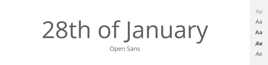
Open Sans
- Free or Paid: Free – Google Font
- How many styles: Total 12 styles = 6 upright & 6 italics (light, regular, medium, semibold, bold & extrabold).
- Usually used for: Web and mobile interfaces due to its legibility at small sizes. Also, it's a popular choice for print materials.
When it comes to Google fonts, I feel like Open Sans is one of „the classics“.
It’s a humanist sans-serif typeface designed by Steve Matteson. As such, it draws from human handwriting, creating a friendly and open character similar to Montserrat's approachable design. Both Open Sans and Montserrat share a tall x-height, which enhances their legibility, especially in small sizes.
When compared to Montserrat, Open Sans carries a cleaner, more uniform feel with letterforms that are more consistently shaped and less stylized. This is particularly noticeable in the ‘g' – Montserrat presents a unique double-story form while Open Sans utilizes a simpler, single-story design. Montserrat's geometric influence is clear in its tightly-crafted shapes and corners, while Open Sans's forms are a touch more relaxed and rounded. In terms of weights and styles, both Open Sans and Montserrat have a wide variety to choose from, further increasing their versatility. Their ample letter spacing also enhances readability, especially in paragraphs or lengthy text.
Lato

- Free or Paid: Free – Google Font
- How many styles: Total 10 styles = 5 upright & 5 italics weights (thin, light, regular, bold & black).
- Usually used for: Corporate designs and digital media due to its semi-rounded details and structure. It's a preferred choice for user interfaces and web design.
Lato, a Polish, semi-rounded sans-serif designed by Łukasz Dziedzic, shares some of Montserrat's friendly, approachable characteristics.
The name “Lato” is Polish for “Summer,” which suits its warm, inviting personality. It blends geometric shapes with humanist elements much like Montserrat, creating efficient and clear letterforms. The similar geometric influence is apparent in letters like ‘M' and ‘N', where both fonts utilize straight, diagonal strokes.
However, there are some key differences: Montserrat's ‘t' is straight at the bottom, while Lato's curves up, and Lato's ‘y' descends straight down, while Montserrat's veers to the right. Lato's terminals are semi-rounded, imparting a sense of warmth, while Montserrat's terminals are more straight-cut, giving it a slightly more formal feel. Despite their differences, both typefaces maintain a sense of friendliness and clarity, and like Montserrat, Lato also offers a variety of weights.
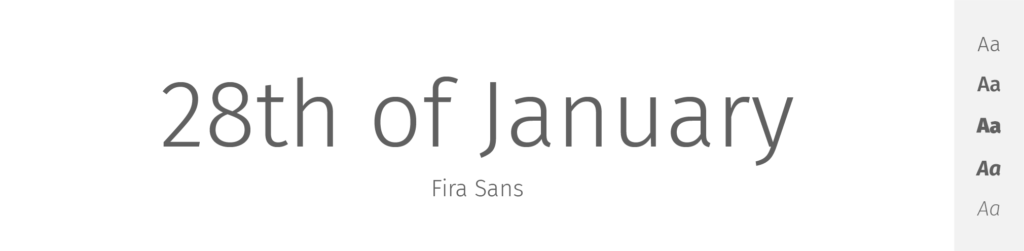
Fira Sans
- Free or Paid: Free – Google Font
- How many styles: Total 18 styles = 9 upright & 9 italics weights (thin, extralight, light, regular, medium, semibold, bold, extrabold & black).
- Usually used for: Small screen readability as it was initially designed for Mozilla’s Firefox OS. It's a popular choice for web design and applications.
Fira Sans is a sans-serif typeface designed by Erik Spiekermann for the Firefox OS. The typeface reflects a balance of geometric precision and organic fluidity, much like Montserrat.
With its variety of weights and styles, it matches Montserrat's versatility. The letterforms are slightly wider than Montserrat's, giving the typeface a more expansive feel. However, some of Fira Sans' character designs, such as the single-story ‘a' and the ‘g' with a curled ear, contrast with Montserrat's more geometric characters.
Despite these differences, Fira Sans maintains friendly and open quality, which is similar to Montserrat.
Alegreya Sans
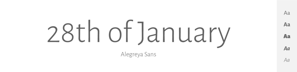
- Free or Paid: Free – Google Font
- How many styles: Total 14 styles = 7 weights + matching italics (thin, light, regular, medium, bold, extrabold & black).
- Usually used for: Long texts and reading interfaces due to its dynamic and fluid design. It's also commonly used in book design and editorial work.
Alegreya Sans, designed by Juan Pablo del Peral, is a humanist sans-serif typeface with a calligraphic touch, which sets it apart from Montserrat's geometric approach.
This typeface is characterized by its dynamic rhythm and open forms, providing a warm reading experience. It contrasts Montserrat with its more natural, fluid shapes, which are inspired by calligraphy and old-style typefaces. Both typefaces, however, share an emphasis on legibility and versatility, and their extensive range of weights allows them to adapt to a variety of design contexts.
I think that despite some of these differences, Alegreya Sans and Montserrat serve a similar purpose of delivering clear and legible text. That makes Alegreya Sans a great option when trying to replace Montserrat.
PT Sans
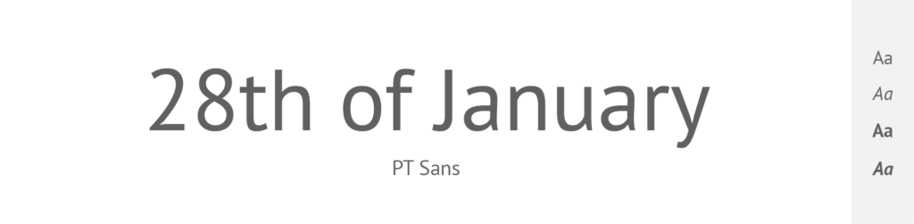
- Free or Paid: Free – Google Font
- How many styles: Only 4 styles = regular & regular italics + bold & bold italics.
- Usually used for: Interfaces, informative texts, and signage due to its clarity and openness. It's also seen in academic and government documents.
PT Sans is a part of the larger PT Fonts collection from the Russian Type Foundry ParaType.
This humanist sans-serif typeface was designed for the Public Types of Russian Federation project. It is influenced by Russian sans serif types of the second part of the 20th century but also has distinctive features of contemporary humanistic designs.
Compared to Montserrat, PT Sans has more variation in stroke width and more traditional proportions and shapes, whereas Montserrat adheres strictly to its geometric principles. PT Sans' ‘a' and ‘g' are two-story, contrasting with Montserrat's single-story designs. However, both PT Sans and Montserrat offer excellent readability and a broad variety of weights, making them highly versatile for various applications.
Exo
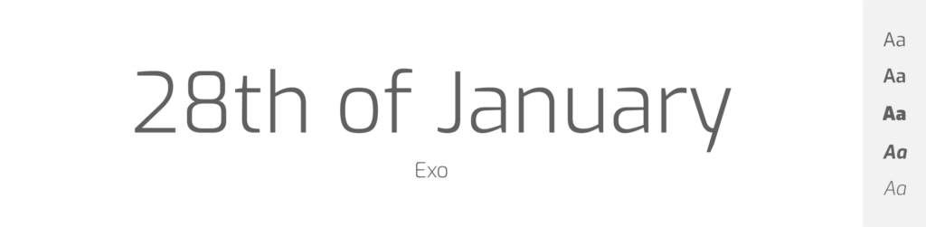
- Free or Paid: Free – Google Font
- How many styles: Total 18 styles = 9 upright weights & 9 italics (thin, extralight, light, regular, medium, semibold, bold, extrabold & black).
- Usually used for: Sci-fi and technology-related design themes because of its futuristic look. It's also commonly found in digital media and video games.
Exo is a contemporary geometric sans serif font designed by Natanael Gama. A unique feature of Exo is its futuristic look, which is characterized by a sleek, clean design with a variety of unique letterforms. It's a font that pushes the envelope with an experimental approach to traditional geometric designs.
However, like Montserrat, Exo takes inspiration from geometric shapes, particularly circular forms, evident in letters such as ‘o' and ‘b'. Despite this shared grounding in geometry, Exo tends to have sharper, more angular forms compared to Montserrat’s soft, rounded corners. Moreover, while both fonts maintain similar proportions across their character sets, Exo’s design introduces more variation in stroke width, giving it a dynamic aesthetic that Montserrat, with its even stroke width, doesn't have.
Regardless of these differences, both Exo and Montserrat are versatile fonts due to their extensive range of weights and styles. Their clean, modern aesthetics also make them perfect for a variety of uses, from headlines to body text, in both digital and print formats and therefore I think that you should try giving Exo a chance when you’re looking for an alternative to Montserrat.
Source Sans
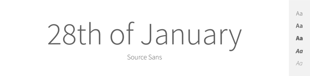
- Free or Paid: Free – Google Font
- How many styles: Total 16 styles = 8 upright weights & 8 italics (extralight, light, regular, medium, semibold, bold, extrabold & black).
- Usually used for: User interfaces and code editing environments as it was Adobe’s first open-source font. It's also widely used in web design and digital media.
Source Sans Pro is a sans serif typeface created by Paul D. Hunt for Adobe. It's Adobe's first open-source font and is designed primarily for user interface (UI) environments.
Source Sans Pro, like Montserrat, possesses a clean, modern aesthetic, but it leans more towards the humanist genre of typefaces, compared to Montserrat's geometric nature. Source Sans Pro features a larger x-height, which improves legibility at smaller sizes, a characteristic shared with Montserrat. The most noticeable differences can be found in individual letterforms. For instance, Source Sans Pro's ‘a' and ‘g' are double-storey, in contrast to Montserrat’s single-storey ‘a' and ‘g'. Additionally, Source Sans Pro's stroke width is more consistent, while Montserrat displays slight variations in thickness. Even with these variances, both fonts are valued for their clarity, simplicity, and versatility, making them a go-to choice for a broad array of design contexts.
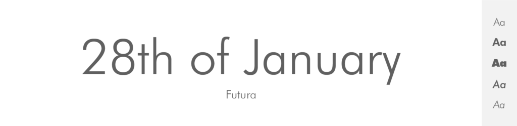
Futura
- Free or Paid: Paid – by Linotype
- How many styles: Total 22 styles = It has 12 primary fonts – 6 weights + matching obliques (light, book, medium, heavy, bold, extrabold). Then it has some condensed styles – both upright and oblique. And 2 extra fonts – Futura Black and Futura Display.
- Usually used for: Logos and branding because of its clean, geometric shapes. It's also seen in posters and advertising.
Futura is a classic geometric sans serif typeface designed by Paul Renner in the 1920s, so yes, it’s really old.
It was built on the foundation of geometric shapes, and it has influenced many subsequent designs – including Montserrat. The fundamental principle behind both Futura and Montserrat is the same: they both rely heavily on perfect circles, triangles, and squares in their construction.
They have much in common, such as the perfectly round ‘O' and single-storey ‘a' and ‘g'. However, Futura's design tends to be more rigidly geometric, with its perfectly circular ‘o' and ‘O' and sharp, angular terminals, compared to Montserrat's slightly more organic forms and rounded terminals. While Montserrat provides a subtle deviation from strict geometric rules, resulting in softer, more humanist forms, Futura remains true to its geometric roots, presenting a more mechanical and less organic aesthetic.
I think of Futura almost as an art, not a font, because it really is a classic. And despite some differences, it makes an excellent Montserrat alternative – after all Montserrat is even a bit inspired in Futura.
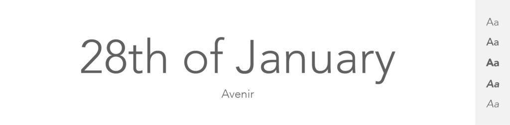
Avenir
- Free or Paid: Paid – by Linotype
- How many styles: Total 12 styles = 6 upright + 6 matching oblique (light, book, roman, medium, heavy & black).
- Usually used for: High-end print and digital designs for its sleek and sophisticated style. It is also commonly used in branding and corporate identities.
Avenir, designed by Adrian Frutiger in 1988, is a geometric sans-serif typeface that beautifully blends organic, humanist elements with stricter geometry, making it a great balance between the rigidity of Futura and the warmth of Frutiger's eponymous typeface.
Compared to Montserrat, Avenir is characterized by a more humanist design with more variation in stroke width and a distinct vertical stress in rounded glyphs. However, like Montserrat, Avenir exhibits clear and simple letterforms that are easy to read at both large and small sizes. One notable distinction can be seen in the lowercase ‘a' and ‘g'. Montserrat uses a single-story ‘a' and ‘g', while Avenir uses a double-story design. Yet both typefaces provide a sense of modern simplicity and functionality, allowing them to adapt to a broad range of uses in design.
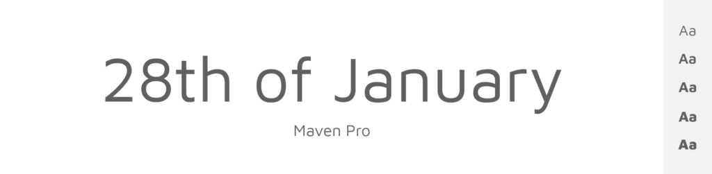
Maven Pro
- Free or Paid: Free – Google Font
- How many styles: Total 6 styles = 6 weights – only upright & no italics (regular, medium, bold, extrabold & black).
- Usually used for: Digital displays and web design because of its unique curvature and character. It's also often used in corporate branding and advertising.
Maven Pro, designed by Joe Prince, is an original sans-serif typeface with unique curves and a modern, sleek structure.
While it incorporates geometric characteristics, it also shows an influence from humanist-style typefaces. Compared to Montserrat, Maven Pro's characters seem slightly elongated, with the ‘O' and ‘o' appearing more oval than circular.
Like Montserrat, Maven Pro has open and clear letterforms, which makes it highly legible at various sizes. Its terminals tend to be more angled, providing a different aesthetic to Montserrat's more rounded terminals. In terms of individual letters, Maven Pro's ‘g' is a single-story form, aligning with Montserrat's ‘g'.
Maven Pro and Montserrat have both clean and modern aesthetic and therefore I think that Maven Pro makes a great Montserrat alternative.
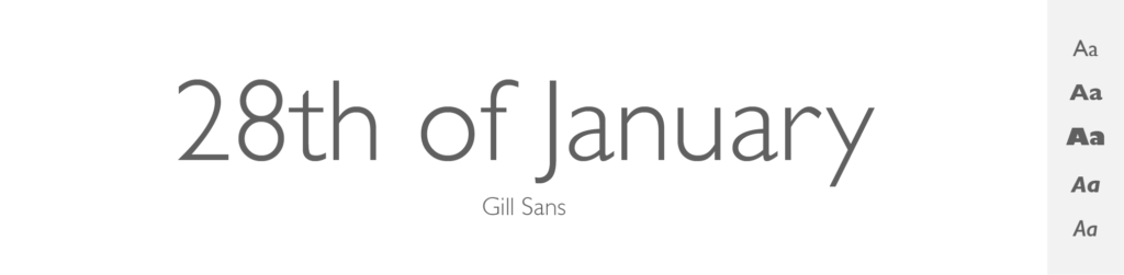
Gill Sans
- Free or Paid: Paid
- How many styles: Total 15 styles = 6 “classic” fonts – 3 upright & matching italics (light, medium & bold). Then it has some fancy and original fonts: like extrabold, ultrabold, condensed, shadowed – and these also come in variations.
- Usually used for: Signage, branding, and print media due to its distinct and classic design. It's also often seen in corporate communication and digital media.
Gill Sans, created by Eric Gill in the mid-1920s, is a humanist sans-serif typeface. Its design was influenced by the underground railway signs in London.
Gill Sans, as a humanist font, brings a warmer, more calligraphic sensibility, quite distinct from Montserrat's geometric orientation. This is evident in its more traditional proportions, less uniform stroke width, and more organic, calligraphic forms. Yet, both Gill Sans and Montserrat carry a modern feel, even though they originate from different typographic philosophies.
Both fonts emphasize clarity and versatility, making them a popular choice for a wide array of applications, including both print and digital media.
Akzidenz Grotesk
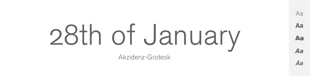
- Free or Paid: Paid – by Berthold
- How many styles: Total 30 styles = But there are 12 primary variants – 6 “classic” upright weights + matching italics (light, regular, medium, bold, extrabold & super). Then it has also different weights of condensed and extended variations in both upright & italics.
- Usually used for: Print and commercial media due to its influential design in the history of typography. It's also seen in corporate branding and signage.
I don’t know if you know this, but Akzidenz Grotesk is like a great-grandpa of all the sans-serif fonts we use today. It was once even a strong competitor to the infamous Helvetica – in fact, Helvetica was released in order to compete with this old and strong Swiss typeface.
A quintessential grotesque typeface, Akzidenz Grotesk was released by the Berthold Type Foundry back in 1896. That is really long time ago! And it is widely recognized as one of the precursors to all the modern sans-serif typefaces we use today.
Compared to Montserrat, Akzidenz Grotesk leans more towards traditional grotesque aesthetics, exhibiting more variability in stroke width and slightly tighter letter-spacing. Although both fonts share a clean, modern aesthetic, Montserrat tends to have a warmer, more geometric and humanist touch. The letterforms in Akzidenz Grotesk tend to be more neutral and less stylized than those in Montserrat.
However, the modern design and excellent readability at various sizes make Akzidenz Grotesk an effective choice for replacing Montserrat, as you can use this grandpa anywhere you wish (headlines, body, print).
Quicksand
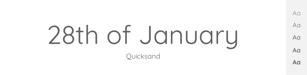
- Free or Paid: Free – Google Font
- How many styles: Total 5 styles = 5 weights – only upright & no italics (light, regular, medium, semibold & bold).
- Usually used for: Display and children's products due to its rounded, friendly letterforms. It's also often used in web design and digital media.
Quicksand, designed by Andrew Paglinawan in 2008, is a display sans-serif typeface with rounded terminals. Its design, based on geometric shapes, is imbued with a sense of friendliness due to its rounded form.
Like Montserrat, Quicksand uses geometric principles, but the resemblance ends there. Quicksand's letterforms are almost uniformly rounded, providing a softer aesthetic compared to Montserrat's more standard, slightly sharper form. It also has noticeably wider letter-spacing, enhancing its light, airy feel.
While Quicksand and Montserrat both have open, clear letterforms that ensure good readability, Quicksand is primarily designed for display purposes and may not be as versatile as Montserrat for long-form text or small sizes. But if you’re for example designing logo, or shorter text, I suggest you look into Quicksand – it may surprise you with its welcoming feel.
Univers
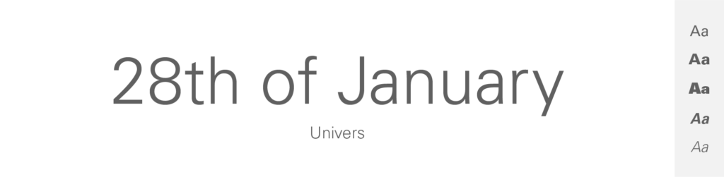
- Free or Paid: Paid – by Linotype
- How many styles: Total 27 styles = But is has 10 primary variants – 5 upright + matching italics (light, roman, bold, black & extrablack). It also has condensed and extended versions in many weights & both upright and italics.
- Usually used for: Corporate communication and advertising because of its comprehensive font family and clear legibility. It's also popular in digital design and typography.
Univers, designed by Adrian Frutiger in 1957, is a neo-grotesque sans-serif typeface that was one of the first to be launched with a wide range of weights and widths.
Compared to Montserrat, Univers has a more consistent stroke width and a more neutral design, making it a truly versatile typeface that can adapt to almost any situation.
The letterforms in Univers show minimal influence from geometric shapes, instead opting for more organic, traditional forms.
In comparison, Montserrat's design is noticeably influenced by geometric shapes, seen in its round ‘O' and ‘o'. Nevertheless, both typefaces provide excellent legibility and flexibility, making them popular choices in the realms of graphic and typographic design.
I think that both Univers and Montserrat are well-suited to all kinds of use, thanks to their clear, simple forms and wide range of weights.
Is Montserrat font free or paid?
Montserrat is a free font.
It was designed by Julieta Ulanovsky and is available on Google Fonts, which means you can use it for free, even for commercial purposes.
How many styles does Montserrat have?
Montserrat has a total 18 styles:
There are 9 classic upright weights + matching 9 italics (thin, extralight, light, regular, medium, semibold, bold, extrabold & black).
What is Montserrat mostly used for?
As I already told you, Montserrat is incredibly popular & people use it daily for many and many design purposes. it fits basically anywhere. Amongst the most common usages are:
- Websites: Montserrat's clean and modern look makes it a favorite for web design – both headings and body text.
- Apps: Its high readability on digital screens makes it a good choice for user interfaces in apps.
- Logos & Branding: Some companies choose Montserrat for their logos or branding materials because of its versatile and contemporary appeal.
- Print Media: It's also used in print media like flyers, posters, and brochures because it's easy to read and works well in different sizes and weights.
A bit of history about Montserrat.
Montserrat is a font that was made by a designer named Julieta Ulanovsky. She lives in a neighborhood in Buenos Aires, Argentina, also named Montserrat. She loved the old signs and posters in her neighborhood, which had a special kind of lettering.
As modern times rolled in, those old-style letters began to disappear. To keep the spirit of her neighborhood alive, Julieta decided to design a font that was inspired by those old letters. And that's how the Montserrat font was born! What a beautiful story.
Today, this font is loved by many people around the world for its modern yet classic vibe. And the best part? It's free for everyone to use! No wonder it’s one of my favorites, right?
Conclusion
And that’s all I have prepared for you today. Keep in mind, that there are thousands of fonts out there and many of them might suit as a Montserrat alternative. It only depends on what you’re designing.
My top pick in similarity are Gotham or Work Sans.
If you’re going for a website design, and need people to be able to read a big pile of text, try sticking to something easy-to-read – like Raleway, Helvetica, or Proxima Nova.
And if you’re designing a logo, banner, or some shorter typo design, then feel free to explore your creativity. You can even use something completely different than the infamous, popular and chubby Montserrat.