Summary: In this article I’ll show you 25 incredible & modern alternatives to Proxima Nova. To make it even easier, here are my top picks:
- Work Sans – very close resemblence and feel
- Metropolis – visually incredibly similar
- Montserrat – a bit wider, but is very clean and modern
- Raleway – it’s characters differ a bit, but it serves similar purposes
That’s not all! In this article I came up with a total of 25 typefaces that are similar to Proxima Nova. I suggest you take your time and compare each letter, so you pick the best one.
As for Proxima Nova, I have to tell you – it is one of my favorites. In my eyes, Proxima Nova is like a role model of typefaces. But good new is that some unique fonts can still keep up, or even overtake – that’s when this list comes in a place. Just choose your pick.
TOP 25 fonts similar to Proxima Nova
- Work Sans – Free
- Metropolis – Free
- Montserrat – Free
- Raleway – Free
- Gotham – Paid
- Roboto – Free
- Museo Sans – Paid
- Fira Sans – Free
- Avenir – Paid
- Muli – Free
- Poppins – Free
- Geomanist – Free for personal use, Paid for commercial
- Nunito – Free
- Open Sans – Free
- Futura – Paid
- Gilroy – Paid
- Lato – Free
- Hind – Free
- Exo – Free
- Public Sans – Free
- Nexa – Paid
- Cabin – Free
- Questrial – Free
- PT Sans – Free
- Source Sans – Free
Work Sans
- Free or Paid: Free – Google Font
- How many styles: Total 18 styles = 9 classic upright & 9 italics weights (thin, extralight, light, regular, medium, semibold, bold, extrabold & black).
- Usually used for: Text in digital interfaces and lower-resolution displays. It is frequently used for creating clean and minimalist designs.
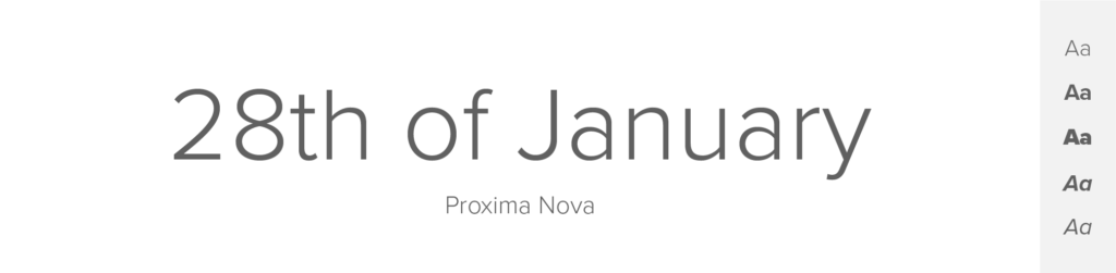
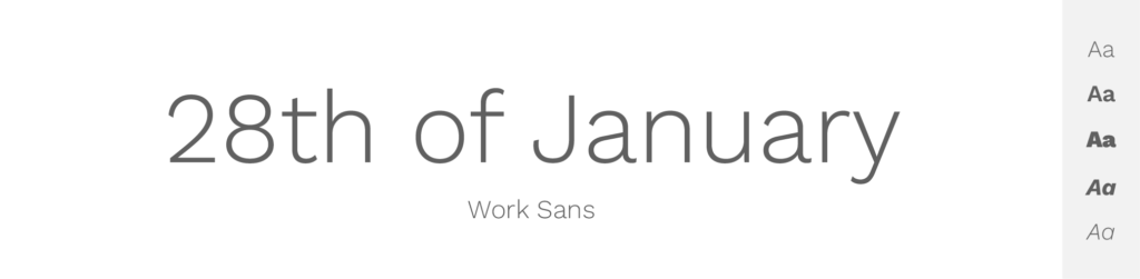
Work Sans is another of my favorite fonts, I mean – when I look at this font, I just feel so welcomed.
This font was designed specifically for user interfaces, making it an ideal alternative to Proxima Nova in digital applications. It shares some resemblances with Proxima Nova, particularly in terms of legibility and clean lines. Work Sans features a balanced x-height and open counters, enhancing its readability on screens of different sizes.
Work Sans, like Proxima Nova, has a modern and straightforward appearance. Its letterforms are geometric and slightly condensed, resulting in a compact and space-efficient design. The font offers a range of weights and styles, providing versatility and adaptability for various design needs.
I think that when picking an alternative to Proxima Nova, Work Sans might be a suitable substitute, especially in digital interfaces where readability and clarity are crucial.
Metropolis
- Free or Paid: Free font by Chris Simpson
- How many styles: Total 18 styles = 9 weights + matching italics (thin, extralight, light, regular, medium, semibold, bold extrabold & black).
- Usually used for: Modern corporate identity and branding, it offers a professional and clean look. It's also seen in headlines and titles.
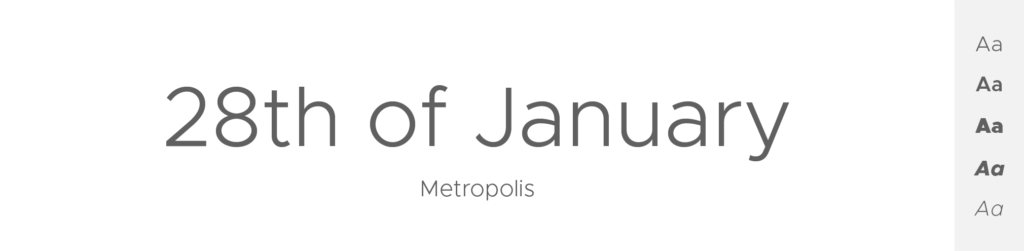
Metropolis is a contemporary sans-serif font that shares similarities with Proxima Nova, particularly in terms of its sleek and modern aesthetic. It features clean lines, open apertures, and balanced proportions, making it suitable for both headlines and body text.
Like Proxima Nova, Metropolis combines geometric and humanist elements to create a harmonious balance. It has a slightly condensed design and a wide range of weights, providing versatility in design applications. Metropolis carries a sense of sophistication and elegance, which I think makes it a great choice for projects that require a modern and refined look.
Montserrat
- Free or Paid: Free, Google font
- Number of styles: Total 18 = 9 weights from thin to thick (+ all of them in italics)
- Usually used for: Everything – including branding, digital designs, print, big pile of texts, websites, headlines, body, etc.
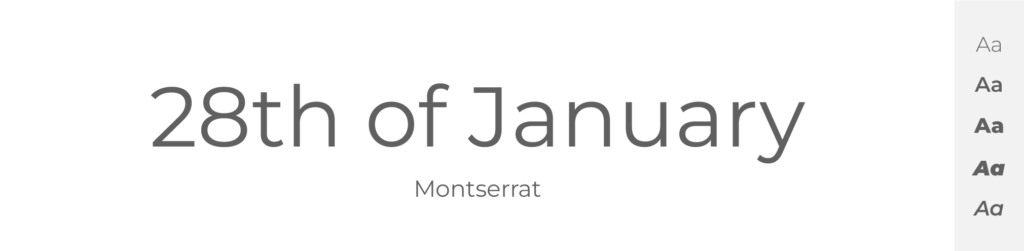
I will start the list with one of my all-time favorite fonts: Montserrat. It is a versatile sans-serif that shares similarities with Proxima Nova. It features a clean and modern design, making it an excellent alternative for various design projects. The font's letterforms are geometric and have a slightly condensed appearance, much like Proxima Nova. Montserrat offers a range of weights and styles, including regular, bold, thin, and black, which is great, because it allows a lot of flexibility in design choices.
One of the key resemblances between Montserrat and Proxima Nova lies in their proportions and overall readability. Both fonts exhibit a balanced x-height, which ensures legibility in small sizes and on various devices. Montserrat's rounded terminals and gentle curves give it a friendly and approachable feel – just like Proxima Nova.
However, I think it's worth noting that Montserrat may feel a bit more geometric and less humanist compared to Proxima Nova. But it still makes one of the best alternatives – and it’s free!
Raleway

- Free or Paid: Free – Google Font
- How many styles: Total 18 styles = 9 upright & 9 italics (thin, extralight, light, regular, medium, semibold, bold, extrabold & black).
- Usually used for: Elegant and stylish headings. It is also popular for use in website body text.
Oh, Raleway – this font is like a friend. It can be a bit specific thanks to some of its shapes, but boy, it is suitable for any purpose and easy-to-read, which are both amazing qualities of a typeface.
Raleway is a sans-serif font that shares some similarities with Proxima Nova in terms of its elegant and sophisticated appearance. It has a clean and minimalistic design, making it suitable for a wide range of design projects. Raleway's letterforms are slender and slightly condensed, resembling Proxima Nova's proportions.
Both Raleway and Proxima Nova exhibit a sense of simplicity and modernity. Raleway's thin and delicate strokes give it a sophisticated and refined look, similar to Proxima Nova. The font offers a variety of weights and styles, providing flexibility and versatility in design choices.
So I wouldn’t say that Raleway looks the same as Proxima Nova, but to be honest, when you’re looking for an alternative, you often want something that looks different, but has a similar feeling, right? And that is what I think is Raleway to Proxima Nova.
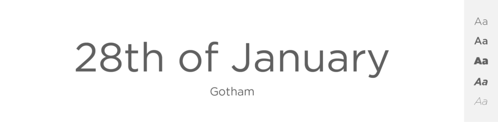
Gotham
- Free or Paid: Paid – Hoefler & Co
- How many styles: Total 66 styles = But there are 16 “classic” Gotham fonts – 8 upright and 8 italics (thin, extralight, light, book, medium, bold, black & ultra). Then there are 50 more styles of this font – like Narrow, Extra Narrow or Condensed, and all of these come in different weights and both italics and upright.
- Usually used for: Corporate identities and logos. It's often used in graphic designs and architectural presentations.
Gotham is another really, really great typeface, which I particularly like, but to be honest, it looks incredibly similar to Montserrat, with very few differences, only it’s paid. And therefore Montserrat might be a bit better option for many people.
Created by Tobias Frere-Jones, Gotham has gained popularity for its clean and contemporary aesthetic. Just like Montserrat, it shares common traits with Proxima Nova, such as its geometric shapes and neutral tone. Gotham is known for its versatility and readability across different media, making it suitable for both print and digital projects.
In terms of similarities, both Gotham and Proxima Nova possess a sense of minimalism and simplicity. Gotham's letterforms are bold and slightly condensed, resembling Proxima Nova's overall proportions.
Both fonts offer a wide range of weights and styles, ensuring flexibility in design applications. I think that Gotham is a beautiful typeface that you can use really anywhere – just like Proxima Nova.
Roboto
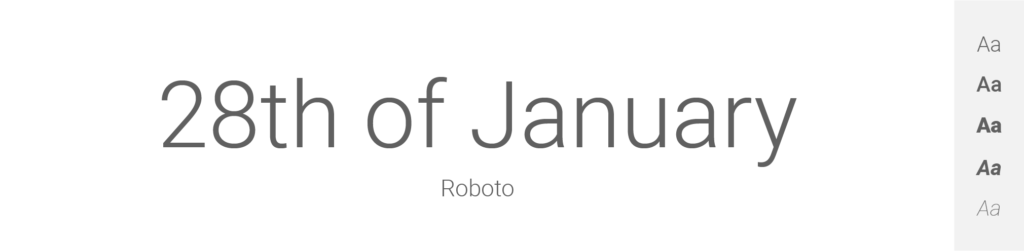
- Free or Paid: Free – Google Font
- How many styles: Total 12 styles = 6 classic upright & 6 matching italics (thin, light, regular, medium, bold & black).
- Usually used for: Android OS and Google services typography. Also often used in modern website and app designs.
Roboto is modern and free, widely used sans-serif typeface that offers a balance between geometric and humanist design principles. That alone makes it a popular alternative to Proxima Nova.
Developed by Google, Roboto is known for its versatility and readability across different platforms. It features a slightly condensed letterform with open counters, enhancing legibility, especially in small sizes and on digital screens.
Similar to Proxima Nova, Roboto has a clean and modern appearance. Its letterforms exhibit clear and well-defined strokes, ensuring readability in various contexts. Roboto offers a wide range of weights and styles, allowing for flexible usage in different design projects.
Museo Sans
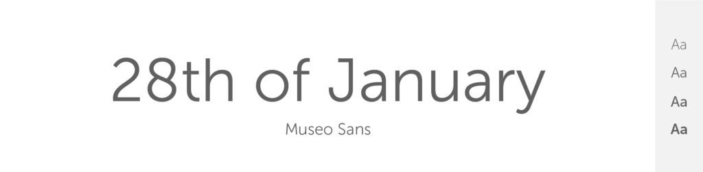
- Free or Paid: Paid – Exljbris Font Foundry
- How many styles: Total 37 styles = But it has 10 primary “classic” fonts: 5 weights (100, 300, 500, 700 & 900) + matching italics. And then it has many other styles like Display, Rounded or Condensed in both upright and italics + different weights.
- Usually used for: Graphic design projects for its balanced and readable character. Museo Sans is often chosen for advertisements and marketing materials.
Museo Sans is a sans-serif typeface with a distinctive character that sets it apart from Proxima Nova. And while it may not share that many similarities, I think it can still be considered an alternative, particularly in projects that require a touch of uniqueness. Museo Sans features a more pronounced contrast between thick and thin strokes, giving it a distinctive visual identity.
With a range of weights and styles, Museo Sans offers flexibility in design choices. It has a relatively wide letterform and generous spacing, ensuring readability even in small sizes. Although Museo Sans has its own distinct style, I think it can be nice and refreshing alternative to Proxima Nova, especially in designs that call for a bit of personality.
Fira Sans
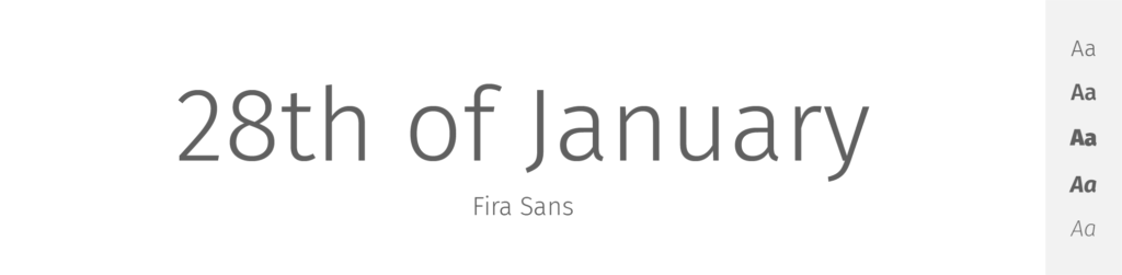
- Free or Paid: Free – Google Font
- How many styles: Total 18 styles = 9 upright & 9 italics weights (thin, extralight, light, regular, medium, semibold, bold, extrabold & black).
- Usually used for: Small screen readability as it was initially designed for Mozilla’s Firefox OS. It's a popular choice for web design and applications.
Fira Sans is a contemporary, humanist sans-serif font that shares some similarities with Proxima Nova in terms of its legibility and modern appearance. Developed specifically for screen usage, Fira Sans offers excellent readability on digital devices, making it a suitable alternative to Proxima Nova for example in web design or user interfaces.
Just like Proxima Nova, Fira Sans has a clean and minimalistic design. Its letterforms are slightly condensed, providing an efficient use of space. Fira Sans offers multiple weights and styles, allowing for flexibility in design applications. And even if it doesn’t have the exact same characteristics as Proxima Nova, I still believe that Fira Sans can serve as a practical substitute, especially when prioritizing legibility on screens.
Avenir

- Free or Paid: Paid – by Linotype
- How many styles: Total 12 styles = 6 upright + 6 matching oblique (light, book, roman, medium, heavy & black).
- Usually used for: High-end print and digital designs for its sleek and sophisticated style. It is also commonly used in branding and corporate identities.
Another font I’ll show you is Avenir – a widely recognized and versatile sans-serif typeface that can be considered as an alternative to Proxima Nova.
Designed by Adrian Frutiger, Avenir features a geometric and balanced design with clean lines and minimal stroke contrast. It has an open and spacious appearance, ensuring excellent legibility in both print and digital contexts.
Avenir shares some common traits with Proxima Nova, such as its modern and elegant aesthetic. Both fonts exhibit a sense of simplicity and clarity. On top of that, Avenir offers a range of weights and styles, allowing for versatility and adaptability in design choices (just like Proxima Nova). And truth is that it does have its own distinct style which can be a bit different from Proxima Nova, but my opinion is that Avenir can be an excellent Proxima Nova alternative.
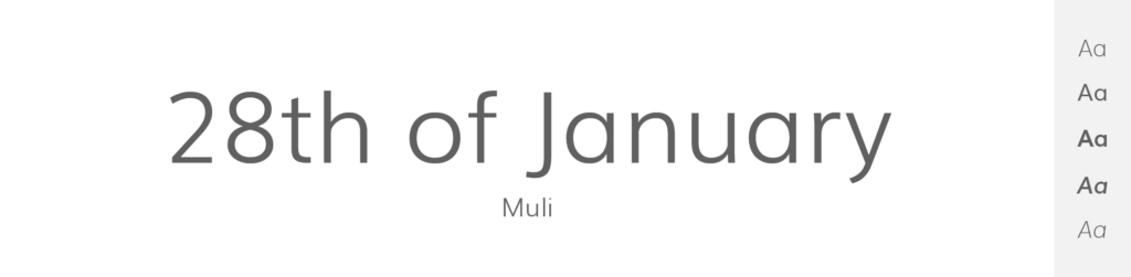
Muli
- Free or Paid: Free by Vernon Adams
- How many styles: Total 10 styles = 5 weights + matching italics (extralight, light, regular, semibold & bold).
- Usually used for: Web design and digital displays due to its minimalist and modern style. It's often seen in web and mobile applications.
Muli is a sans-serif typeface that can be considered as an alternative to Proxima Nova, mostly I’d say in digital contexts. It features a clean and modern design with open letterforms and generous spacing, ensuring readability on screens of different sizes.
Like Proxima Nova, Muli has a versatile and adaptable nature. It offers a range of weights and styles, providing flexibility in design applications. Muli's letterforms have a balanced x-height and a slightly condensed appearance, resembling Proxima Nova's proportions. While it may not have the exact same characteristics, I think that Muli can be a suitable substitute, especially in digital interfaces and web design projects where legibility and clarity are paramount.
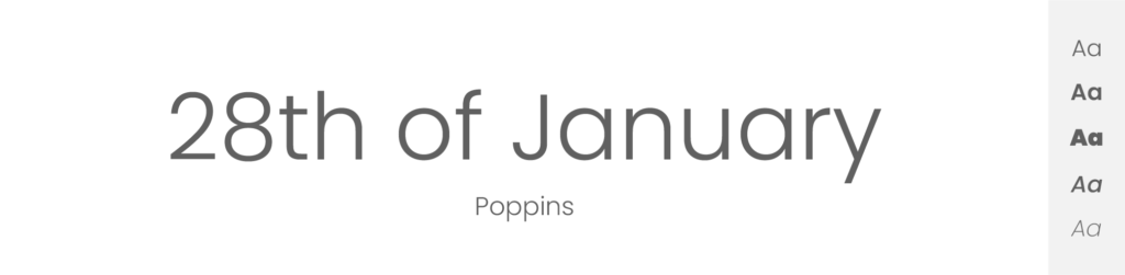
Poppins
- Free or Paid: Free – Google Font
- How many styles: Total 18 styles = 9 upright weights & 9 italics weights (thin, extralight, light, regular, medium, semibold, bold, extrabold & black).
- Usually used for: Creative designs due to its geometric design and monolinear letterforms. It's also popular for children's media and advertising.
Poppins is a modern sans-serif font that in my opinion is not same as Proxima Nova, but it does share some similarities with it and that’s mostly in terms of its clean and geometric design.
Developed by Indian Type Foundry, Poppins features open letterforms and generous spacing, ensuring readability across different mediums.
Similar to Proxima Nova, Poppins offers a wide range of weights and styles, providing versatility in design applications. Its letterforms have a slightly condensed appearance, resulting in a space-efficient design. Poppins exudes a contemporary and friendly vibe, making it suitable for a variety of projects where a modern aesthetic is desired and that’s also why I think it’s great Proxima Nova alternative.
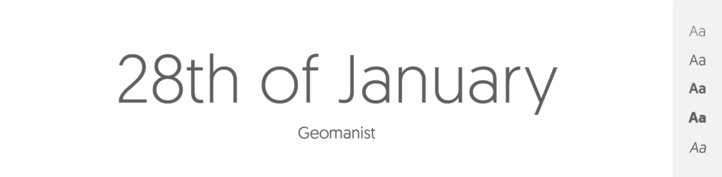
Geomanist
- Free or Paid: Free for personal use, Paid for commercial
- How many styles: Total 9 styles = only upright weights – no italics (thin, extralight, light, book, regular, medium, bold, black & ultra).
- Usually used for: Contemporary graphic design projects due to its clean, modern look. It is also often utilized in web and application design.
Another geometric sans-serif typeface that can be considered as an alternative to Proxima Nova is Geomanist. It features a clean and minimalist design with precise and well-defined letterforms. Geomanist's overall proportions and letter spacing are reminiscent of Proxima Nova, providing a sense of familiarity.
Like Proxima Nova, Geomanist offers multiple weights and styles, allowing for flexibility in design choices. It has a slightly condensed structure, making it efficient in space utilization. Geomanist's geometric shapes and clean lines contribute to a modern and sophisticated look and therefore you can use this font as an alternative to Proxima Nova.
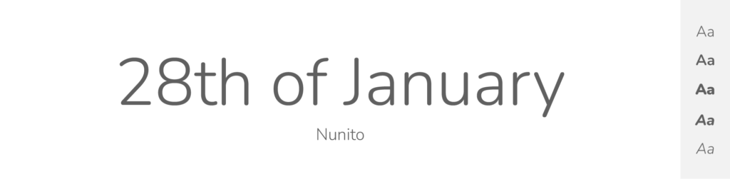
Nunito
- Free or Paid: Free – Google Font
- How many styles: Total 18 styles = 9 upright & 9 italics weights (extralight, light, regular, medium, semibold, bold, extrabold, black & weight).
- Usually used for: Children's products and creative designs due to its rounded, friendly letterforms. It's also used in web and app design because of its readability.
Nunito is a humanist sans-serif font that shares some similarities with Proxima Nova and so it can be used when looking for alternatives. It features open letterforms and a balanced x-height, ensuring readability in different sizes and on various devices.
I think that like Proxima Nova, Nunito has a versatile and approachable character. It offers a range of weights and styles, providing flexibility in design applications. Nunito's letterforms have a slightly condensed design, resulting in an efficient use of space. With its clean and friendly look, Nunito can be a suitable alternative to Proxima Nova in projects that require a modern and approachable aesthetic.
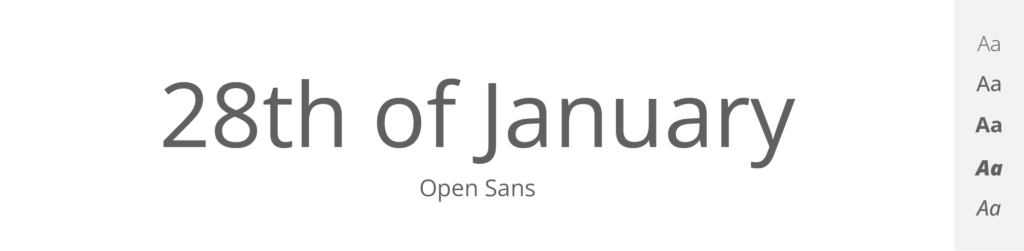
Open Sans
- Free or Paid: Free – Google Font
- How many styles: Total 12 styles = 6 upright & 6 italics (light, regular, medium, semibold, bold & extrabold).
- Usually used for: Web and mobile interfaces due to its legibility at small sizes. Also, it's a popular choice for print materials.
As the name may suggest, Open Sans is a widely used sans-serif typeface that can serve as a great alternative to Proxima Nova, especially in digital contexts. I do like Open Sans, and it also is a free font, since it was developed by Google, which makes the use easier. It has a clean and neutral design with well-balanced letterforms.
Similar to Proxima Nova, Open Sans exhibits a sense of simplicity and clarity. Again it offers a range of weights and styles, allowing for flexibility in design choices. Open Sans has a slightly condensed appearance, making it space-efficient. With its wide availability and compatibility, Open Sans can be really practical substitute for Proxima Nova – I think you should give it a go.
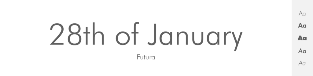
Futura
- Free or Paid: Paid – by Linotype
- How many styles: Total 22 styles = It has 12 primary fonts – 6 weights + matching obliques (light, book, medium, heavy, bold, extrabold). Then it has some condensed styles – both upright and oblique. And 2 extra fonts – Futura Black and Futura Display.
- Usually used for: Logos and branding because of its clean, geometric shapes. It's also seen in posters and advertising.
Another especially beautiful font I want to show you is Futura – a geometric sans-serif with a distinctive and timeless design. While it may have a different visual style from Proxima Nova, it can be considered as an alternative, because in my opinion, it is just as big and mighty. Or well – maybe it’s a bit less known then Proxima Nova, but still it’s pretty popular. Futura features clean lines, minimal stroke contrast, and a sense of modernity.
Although Futura has a more geometric and futurist aesthetic compared to Proxima Nova, it can be an intriguing choice for designs that seek a bold and eye-catching look. It offers multiple weights and styles, providing versatility in design applications. And while it may not have the exact same visual characteristics as Proxima Nova, Futura can be a great alternative if you want something with a great feel, but a bit different.
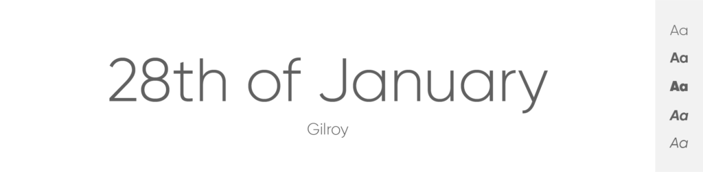
Gilroy
- Free or Paid: Paid, but the Light & ExtraBold weights are free
- How many styles: Total 20 styles = 10 weights + matching italics (thin, ultralight, light, regular, medium, semibold, bold, extrabold, black & heavy).
- Usually used for: Modern branding and advertising campaigns because of its geometric and modern style. It is also commonly used in digital design.
Gilroy is a modern geometric sans-serif font that can also be considered as an alternative to Proxima Nova. It features clean lines, a balanced x-height, and a slightly condensed design, similar to Proxima Nova. Gilroy's letterforms have a contemporary and minimalistic appearance, making it suitable for a wide range of design projects.
Again, just like Proxima Nova, Gilroy offers multiple weights and styles, allowing for flexibility and versatility in design choices. It combines geometric shapes with subtle humanist touches, resulting in a harmonious balance between readability and visual appeal and that is something not all fonts have. With its modern and sophisticated look, Gilroy can be a compelling choice for projects where you’d normally use Proxima Nova.
Lato

- Free or Paid: Free – Google Font
- How many styles: Total 10 styles = 5 upright & 5 italics weights (thin, light, regular, bold & black).
- Usually used for: Corporate designs and digital media due to its semi-rounded details and structure. It's a preferred choice for user interfaces and web design.
This Polish font, Lato, is a versatile sans-serif that shares some similarities with Proxima Nova and therefore can be used as its alternative.
It features open letterforms, generous spacing, and a balanced x-height, ensuring readability in various sizes and mediums.
Similar to Proxima Nova, Lato has a clean and neutral design. It offers a wide range of weights and styles, providing flexibility in design applications. Lato's letterforms are slightly condensed, making it efficient in space utilization. And even if I think that these two are not cut from the same cloth, Lato’s approachable and friendly look can be a suitable alternative to Proxima Nova.
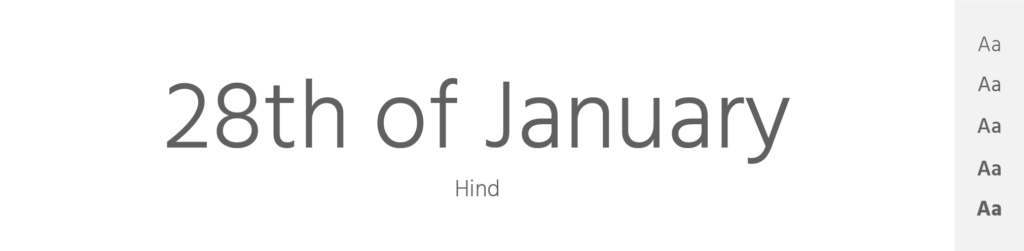
Hind
- Free or Paid: Free – Google Font
- How many styles: Total 8 styles = 4 upright weights & 4 italics (light, regular, medium, semibold).
- Usually used for: Digital platforms due to its simplification for screen legibility. It is also used in print and graphic design projects.
Hind is a great, free, sans-serif font that can serve as an alternative to Proxima Nova, especially in digital contexts. It features a clean and modern design with open letterforms and generous spacing, ensuring readability on screens of different sizes.
Hind exhibits a sense of simplicity and clarity, just like Proxima Nova. It offers multiple weights and styles, allowing for flexibility in design choices. Hind's letterforms have a slightly condensed appearance, providing an efficient use of space. With its balanced proportions and legibility, Hind can be a nice substitute for Proxima Nova in digital interfaces, web design, and other screen-based projects.
Exo
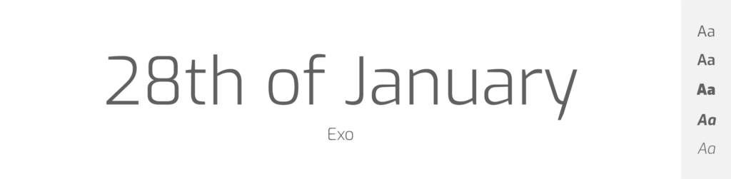
- Free or Paid: Free – Google Font
- How many styles: Total 18 styles = 9 upright weights & 9 italics (thin, extralight, light, regular, medium, semibold, bold, extrabold & black).
- Usually used for: Sci-fi and technology-related design themes because of its futuristic look. It's also commonly found in digital media and video games.
Even though this geometric sans-serif font designed by Natanael Gama, Exo, is not completely same as Proxima Nova, it can still be considered as a suitable alternative. With its clean and modern appearance, Exo features distinct geometric shapes, minimal stroke contrast, and a slightly condensed structure. It offers a range of weights, providing flexibility in design applications.
And while it may not have the exact same characteristics as Proxima Nova, its clean lines and balanced proportions make it a compelling choice for projects that require a sleek and contemporary sans-serif font, just like Proxima Nova. Both these fonts offer versatility and legibility, but they differ in their design approach and overall aesthetic.
Public Sans
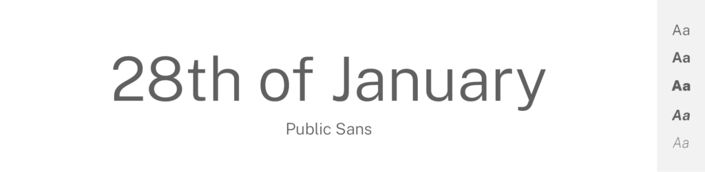
- Free or Paid: Free – Google Font
- How many styles: Total 18 styles = 9 upright weights & 9 italics weights (thin, extralight, light, regular, medium, semibold, bold, extrabold & black).
- Usually used for: Government and public service websites due to its creation by the United States federal government. It's also seen in various digital applications for its accessibility and readability.
Public Sans is a free and open-source sans-serif font originally developed for use in government projects, and I think it can also be considered as an alternative to Proxima Nova. It features clean lines, neutral proportions, and a slightly condensed design, similar to Proxima Nova.
Like Proxima Nova, Public Sans exhibits a sense of simplicity and legibility. It offers multiple weights and styles, which is good, because then you have many choices. Public Sans' letterforms have open counters and generous spacing, ensuring readability in different contexts. With its accessibility and clean design, Public Sans can be a practical substitute for Proxima Nova in projects that require a professional and inclusive typeface.
Nexa
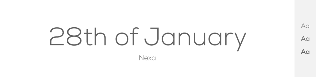
- Free or Paid: Basically free, but full family is paid.
- How many styles: Total 36 styles = It has 8 classic weights (thin, extralight, light, book, regular, bold, extrabold & black) in 2 styles (classic & text) + all in matching italics.
- Usually used for: Graphic design projects for its clear, geometric shapes and wide range of styles. It's also often chosen for headlines, logos, and branding.
This geometric sans-serif font that can be considered as an alternative to Proxima Nova is called Nexa. It features clean lines, a balanced x-height, and a modern design. Nexa's letterforms exhibit a slightly condensed structure, making it practical and efficient in space utilization.
I think that just like Proxima Nova, Nexa offers multiple weights and styles, providing versatility in design applications. It combines geometric shapes with subtle humanist touches, striking a balance between readability and visual appeal. I think that with its contemporary and stylish look, Nexa can be a great choice when trying to find fonts similar to Proxima Nova.
Cabin
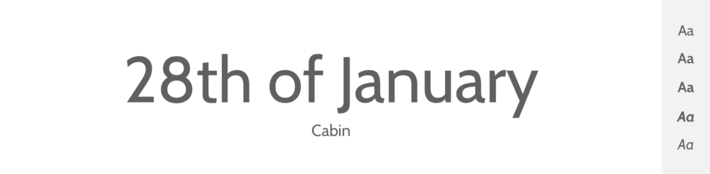
- Free or Paid: Free – Google Font
- How many styles: Total 8 styles = 4 upright weights & 4 italics (regular, medium, semibold & bold).
- Usually used for: Screen display due to its high readability and optimized kerning. It's also a popular choice for both print and digital applications due to its versatility.
Cabin is a versatile sans-serif font that shares some similarities with Proxima Nova, particularly in terms of its legibility and modern appearance, and therefore can make a great alternative to the big and mighty typeface. It features open letterforms, generous spacing, and a balanced x-height, ensuring readability in various sizes and mediums.
Cabin has a clean and neutral design and that is similar to Proxima Nova. It offers a range of weights and styles, allowing for flexibility in design choices. Cabin's letterforms have a slightly condensed structure, making it efficient in space utilization. I think that Cabin can be a suitable alternative to Proxima Nova, because of its approachable and friendly look.
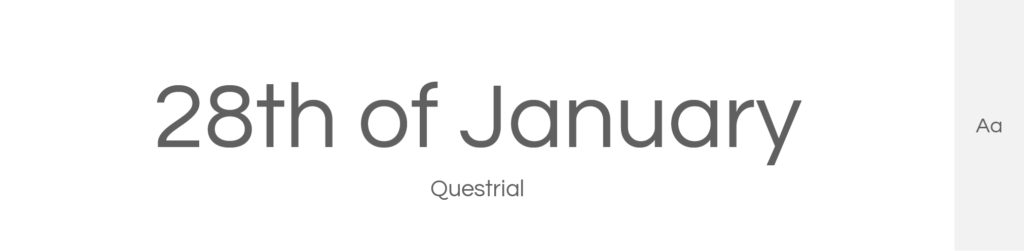
Questrial
- Free or Paid: Free – Google Font
- How many styles: Only 1 style = regular (400)
- Usually used for: Digital design and web typography due to its excellent legibility and clean design. It's also commonly used for body text in both print and digital media.
Questrial is a sans-serif font that can aslo serve as an alternative to Proxima Nova, especially in digital contexts. It has a clean and modern design with open letterforms and generous spacing, which ensures readability on screens of different sizes.
Questrial exhibits a sense of simplicity and clarity which is just like Proxima Nova, but it offers only a single weight, providing a streamlined approach to design, but leaving a designer with not that many choices. Questrial's letterforms have a slightly condensed appearance, making it space-efficient.
I think that Questrial is especially beautiful font and can be used in various designs, but it only features 1 weight which can sometimes be challenging. Still it is a great alternative to Proxima Nova.
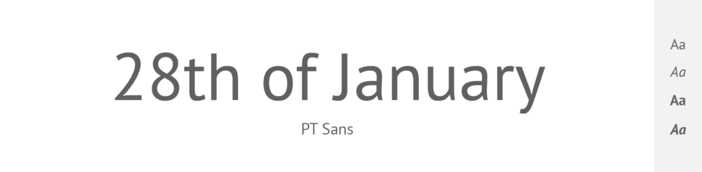
PT Sans
- Free or Paid: Free – Google Font
- How many styles: Only 4 styles = regular & regular italics + bold & bold italics.
- Usually used for: Interfaces, informative texts, and signage due to its clarity and openness. It's also seen in academic and government documents.
One of the last fonts I’ll show you is PT Sans – a versatile sans-serif that shares some similarities with Proxima Nova and can be used as an alternative. It features open letterforms, generous spacing, and a balanced x-height, ensuring readability in various sizes and mediums.
PT Sans has a clean and neutral design which is similar to our favorite Proxima Nova. It again offers a range of weights and styles, allowing for flexibility in designs. PT Sans' letterforms have a slightly condensed structure, making it efficient in space utilization.
Overall I think it’s worth using this font when trying to find an alternative to Proxima Nova.
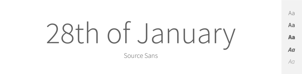
Source Sans
- Free or Paid: Free – Google Font
- How many styles: Total 16 styles = 8 upright weights & 8 italics (extralight, light, regular, medium, semibold, bold, extrabold & black).
- Usually used for: User interfaces and code editing environments as it was Adobe’s first open-source font. It's also widely used in web design and digital media.
Let’s finish this list with a modern and professional sans-serif typeface: Source Sans. This font developed by Adobe can be considered a great alternative to Proxima Nova. It features clean lines, open letterforms, and a balanced x-height, ensuring readability across different mediums.
Similar to Proxima Nova, Source Sans has a modern, clean, and professional appearance. It offers many weights and styles, providing flexibility in design applications. Source Sans's letterforms have a slightly condensed design, resulting in space-saving properties. With its clean and legible look, Source Sans can definitely be a practical alternative to Proxima Nova in many design projects, and in both print and digital formats.
Is Proxima Nova free or paid?
Proxima Nova is a paid font.
To use it, especially for commercial projects, a license needs to be purchased.
Proxima Nova was created and is owned by type designer Mark Simonson, however, the distribution and licensing are managed through font licensing platforms, especially Adobe Fonts.
How many styles does Proxima Nova have?
- But, there are 16 “classic” Proxima Nova fonts = 8 upright and 8 italics (thin, light, regular, medium, semibold, bold, extrabold & black).
- Then it has more styles – like condensed, extra condensed, wide and extra wide + all of these come in different weights & both italics and upright.
What is Proxima Nova mostly used for?
Proxima Nova is incredibly popular – many designers, brands and big players use this amazing typeface in their artworks. The main usages of this font are:
- Websites: It's super popular in web design because it's easy to read on screens. For example Healthline uses Proxima Nova on their website.
- Apps: Many app designers love Proxima Nova for its clean and modern look.
- Branding & Logos: Companies like Spotify and BuzzFeed have used it in their logos and branding.
- Print Media: It's also used in newspapers, magazines, and books because it's versatile and works well in different sizes.
A bit of history about Proxima Nova
Proxima Nova is a font created by Mark Simonson in 2005. Before that, in 1994, he made a simpler font called Proxima Sans, but it wasn't a big hit. So, he improved it, added more styles and features, and renamed it to Proxima Nova.
Its design is a mix of modern and classic styles, which makes it friendly and versatile. When web fonts became popular in the late 2000s, Proxima Nova took off and now many companies like Spotify and BuzzFeed use it. So, Proxima Nova had a slow start but is now a big name in the design world!
Conclusion
Proxima Nova is a super popular font that you've probably seen around without even realizing it. The cool thing about this typeface is that it's like a bridge between old and new. It combines the clean and modern lines of a sans-serif font with the friendly and familiar feel of traditional fonts. In my opinion it is one of the most beautiful typefaces out there. But since it’s more of a “classic” font, it also means people use it often. And therefore us designers start to look for less “mainstream” fonts.
If that’s the case and you’re also looking for a Proxima Nova alternative, you should perhaps try Work Sans, Metropolis, Montserrat, Raleway, or any other typeface in this list.