Summary: In this article, I'll be taking you through 27 outstanding sans-serif fonts in Microsoft Word. My top picks include:
- Gill Sans Nova: Elegant font that adds a bit of sophisticated touch.
- Impact: Go-to for strong, eye-catching headlines and statements.
- Avenir Next LT Pro: Sleek and modern, perfect for contemporary document designs.
Delving into Microsoft Word's extensive font selection, I've selected these 27 sans serif fonts for their distinct qualities and versatility. Whether you're looking to enhance a business report, add clarity to your presentations, or inject some modern flair into your writing, this collection has something for every need. Excited to explore these sans serif standouts? Join me as we uncover the diverse styles and applications of these exceptional fonts!
TOP 27: best sans serif fonts in Microsoft Word
1. Gill Sans Nova
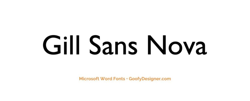
- About: Gill Sans Nova is perfect for professional presentations and sophisticated publications, offering timeless elegance and excellent readability.
2. Impact
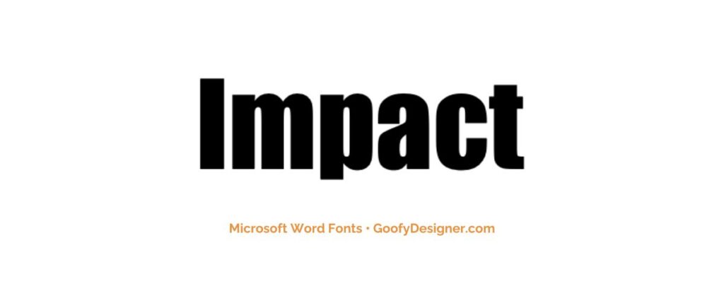
- About: With its condensed and thick strokes, Impact is ideal for eye-catching headlines and titles in posters, banners, and advertisements, standing out even in small spaces.
3. Avenir Next LT Pro
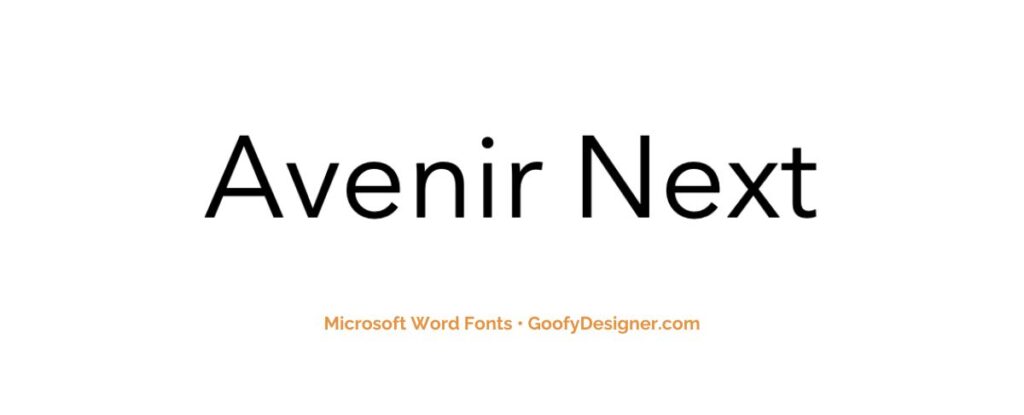
- About: Avenir Next LT Pro's modern and clean design suits professional reports, business branding, and sleek web design, offering versatility in both print and digital formats.
4. Tw Cen MT
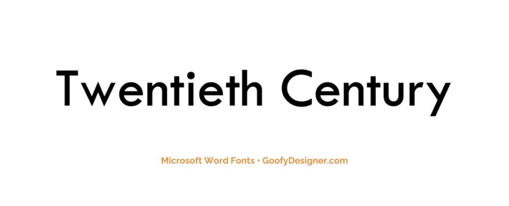
- About: With its Art Deco style and distinct character, this font is well-suited for marketing materials, magazine headlines, and any design seeking a touch of vintage elegance.
5. Century Gothic
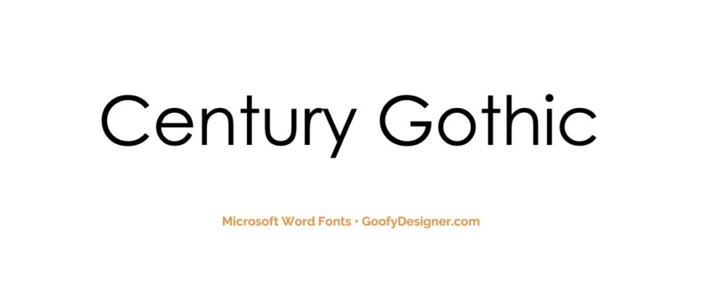
- About: Century Gothic, known for its geometric design and efficient ink usage, is perfect for modern advertising, and digital graphics that require a clean, minimalist look.
6. Arial Nova
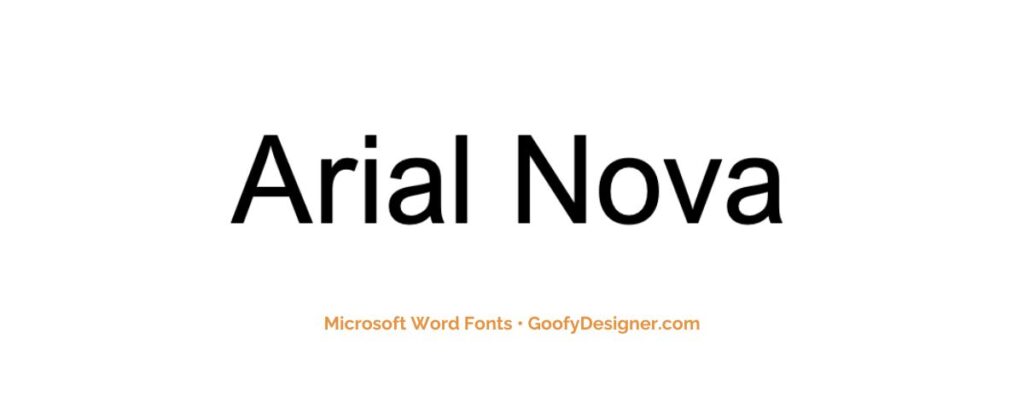
- About: A contemporary refinement of the Arial offers wide applicability in business documents and web design and is valued for its readability and neutral aesthetics.
7. Calibri
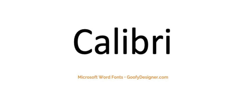
- About: With its warm and soft character, Calibri is a default choice for a wide range of documents in Microsoft Office, offering a friendly yet professional appearance.
8. Verdana Pro
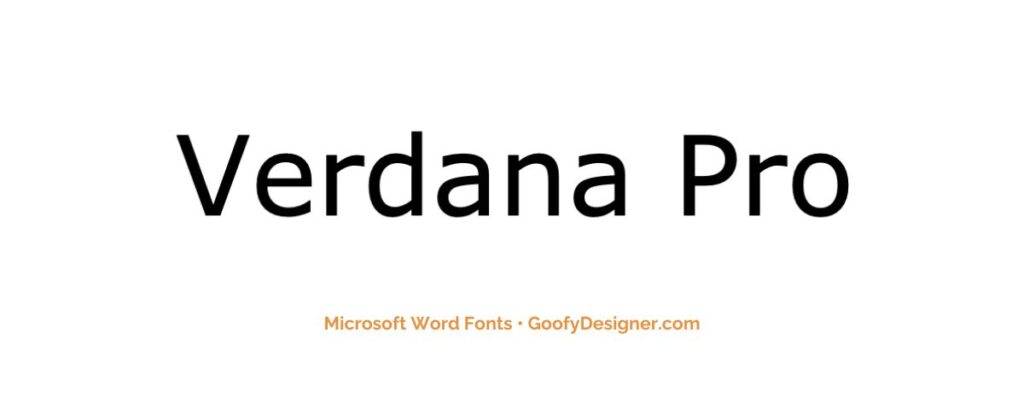
- About: Verdana Pro, specifically designed for screen readability, excels in website content, digital communications, and UI design, ensuring clarity and readability even at small sizes.
9. Aharoni Bold

- About: Aharoni Bold, with its heavy and condensed style, is perfect for attention-grabbing headlines and strong statements in advertising, poster design, and branding materials.
10. Candara
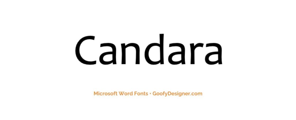
- About: Candara’s gentle curves and slightly condensed form make it ideal for both digital and print media, offering a contemporary feel suitable for casual and business texts.
11. Bahnschrift Regular
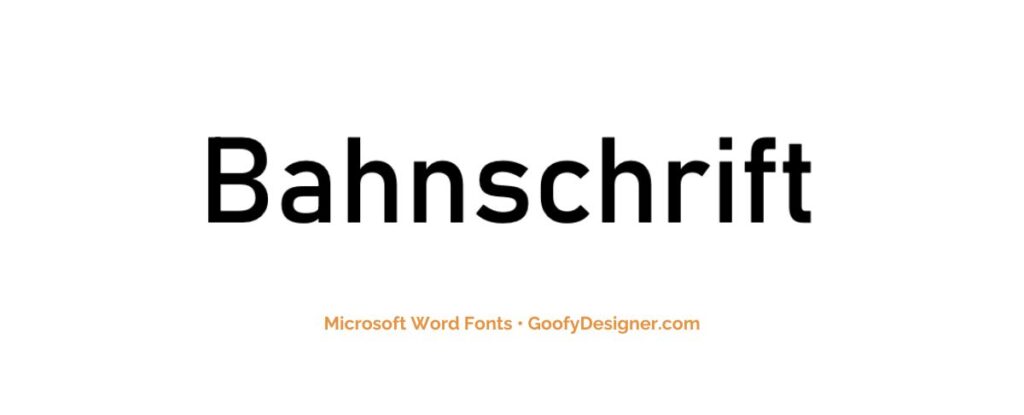
- About: A versatile, modern font with a clean and straightforward appearance, is excellent for a wide range of applications, including business reports, digital interfaces, and signage.
12. Gisha

- About: Gisha's clean and straightforward design is perfect for user interfaces, digital content, and professional documents, offering excellent readability and a modern look.
13. Daytona
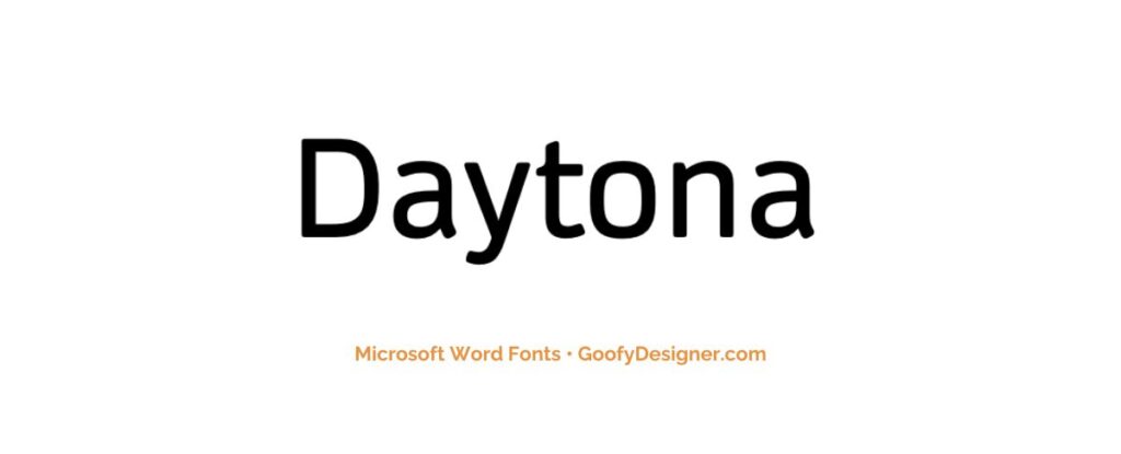
- About: With its dynamic and sporty flair, Daytona is excellent for automotive advertising, sports marketing materials, and any design that requires a touch of energy and movement.
14. Corbel
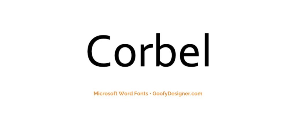
- About: Corbel, with its clear and legible design, is ideal for both print and screen use, particularly in business communications, academic texts, and user interfaces.
15. Dotum
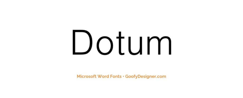
- About: Dotum’s simple and unembellished style makes it perfect for technical documents, user manuals, and digital interfaces, offering excellent legibility.
16. Posterama
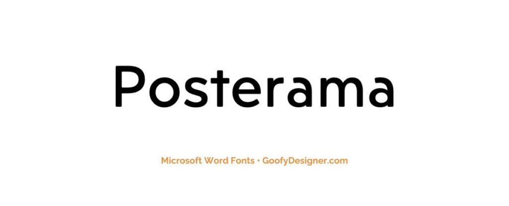
- About: Posterama is perfect for creative projects, themed advertising, and artistic endeavors requiring unique, era-specific typography.
17. Dubai Regular
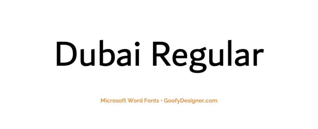
- About: Dubai Regular's unique design is excellent for multicultural projects, international business communications, and educational materials.
18. Grandview Display
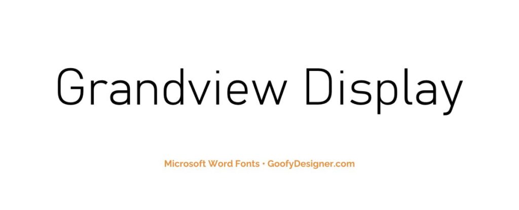
- About: Grandview Display, designed for long-distance legibility, is perfect for signage, transportation communication, and any project where clarity from afar is paramount.
19. Miriam
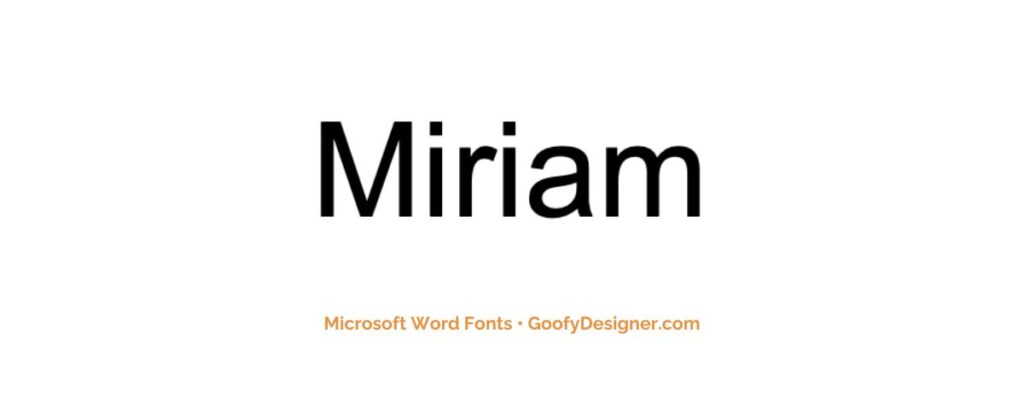
- About: Miriam's straightforward design is ideal for texts in official documents, educational materials, and digital content, ensuring readability and a professional appearance.
20. Utsaah

- About: With its fluid and legible style, Utsaah is excellent font texts in cultural publications, educational materials, and digital media.
21. Source Sans Pro
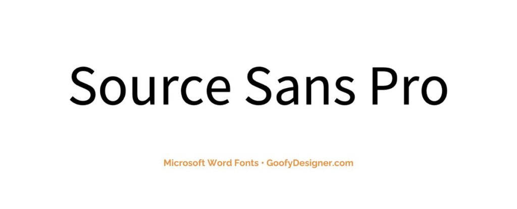
- About: Source Sans Pro is a go-to for UI/UX design, web content, and corporate communications, offering versatility and a modern, approachable look.
22. Britannic Bold
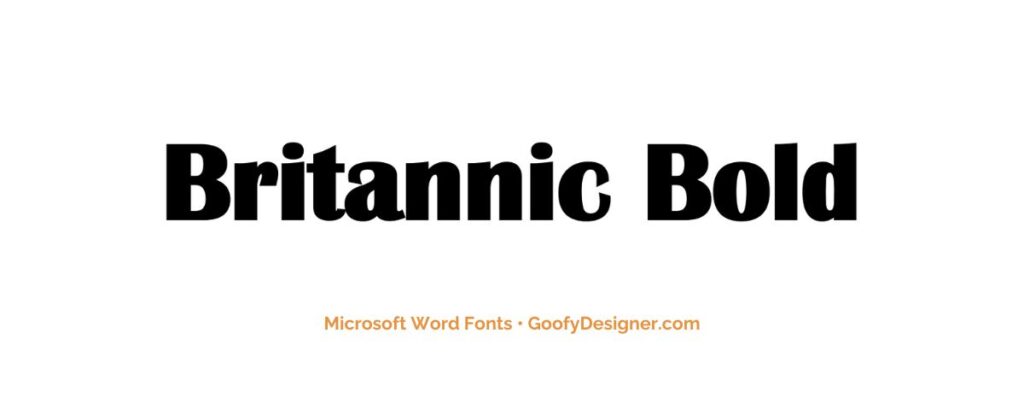
- About: Britannic Bold's distinctive presence makes it suitable for headings and titles in magazines and advertising, where a touch of classic, early-20th-century style is desired.
23. Quire Sans

- About: Versatile and readable font, perfect for corporate communications, book publishing, and any design project requiring a blend of traditional and modern aesthetics.
24. Biome
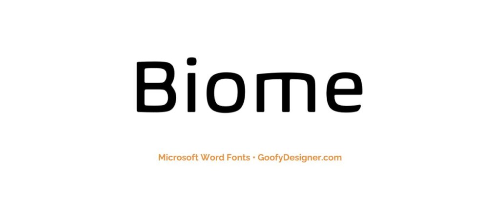
- About: Biome's unique and futuristic design makes it an excellent choice for tech-related projects, sci-fi themes, and any creative endeavor seeking a distinctive, avant-garde touch.
25. Kalinga
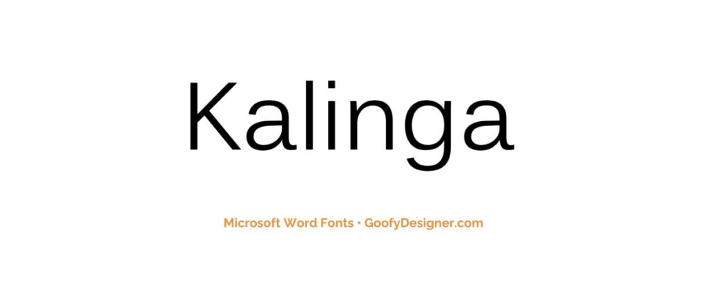
- About: Kalinga’s design is ideal for multilingual documents, cultural publications, and educational materials, offering both aesthetic appeal and functional versatility.
26. Congenial Regular
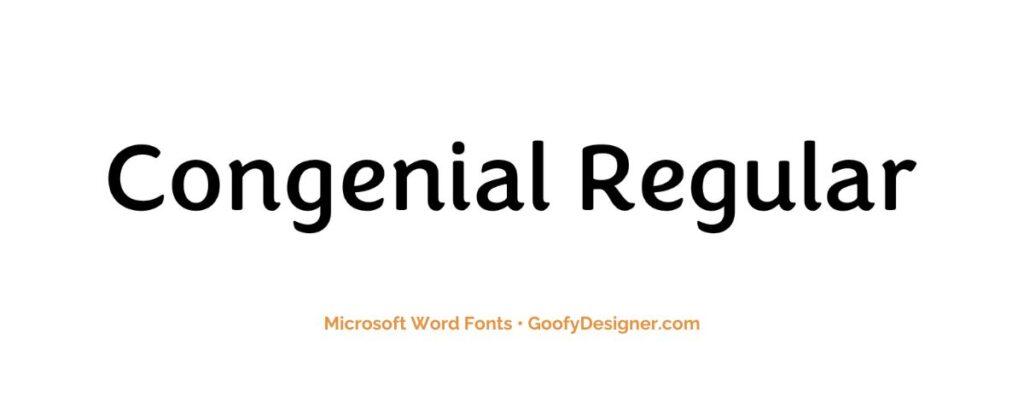
- About: Congenial Regular's warm appearance suits informal, professional documents and friendly designs needing approachability and charm.
27. Lucida Sans
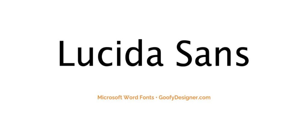
- About: Lucida Sans is well-suited for body text and headings in professional documents, presentations, and interfaces, ensuring readability and a touch of elegance.
Want more sans serif fonts?
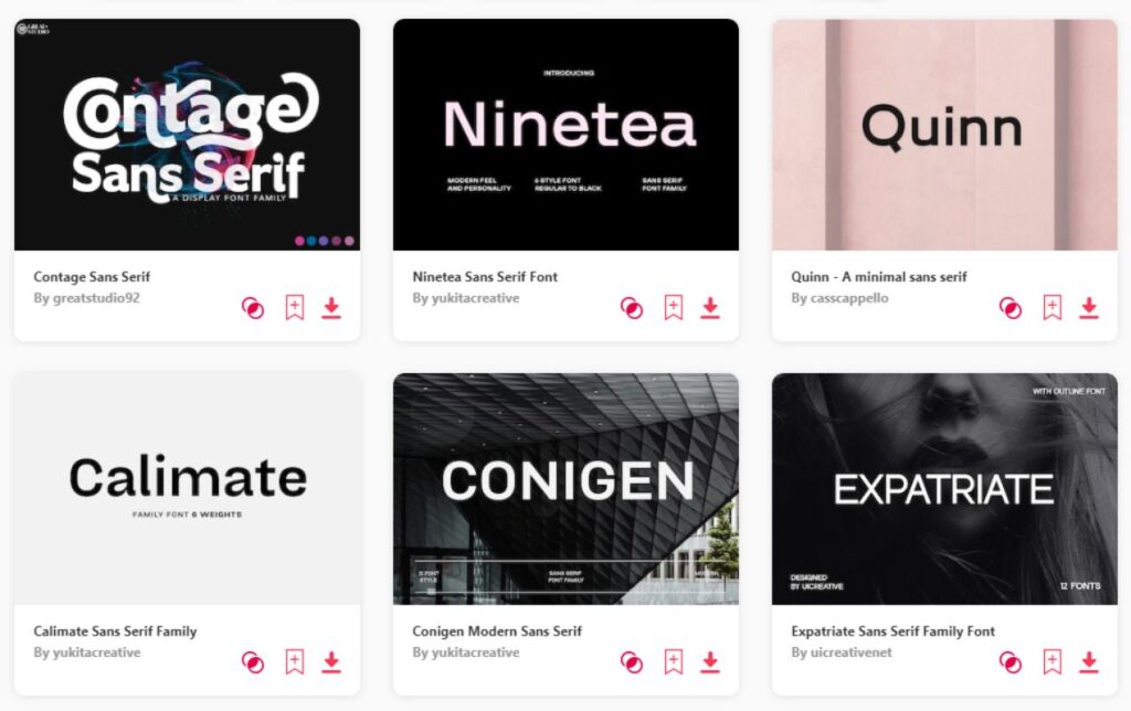
If you want to find more fonts and get access to milions of elements for Canva, browse my favorite site: Envato Elements.
They have all kinds of assets such as:
- Fonts (40,000+)
- Stock photos (9,3M+)
- Graphic templates (270,000+)
- Presentation templates (110,000+)
- Stock videos (5,1M+)
- Video templates (96,000+)
- 3D elements (210,000+)
- WordPress assets (6,500+)
- Royalty-free music (140,000+)
How to choose the best sans serif font in Word?
- Readability: Select fonts that are easy to read, especially at smaller sizes. This is crucial for long texts or documents that will be printed.
- Purpose and Tone: Consider the purpose of your document. A professional report might require a different font than a creative presentation.
- Compatibility: Ensure the font displays well on different devices and software versions, especially if the document will be shared.
- Font Pairing: If using multiple fonts, choose sans serif fonts that pair well with other fonts in your document, maintaining a cohesive look.
- Legibility: Look for clear spacing and distinct character designs to avoid confusion between similar characters like ‘I' and ‘l', or ‘0' and ‘O'.
What are sans serif fonts usually used for?
- Digital Documents: Sans serif fonts are often preferred for screen reading as they appear clearer on various digital displays.
- Corporate and Business Materials: Their clean and modern look makes them suitable for business reports, presentations, and corporate communications.
- Marketing and Advertising: Sans serif fonts are used in marketing materials for their bold and attention-grabbing appearance.
- Educational and Instructional Materials: Their simplicity and legibility make them ideal for textbooks, instructional guides, and e-learning materials.
- User Interfaces and Web Design: Often used in user interface design for apps and websites due to their readability and modern aesthetics.
Conclusion
Concluding our journey, the standout sans serif fonts in Microsoft Word for me are Gill Sans Nova, Impact, and Avenir Next LT Pro. But keep in mind, the term ‘best' is quite subjective and hinges on the requirements and mood of your particular project. The perfect font choice varies, depending on what you're creating and the atmosphere you're aiming to achieve. Dive into this exploration with enthusiasm and let your creative instincts lead the way. Every font has its unique charm and personality, poised to complement and elevate your individual design vision. Enjoy your typographic adventure!
