Summary: Today, I'm going to guide you through 23 of the best slab serif fonts you can find in Microsoft Word. My top three favorites are:
- Gungsuh: Perfect choice when you need both classic and unique font.
- Rod: Your go-to if you're after simplicity with impact.
- Courier New: An absolute classic in the typewriter world.
Navigating Microsoft Word's font library can be overwhelming, so I put together this list to highlight the 23 best slab serif fonts. Whether you're spicing up a project, revamping your resume, or just want to add a bit of flair to your writing, these fonts are here to elevate your work. Ready to dive into these slab serif stars? Let’s start exploring and see what new styles we can uncover!
TOP 23 slab serif fonts on Word
- Gungsuh
- Rod
- Courier New
- Courier New Bold
- Simplified Arabic Fixed
- Tisa Offc Serif Pro
- NSimSun
- Amasis MT Pro Regular
- Amasis MT Pro Black
- Cambria
- Rockwell
- Rockwell Light
- Rockwell ExtraBold
- Rockwell Condensed
- DilleniaUPC
- DilleniaUPC Bold
- Javanese Text
- Miriam Fixed
- Sitka Text
- MS Mincho
- Sylfaen
- High Tower Text
- High Tower Text Italic
1. Gungsuh
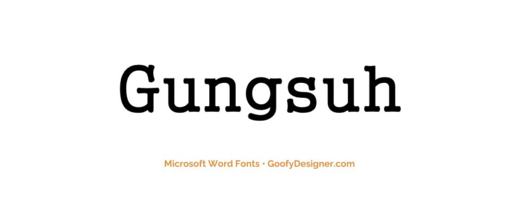
- About: Perfect for blending traditional slab serif aesthetics with East Asian influences, ideal for multicultural documents and artistic projects.
2. Rod
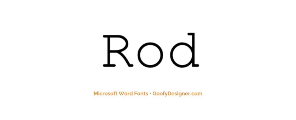
- About: With its straightforward design, Rod is great for business communications and documents needing a clear, professional appearance.
3. Courier New
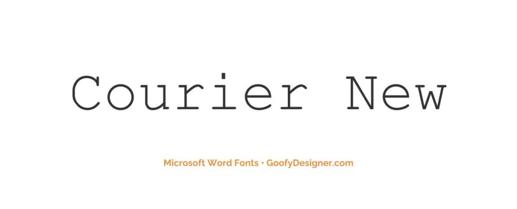
- About: A classic choice for screenplays and formal documents, offering a timeless, typewriter-esque appeal.
4. Courier New Bold
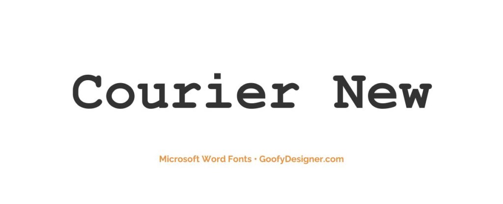
- About: Best suited for making bold statements in headings and titles, providing a strong presence on the page.
5. Simplified Arabic Fixed
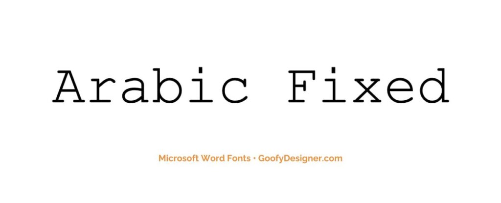
- About: Ideal for Arabic script, combining the clarity and simplicity of slab serif with traditional Arabic calligraphy.
6. Tisa Offc Serif Pro
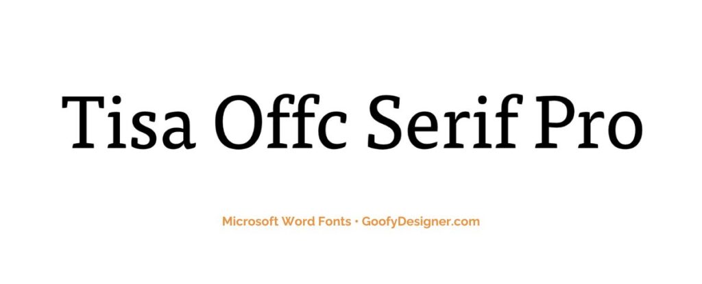
- About: Excellent for editorial work and print media, offering high readability and a contemporary, professional look.
7. NSimSun
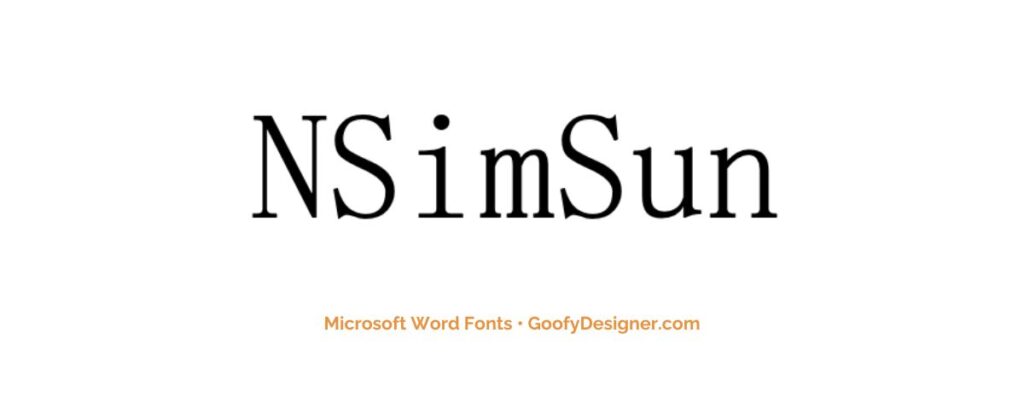
- About: A good fit for Chinese language documents, merging traditional typewriter style with East Asian typography.
8. Amasis MT Pro Regular
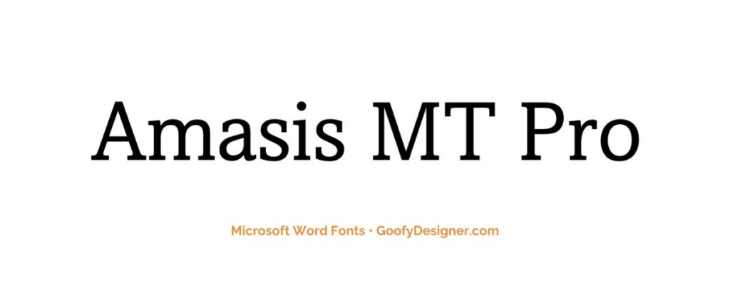
- About: Perfect for body text in professional reports and publications, offering a clear, legible, and elegant appearance.
9. Amasis MT Pro Black
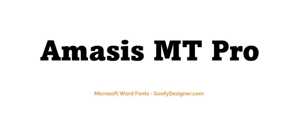
- About: Ideal for impactful headlines or advertising where a bold, assertive slab serif font is needed.
10. Cambria
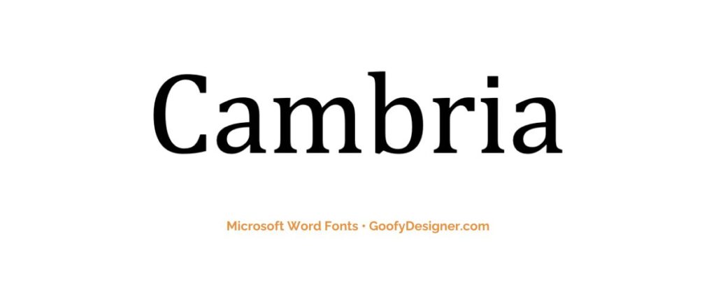
- About: Great for academic papers and professional documents, known for its readability and elegant style.
11. Rockwell
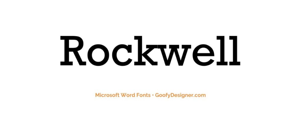
- About: A versatile choice for marketing materials and branding, offering a strong, classic slab serif look.
12. Rockwell Light
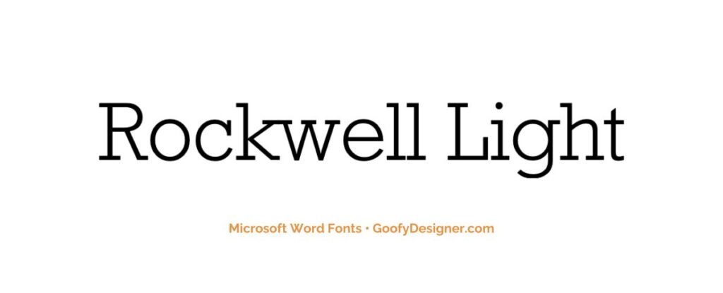
- About: Suitable for subtle, sophisticated designs where a lighter, more refined slab serif is desired.
13. Rockwell ExtraBold
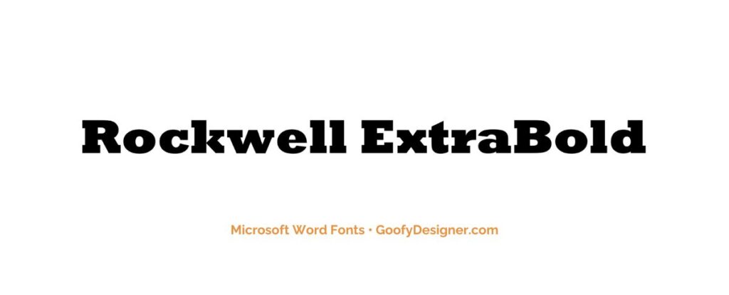
- About: Best for bold statements in large displays, advertisements, and headlines with its commanding presence.
14. Rockwell Condensed
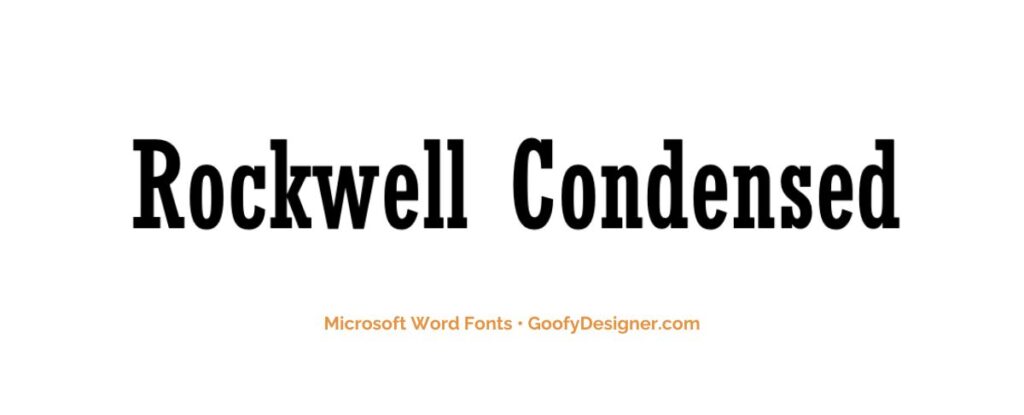
- About: Ideal for space-efficient designs like posters and flyers, maintaining readability and impact.
15. DilleniaUPC
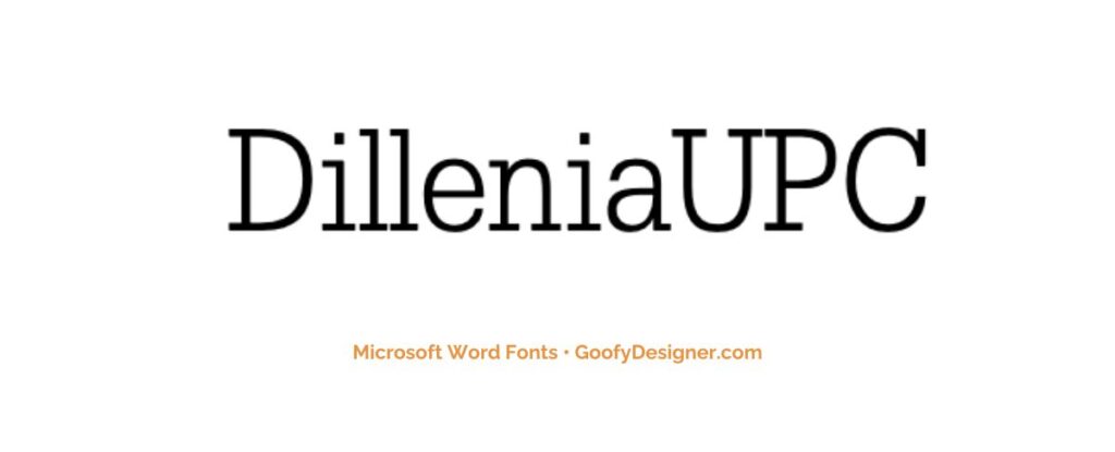
- About: Adds a playful, friendly touch to informal documents and creative projects with its unique slab serif style.
16. DilleniaUPC Bold
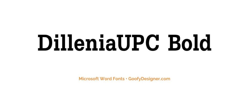
- About: Perfect for eye-catching titles and headers in informal settings, offering a bolder version of its playful style.
17. Javanese Text
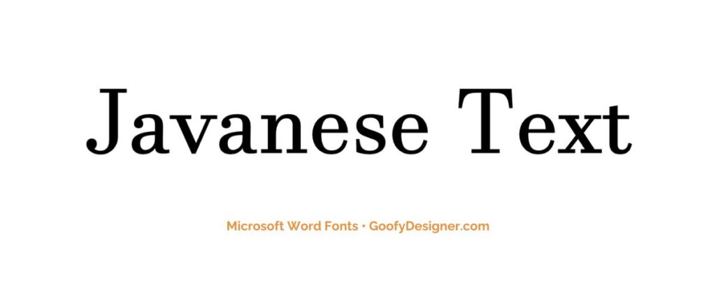
- About: Suitable for documents incorporating Javanese script, blending traditional typographic style with slab serif features.
18. Miriam Fixed
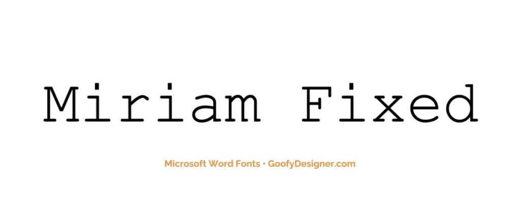
- About: A great choice for technical documents and coding, offering clarity and a unique blend of modern and traditional styles.
19. Sitka Text
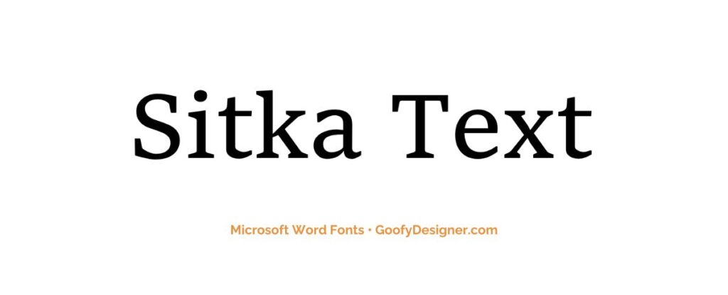
- About: Ideal for digital and print media, offering versatility and readability across various display sizes.
20. MS Mincho
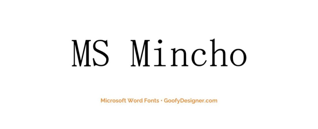
- About: Well-suited for Japanese text, offering a blend of traditional East Asian typography with slab serif characteristics.
21. Sylfaen
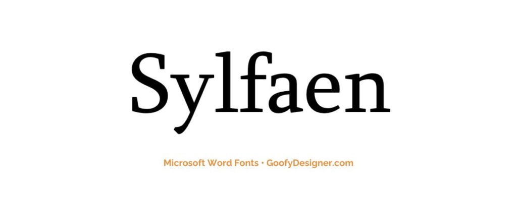
- About: Perfect for multilingual documents, particularly in Georgian and Armenian scripts, with its clear and versatile slab serif design.
22. High Tower Text
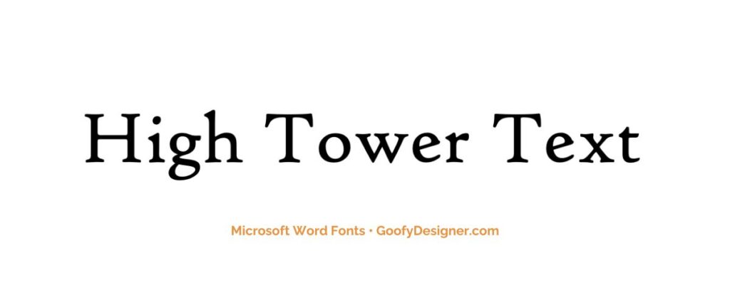
- About: An excellent choice for literary works and formal documents, providing an elegant, classical appearance.
23. High Tower Text Italic
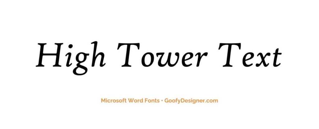
- About: Ideal for emphasizing quotes or important sections in literary and academic works, adding a touch of elegance.
Want more slab serif fonts?
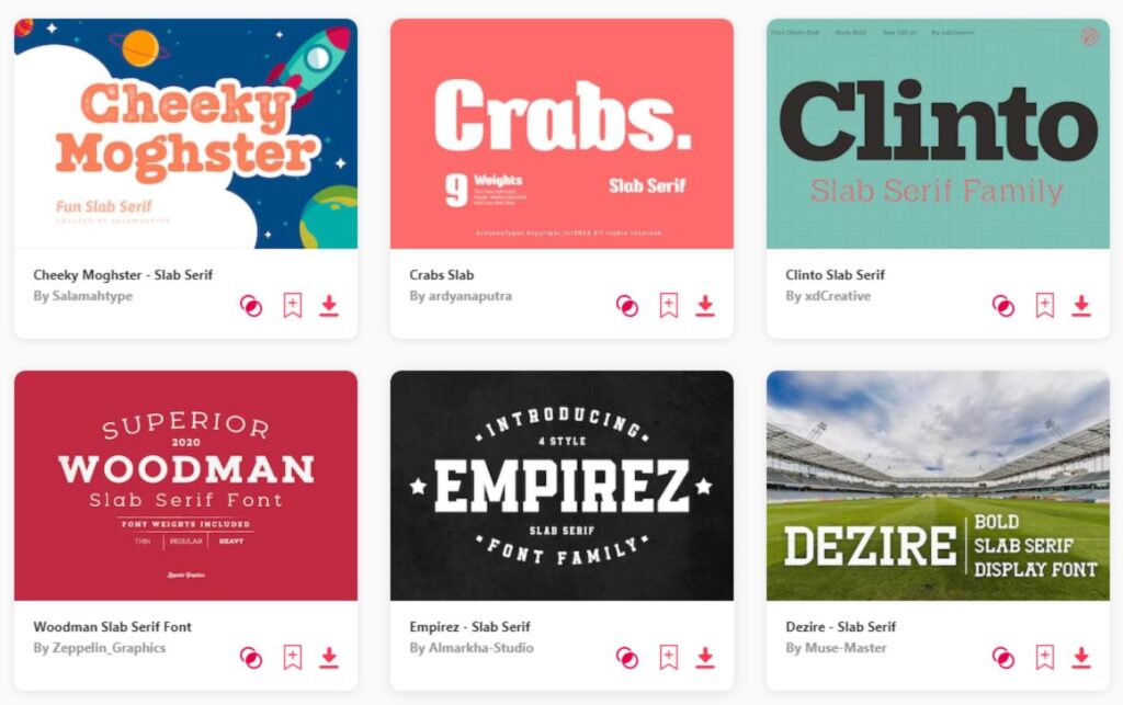
If you want to find more fonts and get access to milions of elements for Canva, browse my favorite site: Envato Elements.
They have all kinds of assets such as:
- Fonts (40,000+)
- Stock photos (9,3M+)
- Graphic templates (270,000+)
- Presentation templates (110,000+)
- Stock videos (5,1M+)
- Video templates (96,000+)
- 3D elements (210,000+)
- WordPress assets (6,500+)
- Royalty-free music (140,000+)
How to choose the best slab serif fonts in Word?
- Purpose of the Document: Match the font with the document's intent. Slab serif fonts work well for titles and headings in formal documents, but some are also suitable for body text.
- Readability: Choose fonts that are easy to read, especially for lengthy texts. Consider letter spacing and size, particularly for print materials.
- Design Aesthetic: Identify the aesthetic you're aiming for. Slab serif fonts can range from modern and bold to classic and elegant.
- Pairing with Other Fonts: Consider how the slab serif font pairs with other fonts in your document. Some slab serifs complement sans-serif fonts well for a balanced look.
- Printing Considerations: If the document will be printed, select a slab serif font that maintains its integrity in printed form, considering factors like ink spread.
What are slab serif fonts usually used for?
- Headings and Titles: Their bold and impactful style makes slab serif fonts ideal for headings, titles, and subheadings in various documents.
- Branding and Advertising: Slab serif fonts are often used in branding materials and advertisements due to their striking appearance and strong presence.
- Print Media: These fonts are popular in newspapers, magazines, and book covers for their readability and aesthetic appeal.
- Web Design: In digital media, slab serif fonts are used for headers and buttons to catch the user’s attention and improve user experience.
- Educational and Professional Presentations: Slab serif fonts are frequently chosen for presentations and reports to convey authority and professionalism.
Conclusion
Wrapping things up, my top picks for slab serif fonts in Microsoft Word are Gungsuh, Rod, and Courier New. But remember, ‘best' is pretty subjective and all about what fits your project's vibe. The right font depends on what you're working on and the feel you're aiming for. So, have fun exploring and let your creative side do the choosing. Each font has its own personality, ready to mesh with your unique style. Happy designing!
