Summary: Today, I’ll walk you through fonts that are associated with Taylor Swift. For as she is known for her musical talent, her fans often want to explore more – like the thoughtful selection of fonts in her album artwork, a lesser-known but crucial aspect of her artistic expression.
Her designers have a knack for picking fonts that perfectly capture the essence of each album, adding a layer of visual storytelling to her music. This attention to typography enhances the connection between the album themes and the audience, making each album even more memorable.
That’s why in this article I decided to give you a peek into the famous fonts of Taylor Swift, where you can even download them and also give you some alternatives you can use.
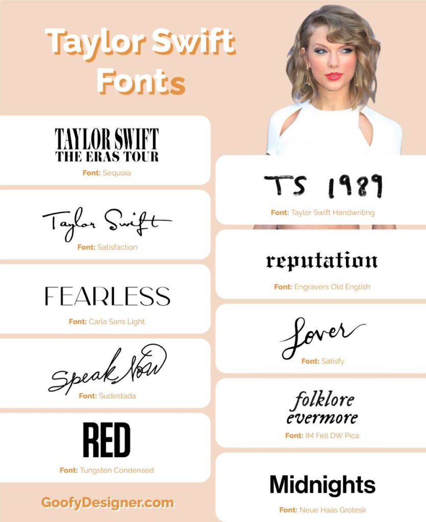
All Taylor Swift fonts (album cover fonts)
- Sequoia – ERAs Tour Font
- Satisfaction – Taylor Swift’s Logo Font
- Carla Sans Light – Fearless Album Font
- Sudestada – Speak Now Album Font
- Tungsten Condensed – RED Album Font
- Taylor Swift Handwriting – 1989 Album Font
- Engravers Old English – Reputation Album Font
- Satisfy – Lover Album Font
- IM Fell DW Pica – Folklore & Evermore Albums Font
- Neue Haas Grotesk – Midnights Album Font
1. Sequoia
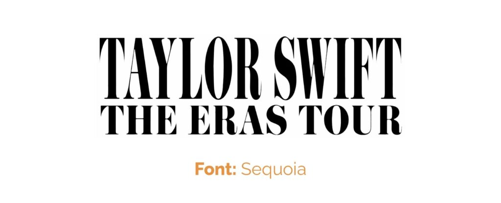
- Where did Taylor use this font: ERAs Tour
- About ERAs Tour: The “Eras Tour” is a concert tour by Taylor Swift that celebrates her entire musical career. It features songs from all her albums, showcasing the different styles and themes from each phase or “era” of her music, from her early country beginnings to her latest pop and indie-folk works.
- More: Bringing a modern twist to the ERAs Tour, Sequoia captures its contemporary essence.
- Licence: Can be purchased.
- Free alternative: Bodoni
2. Satisfaction
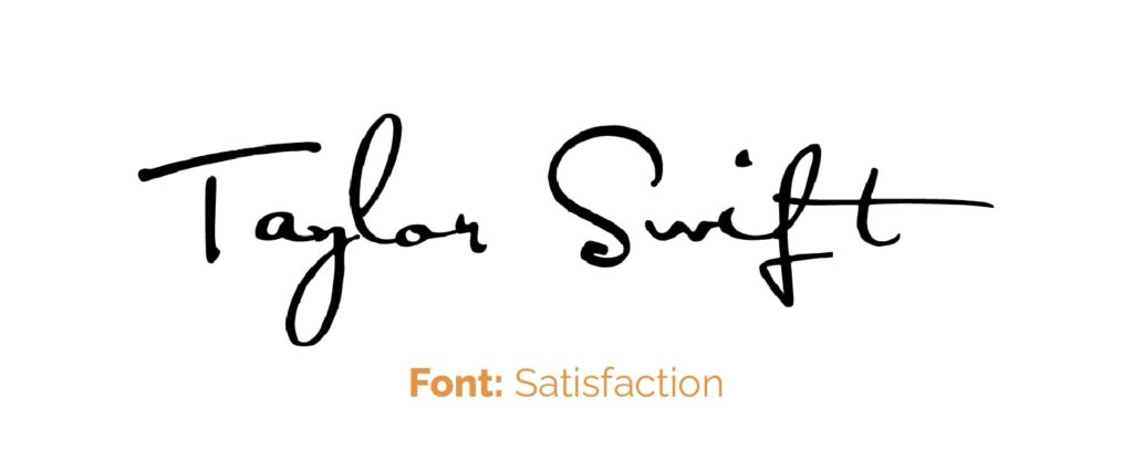
- Where did Taylor use this font: Taylor Swift Logo & debut album
- About Taylor Swift (2006 album): This debut album introduced Taylor Swift as a country music artist. It includes hits like “Tim McGraw,” “Teardrops on My Guitar,” and “Our Song.” The album showcases her talent for storytelling and marks her entry into the music world.
- More: In Taylor Swift's initial branding, Satisfaction offered an elegant, signature-like feel.
- Licence: Free for Personal Use
3. Carla Sans Light
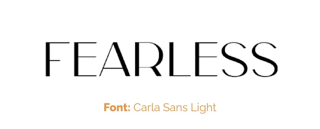
- Where did Taylor use this font: Fearless album cover
- About Fearless (2008 album): This album solidified Swift's status as a rising star. It features the iconic songs “Love Story” and “You Belong With Me.” “Fearless” blends country and pop sounds and won the Grammy Award for Album of the Year.
- More: Carla Sans Light gracefully complements the airy theme of the “Fearless” album.
- Licence: Can be purchased.
- Free alternative: Arsenal
4. Sudestada
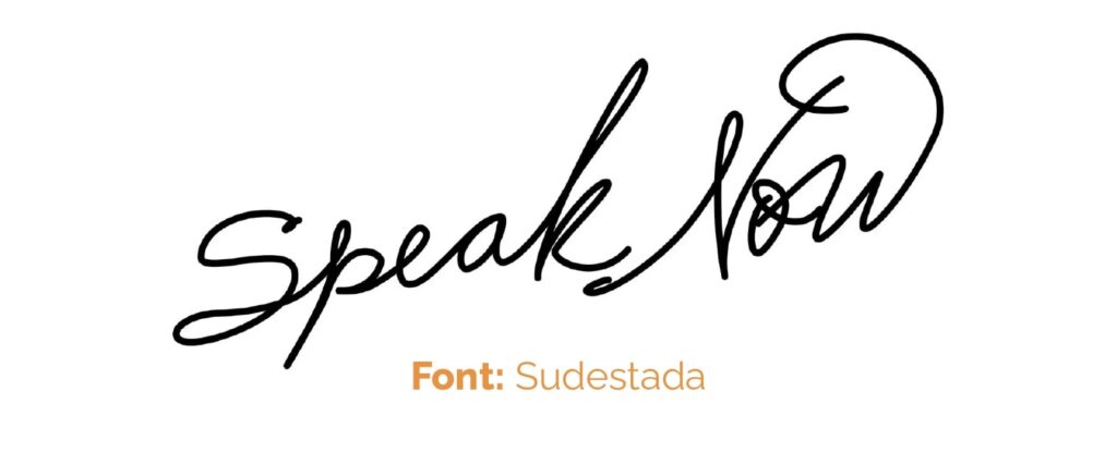
- Where did Taylor use this font: Speak Now album cover
- About Speak Now (2010 album): Entirely written by Swift, this album features more personal and introspective songs. Hits like “Mine,” “Back to December,” and “Mean” highlight her evolving songwriting skills. The album delves into themes of love, regret, and self-discovery.
- More: The “Speak Now” album gets a whimsical touch from Sudestada, a handwritten-style font.
- Licence: Can be purchased. Free for personal use.
- Alternative: Jellyka BeesAntique Handwriting Font
5. Tungsten Condensed
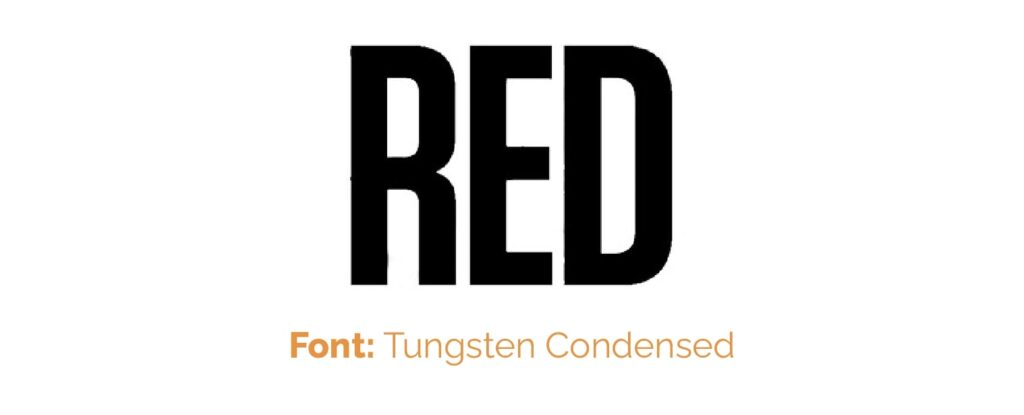
- Where did Taylor use this font: RED album cover
- About RED (2010 album): Marking a shift towards more pop-oriented sounds, “Red” includes popular tracks like “We Are Never Ever Getting Back Together” and “I Knew You Were Trouble.” The album explores the complexities of relationships and heartbreak.
- More: Tungsten Condensed adds a bold statement to the “RED” album.
- Licence: Can be purchased (although it is expensive).
- Free alternative: Bebas Neue
6. Taylor Swift Handwriting
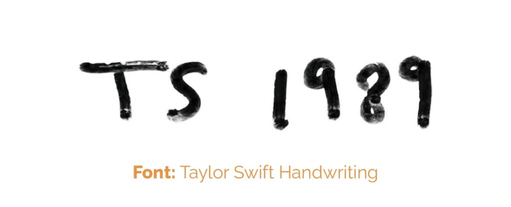
- Where did Taylor use this font: 1989 album cover
- About 1989 (2014 album): A complete departure from her country roots, “1989” is a synth-pop album inspired by 1980s music. It features hits like “Shake It Off,” “Blank Space,” and “Bad Blood.” This album won the Grammy for Album of the Year and solidified Swift's place in pop music.
- More: For “1989,” Taylor Swift Handwriting provides a personal, marker-like appearance.
7. Engravers Old English
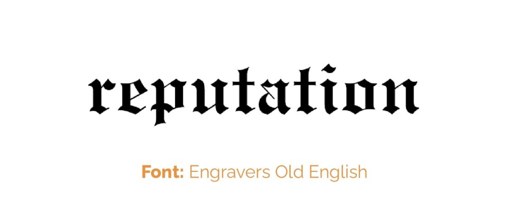
- Where did Taylor use this font: Reputation album cover
- About Reputation (2017 album): This album reflects a darker, edgier Taylor Swift, influenced by media scrutiny and personal experiences. Songs like “Look What You Made Me Do” and “…Ready For It?” showcase a new sound and a defiant attitude.
- More: Engravers Old English imparts a mysterious vibe to the “Reputation” album.
- Licence: Free for Personal Use.
8. Satisfy
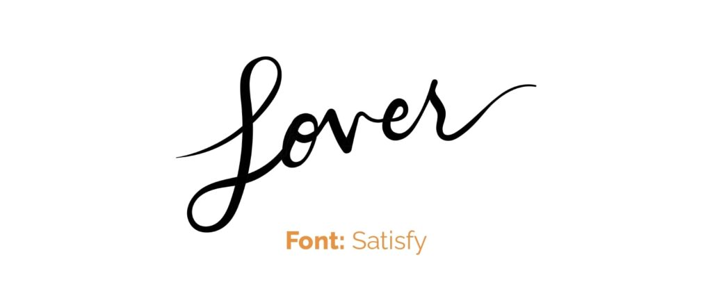
- Where did Taylor use this font: Lover album cover
- About Lover (2019 album): Returning to a brighter, more romantic sound, “Lover” features songs like the title track “Lover,” “Me!” and “You Need to Calm Down.” The album celebrates love in various forms and includes more political undertones.
- More: The brush font Satisfy lends “Lover” a sweet and inviting quality.
- Licence: Free for commercial use (Google Font).
9. IM Fell DW Pica
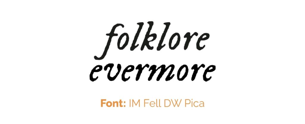
- Where did Taylor use this font: Folklore & Evermore album covers
- About Folklore (2020 album): A surprise indie-folk album released during the pandemic, “folklore” presents a more introspective and storytelling-focused side of Swift. Tracks like “cardigan,” “august,” and “the 1” received critical acclaim for their lyrical depth.
- About Evermore (2020 later album): Released shortly after “folklore,” this album continues the indie-folk style with a touch of whimsy and escapism. Songs like “willow” and “champagne problems” delve into fictional narratives and personal reflections.
- More: “Folklore” and “Evermore” are given a retro feel with IM Fell DW Pica.
- Licence: Free for commercial use (Google Font).
10. Neue Haas Grotesk
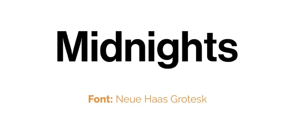
- Where did Taylor use this font: Midnights album cover
- About Midnights (2022 album): This album is said to explore Swift's reflections on sleepless nights throughout her life, offering a mix of her signature storytelling with new musical explorations. Details about its style and tracklist might have been revealed closer to its release.
- More: Lastly, Neue Haas Grotesk offers a clean, modern look to the “Midnights” album.
- Licence: Can be purchased.
- Free alternative: Inter
Conclusion
Taylor Swift's album fonts are an integral part of her visual branding, each one selected to complement the mood and theme of her music. From her early albums to her latest releases, the choice of fonts in her album artwork plays a crucial role in conveying the essence of each era. These fonts range from elegant and whimsical to bold and contemporary, reflecting the evolution of her musical style and artistic expression. They're not just aesthetic choices but also contribute to the storytelling aspect of her albums.
