25 Refreshing Alternatives to Times New Roman

Summary: In this article we’ll go over 25 fonts that are in a way similar to Times New Roman. The best ones are in my opinion:

These fonts are great options for wide range of use, but I have total 25 typefaces ready for you – so you have many to choose from. For each typeface I’ll tell you whether they’re free or paid, how many styles do they have and much more! So keep reading.

And yes, Times New Roman is a infamous serif typeface that's pretty much a celebrity in the world of fonts. However, in spite of (or maybe because of) its ubiquity, it's gained a reputation for being a bit ‘bland' or ‘unimaginative' – sort of like wearing the same outfit every day. And that is why I came up with this article.

Full list: 25 fonts similar to Times New Roman

  1. EB Garamond (Free – Google Font)
  2. Merriweather (Free – Google Font)
  3. PT Serif (Free – Google Font)
  4. Book Antiqua (Paid)
  5. Century Schoolbook (Paid)
  6. Libre Baskerville (Free – Google Font) 
  7. Adobe Jenson Pro (Paid – Adobe)
  8. Source Serif 4 (Free – Google Font) 
  9. Roboto Slab (Free – Google Font)
  10. Noto Serif (Free – Google Font)
  11. Crimson Text (Free – Google Font)
  12. Amiri (Free – Google Font)
  13. Addington CF (Free for personal use)
  14. Palatino (Paid – Linotype)
  15. Minion (Paid – Adobe)
  16. Cardo (Free – Google Font)
  17. Lora (Free – Google Font)
  18. Cormorant (Free – Google Font)
  19. Spectral (Free – Google Font)
  20. Georgia (Paid)
  21. IBM Plex Serif (Free – Google Font)
  22. Plantin (Paid)
  23. Heuristica (Free – SIL Open Font License)
  24. DM Serif Display (Free – Google Font)
  25. Charis SIL (Free – Google Font)

EB Garamond

  • Free or Paid: Free – Google Font
  • How many styles: Total 10 styles = 5 upright weights and 5 italic (regular, medium, semibold, bold & extrabold)
  • Usually used for: Formal documents and high-end print materials. Commonly used in typesetting for books and publications.
  • Summary: EB Garamond is a font based on the original designs of Claude Garamond that shares similarities with Times New Roman in its classic, easy-to-read serifs, giving it a similar formal tone.

Merriweather

  • Free or Paid: Free – Google Font
  • How many styles: Total 8 styles = 4 upright & 4 italic (light, regular, bold, black)
  • Usually used for: Body text for websites and long-form content. Also suitable for print publications such as magazines and books.
  • Summary: Merriweather is a contemporary serif font with a more open, large x-height and wider characters compared to Times New Roman. Its thick/thin contrast is not as strong, which gives it a more friendly, less formal appearance.

PT Serif

  • Free or Paid: Free – Google Font
  • How many styles: Only 4 styles = regular, bold, regular italic & bold italic
  • Usually used for: Editorial design, such as magazines and newspapers. Can also work well for corporate communications and business documents.
  • Summary: Designed for readability on screens, PT Serif retains the legibility and familiarity of Times New Roman, but with a more modern and friendlier appearance.

Book Antiqua

  • Free or Paid: Paid (Monotype Type Drawing)
  • How many styles: Only 4 styles = regular, bold, regular italic & bold italic
  • Usually used for: Printed books and academic publications. Additionally, it can be utilized for vintage-inspired designs and invitations.
  • Summary: Quite similar to Times New Roman, but Book Antiqua has less contrast between strokes and more rounded shapes. It was designed for excellent readability in print.

Century Schoolbook

  • Free or Paid: Paid (Morris Fuller Benton)
  • How many styles: Only 4 styles = regular, bold, regular italic & bold italic.
  • Usually used for: Textbooks, educational materials, and formal documents. Additionally, it can lend a touch of elegance to certificates and diplomas.
  • Summary: Designed to be an extremely legible typeface for use in schoolbooks, Century Schoolbook has a larger x-height and more open counters than Times New Roman, which makes it look friendly and easy to read.

Libre Baskerville

  • Free or Paid: Free – Google Font
  • How many styles: Only 3 styles = regular, bold & italic.
  • Usually used for: Body text for websites and professional documents. Also suitable for creating a refined look in resumes and curriculum vitae.
  • Summary: Inspired by the typefaces of the 18th century, Libre Baskerville offers a warm and a bit vintage feel. Its characters are wider than Times New Roman, and the x-height is larger.

Adobe Jenson Pro

  • Free or Paid: Paid – Adobe
  • How many styles: Total 32 styles = it has 4 classic sets of weights (light, regular, semibold & bold), in 4 different styles (regular, caption, display, & subhead), all available also in italic. 
  • Usually used for: High-quality print materials like books and invitations. Additionally, it can bring sophistication to luxury product packaging.
  • Summary: Adobe Jenson Pro is a humanist serif typeface inspired by the old style typography of the Renaissance period. It's a bit more decorative than Times New Roman, but still pretty similar.

Source Serif 4

  • Free or Paid: Free – Google Font
  • How many styles: Total 16 styles = 8 upright weights & 8 in italic (extralight, light, regular, medium, semibold, bold, extrabold and black)
  • Usually used for: Web typography, e-books, and online content. Also suitable for creating impactful headings and titles in printed materials.
  • Summary: Source Serif 4 is a transitional serif typeface, slightly more contemporary and less formal than Times New Roman. It has sturdier serifs and less contrast between strokes.

Roboto Slab

  • Free or Paid: Free – Google Font
  • How many styles: Total 9 styles, only upright weights (thin, extralight, light, regular, medium, semibold, bold, extrabold and black), no italic.
  • Usually used for: Digital interfaces, headlines, and branding materials. Can also be used for poster designs and impactful signage.
  • Summary: Roboto Slab is a slab-serif version of the popular Roboto typeface. It is more geometric and has a mechanical skeleton, which makes it significantly different from the old-style serif of Times New Roman.

Noto Serif

  • Free or Paid: Free – Google Font
  • How many styles: Total 18 styles = 9 upright weights & 9 italic (thin, extralight, light, regular, medium, semibold, bold, extrabold and black).
  • Usually used for: Multilingual publications and digital content. Additionally, it can be used for creating visually appealing social media graphics.
  • Summary: As a part of Google's mission to support all languages with a consistent visual language, Noto Serif has a similar stroke contrast to Times New Roman but feels more modern.

Crimson Text

  • Free or Paid: Free – Google Font
  • How many styles: Total 6 styles = 3 upright (regular, semibold & bold) + italic.
  • Usually used for: Printed books and academic journals. Also suitable for creating eye-catching event posters and brochures.
  • Summary: Designed specifically for book production, this typeface is similar to Times New Roman in stroke contrast but features more modern shapes and a larger x-height.

Amiri

  • Free or Paid: Free – Google Font
  • How many styles: Total 4 styles = regular, bold, regular italic, and bold italic.
  • Usually used for: Literature, poetry, and religious texts. Can also be used for elegant wedding invitations and formal event programs.
  • Summary: Amiri is unique as it is an Arabic-script typeface but also includes Latin characters. It is designed in the style of ‘Naskh' calligraphy, which is significantly different from Times New Roman, but in my opinion it still feels kinda similar.

Addington CF

  • Free or Paid: Free for personal use
  • How many styles: Total 14 styles = 7 upright and 7 italic (thin, light, regular, medium, demibold, bold and extrabold).
  • Usually used for: Branding, headlines, and creative designs. Additionally, it can be employed for striking packaging designs and product labels.
  • Summary: Addington CF is a high-contrast serif font with a refined feel, similar to Times New Roman in formality, but with a modern and somewhat elegant look.

Palatino

  • Free or Paid: Paid – Linotype
  • How many styles: Total 10 styles = 5 weights (light, roman, medium, bold, black), all upright & italic.
  • Usually used for: Print media like magazines, newspapers, and book typesetting. Also suitable for creating stylish and sophisticated event invitations.
  • Summary: Designed by Hermann Zapf, Palatino is an old-style font that has a similar elegance to Times New Roman but with more open counters and a larger x-height.

Minion

  • Free or Paid: Paid – Adobe
  • How many styles: Total 65 styles = it has 4 classic weights both upright and italic (regular, medium, semibold, and bold) + 4 variations of these (classic, caption, display, subhead) + some of them also in a condensed version.
  • Usually used for: Book typesetting, professional documents, and editorial design. Additionally, it can be used for creating impactful and memorable business cards.
  • Summary: Minion is an old-style serif typeface. It has more of a flowing, calligraphic feel than Times New Roman, but maintains a similar level of readability.

Cardo

  • Free or Paid: Free – Google Font
  • How many styles: Only 3 styles = regular, italic and bold.
  • Usually used for: Scholarly texts and academic publications. Can also be used for religious and philosophical literature.
  • Summary: This is a large font specifically created for the needs of classicists, Biblical scholars, medievalists, and linguists. Its characters are more rounded, with less stroke contrast than Times New Roman.

Lora

  • Free or Paid: Free – Google Font
  • How many styles: Total 8 styles = 4 weights (regular, meduim, semibold & bold) + all upright and italic.
  • Usually used for: Body text in websites, blogs, and magazines. Also suitable for a range of digital and print media.
  • Summary: Although it's a well-balanced contemporary serif with roots in calligraphy, Lora is more rounded and has softer transitions between strokes compared to Times New Roman.

Cormorant

  • Free or Paid: Free – Google Font
  • How many styles: Total 10 styles = 5 weights (light, regular, medium, semibold & bold) – both upright & also italic.
  • Usually used for: Display purposes such as headings and titles. Also works well for luxury brand identities.
  • Summary: A display typeface family inspired by the Garamond heritage. Cormorant is more stylized and decorative than Times New Roman, with significant contrast between thick and thin strokes.

Spectral

  • Free or Paid: Free – Google Font
  • How many styles: Total 14 styles = 7 weights (extralight, light, regular, medium, semibold & bold, extrabold) – both upright & italic.
  • Usually used for: Editorial design, magazines, newspapers, and book layouts. Also suitable for other types of print media.
  • Summary: Spectral is a font developed by Google for both print and screen use, with the aim to make long texts pleasant to read. It has less contrast in stroke width and a more modern feel than Times New Roman.

Georgia

  • Free or Paid: Paid – Monotype
  • How many styles: Total 20 styles = 5 classic upright weights & 5 italic (light, regular, semibold, bold, black) + all also condensed.
  • Usually used for: Digital content, especially for body text and headings websites, and online platforms. It is also suitable for creating visually appealing print materials.
  • Summary: Georgia, a web-safe serif font that is very legible at small sizes, has more rounded forms than Times New Roman and less contrast between strokes, giving it a softer, more modern feel.

IBM Plex Serif

  • Free or Paid: Free – Google Font
  • How many styles: Total 14 styles = 7 weights (thin, extralight, light, regular, medium, semibold, bold) – all upright & italic.
  • Usually used for: Corporate and business purposes, such as presentations, reports, and branding materials. Also can be used for professional documents and financial reports.
  • Summary: As a part of IBM’s Plex typeface family, it shares the clean and neutral style of its siblings. The serif version has a contemporary structure, noticeably different from Times New Roman.

Plantin

  • Free or Paid: Paid – Monotype
  • How many styles: Total 9 styles = 4 upright & 4 italic (light, roman, semibold & bold) + 1 condensed.
  • Usually used for: Book design, typesetting, legal documents, and formal correspondence. Also suitable for creating elegant invitations and certificates.
  • Summary: A font that has influenced the design of many other typefaces, including Times New Roman. Plantin is a more robust and less contrasted typeface, meant for durability in print.

Heuristica

  • Free or Paid: Free font by Andrej Panov, SIL Open Font License
  • How many styles: Only 4 styles = regular, italic, bold & bold italic.
  • Usually used for: Artistic and creative purposes, including logo designs and visually appealing projects. Also can be used for designing unique posters and event graphics.
  • Summary: Heuristica is an enhancement of the typeface Utopia, with improved glyph outlines and extended character support. Its features are more uniform compared to Times New Roman.

DM Serif Display

  • Free or Paid: Free – Google Font
  • How many styles: Only 2 styles = regular & italic.
  • Usually used for: Large-scale typography, such as headlines, banners, and posters. Also can be used for creating impactful packaging designs and promotional materials.
  • Summary: This font is a part of the DM Serif Text typeface from Google Fonts. It has heavier serifs than Times New Roman, giving it a more vintage or classical feel.

Charis SIL

  • Free or Paid: Free – Google Font
  • How many styles: Only 4 styles = regular & regular italic + bold & bold italic.
  • Usually used for: A range of applications, including academic papers, technical documents, and online content. Also can be used for creating accessible typography and font pairing experimentation.
  • Summary: A versatile serif typeface, it has large, clear serifs and tall x-height for readability. And while Charis SIL shares some characteristics with Times New Roman, its overall design leans towards modern typography.

Is Times New Roman free or paid?

Well, technically, Times New Roman is usually free. It's included on most computers as part of software like Microsoft Word. However, if you want to download it from an online source, make sure the website is offering it for free. Some websites might ask for payment. If you plan to use the font for big projects like publishing a book or for your company, it's a good idea to check for any rules about using the font to avoid legal problems. This is often called “licensing”. But in general, for everyday use on your computer, Times New Roman should be a free font.
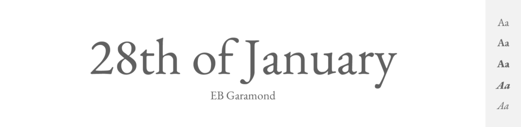
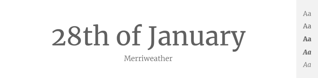
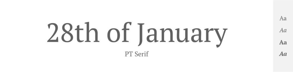
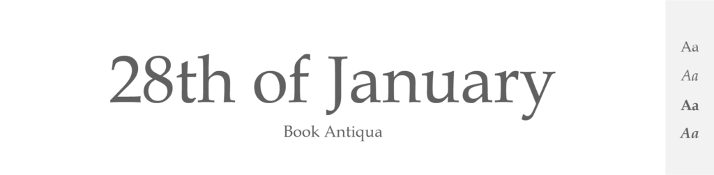
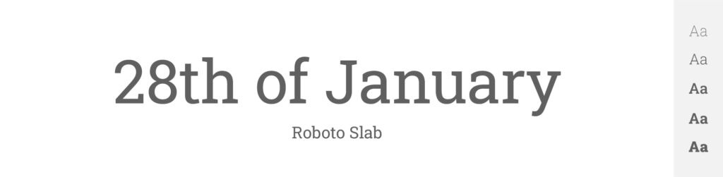
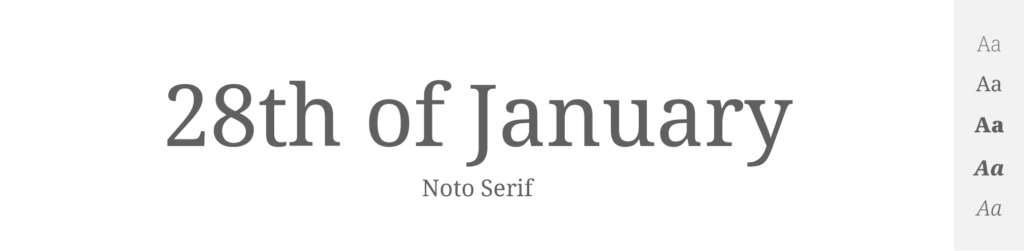
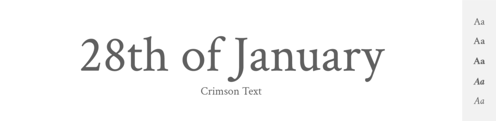
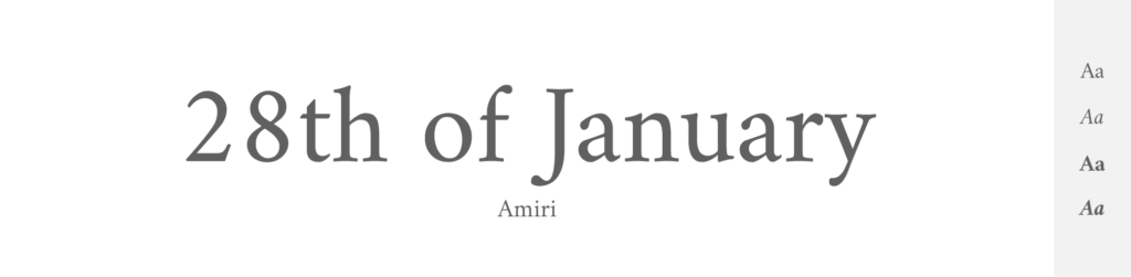
What’s a ‘serif'?

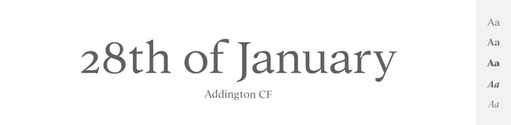
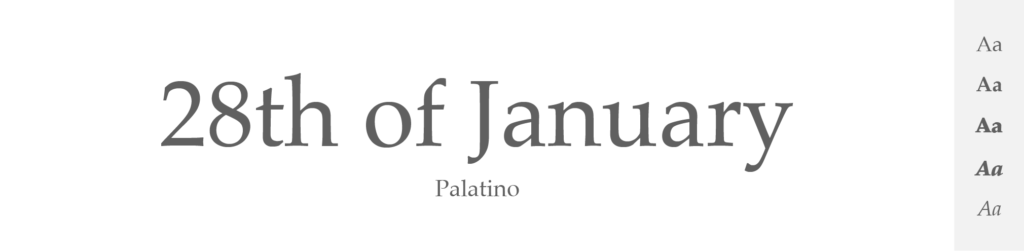
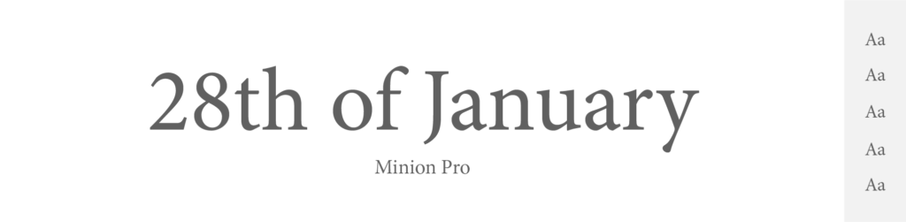
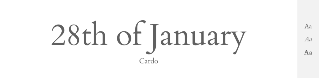
Times New Roman is a ‘serif' font, meaning it has those little decorative strokes or ‘feet' at the end of its letters. And this feature actually helps guide the reader's eye along lines of text, which is why it's often used in books and long articles.

As for me, I am not that big of a fan of serif fonts. I prefer sans serifs, which don’t have the ‘lines' – just because they are more simple and modern. But sometimes you have to use serif, because it simply fits better.

A bit of Times New Roman's history

So, the beginnings of this font are actually pretty awesome: The Times New Roman font was designed for The Times newspaper of London in 1931, following a critique of the newspaper's typographic style. The critique came from Stanley Morison, a type consultant at the British branch of the Monotype Corporation. Morison criticized the newspaper for its outdated typography and printing methods. In response, The Times actually commissioned Morison to create a new text font. Morison partnered with Victor Lardent, a designer at The Times, and the two worked together to create Times New Roman. Pretty unique, right? Imagine getting a gig by criticizing someone else's typeface.

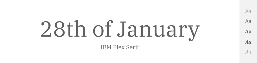
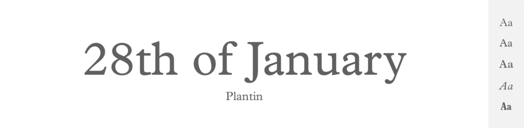
When creating the font, Morison was influenced by a number of classic serif fonts, including Plantin, and his intention was to create a font that was efficient (fitting more words into a given space without compromising readability), yet robust and appealing.

And as we all now know, he did create something unique. The result was the Times New Roman, a font that could be easily read in the narrow columns of a newspaper. It had taller x-height (the height of lowercase letters), which improved readability, and its condensed width allowed more words per line. These attributes, in combination with its clear, objective, and undeniably professional feel, quickly made it a popular choice for a variety of printed materials beyond newspapers.

Since its creation, Times New Roman has become one of the most used fonts in history, particularly for body text in books, periodicals, and professional documents. Today, it's included as a standard font in most word processing programs, and while it's sometimes viewed as a “default” or even “boring” choice due to its ubiquity, I still think it’s a masterpiece that will always be written in the history of typography.

What is Times New Roman most used for?

As I was saying, Times New Roman in nowadays included in most word processing programs as a standard font. So you can use it practically for anything. But here are some of its most common uses:
  • Print Publishing: Not that surprising given its origins as a newspaper typeface. Times New Roman has a long history in print, so it's commonly used in newspapers, magazines, and books, particularly for body text.
  • Academic Writing: Times New Roman is frequently the default or recommended font for academic papers, theses, dissertations, and articles. This is because it is universally available, easy to read, and gives a formal, authoritative appearance to text.
  • Legal Documents: The clarity and formality of Times New Roman make it a popular choice for legal documents, contracts, and official forms.
  • Business Communications: Many businesses use Times New Roman for both internal and external communications, including reports, proposals, presentations, and professional correspondence.
  • Digital Publishing: Although some argue that it's not the optimal font for screen reading, Times New Roman is often used in digital publishing because of its ubiquity and familiarity.
  • Design: In graphic design, Times New Roman is often used when a classic, trustworthy, or traditional feel is desired.

Conclusion

There are like milions of fonts and typefaces that are in the style of serif – which means they have those little decorative lines or feet at the ends of their strokes. Serifs are often used in print and are great for reading long passages because those little lines help guide your eyes along the sentences.

And when it comes to serif fonts, there is clearly one big well-known star: Times New Roman. But Times New Roman is so overused, it's like the ‘water' of the serif beverage selection. And luckily for us designers, these days there are many more serif fonts, that you can choose from. If you don’t know which ones to try, I’d recommend starting with EB Garamond, Meriweather, Libre Baskerville, Roboto Slab, Noto Serif, or any other from this list.

But it all comes down to what you’re designing. Because when it comes to serif font, a very little is needed to the text to feel like it’s “too much”. 

Author

Author:

Latest Articles on Goofy Designer