Summary: Today, I came up with a list of ten amazing animated button templates that will make your YouTube viewers subscribe to your channel. My favorite ones are:
- YouTube Subscribe Button – for After Effects
- Youtube Subscribe – when using Premiere Pro
- YouTube Subscribe Buttons – for Final Cut Pro, or Apple Motion
- Youtube Subscribe – made for DaVinci Resolve
Growing a YouTube channel relies heavily on encouraging viewers to hit that ‘Subscribe' button. You’ll probably agree if I say that an engaging subscribe animation can make all the difference, catching the viewer's eye and giving a professional touch to your videos. In this article, I'll be sharing what I believe are the best YouTube subscribe animation templates that can add a sprinkle of charm to your videos. Let's explore them together!
TOP 10: best animated subscribe templates for YouTube
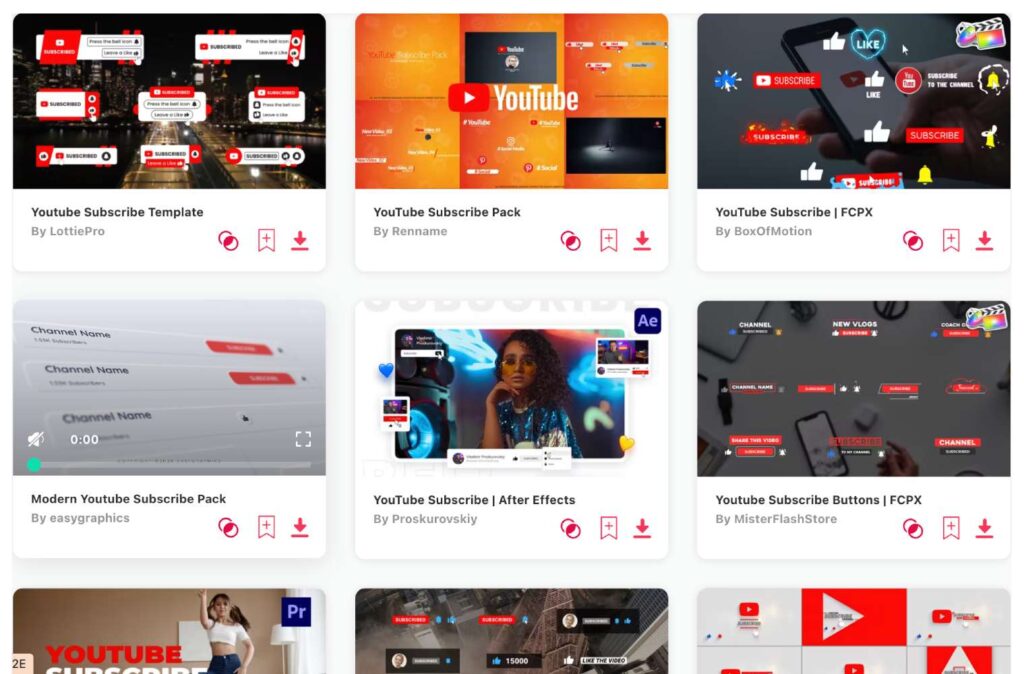
- YouTube Subscribe Button – After Effects
- Youtube Subscribe – Premiere Pro
- YouTube Subscribe Buttons – Final Cut Pro, Apple Motion
- Youtube Subscribe – DaVinci Resolve
- YouTube Subscribe Button – Premiere Pro
- YouTube Subscribe Reminder – After Effects
- Youtube Subscribe Elements – DaVinci Resolve
- YouTube Like & Subscribe – Final Cut Pro, Apple Motion
- Subscribe Buttons for Youtube – Premiere Pro
- Youtube Subscribe Toolkit – After Effects
1. YouTube Subscribe Button
- Resolution: 3840 x 2160
- File Size: 35MB
- Supports: After Effects
- Tags: 4k, Animation, Alert, Asian, Button, Designer, Korean, Mockup, Notification, Resize, Social Media, Subscribe, Thumbs Up, Youtube, Multilanguage
2. Youtube Subscribe
- Resolution: 1920 x 1080
- File Size: 34.9MB
- Supports: Premiere Pro
- Tags: Animation, Broadcast, Business, Clean, Corporate, Elegant, Intro, Logo, Modern, Opener, Package, Promo, Social Media, Text, Youtube
3. YouTube Subscribe Buttons
- File Size: 6.9MB
- Supports: Final Cut Pro, Apple Motion
- Tags: Animation, Blog, Corporate, Creative, Design, Gaming, Instagram, Intro, Logo, Marketing, Opener, Overlay, Promo, Social Media, Youtube
4. Youtube Subscribe
- Resolution: 1920 x 1080
- File Size: 101.6MB
- Supports: DaVinci Resolve
- Tags: Advertising, Blog, Broadcast, Corporate, Dynamic, Fashion, Instagram, Intro, Notification, Opener, Promo, Social Media, Style, Subscribe, Youtube
5. YouTube Subscribe Button
- Resolution: 1080 x 1920
- File Size: 137MB
- Supports: Premiere Pro
- Tags: Advertising, Animation, Blog, Broadcast, Corporate, Design, Documentary, Effects, Film, Logo Intro, Promo, Social Media, Text, Web, Youtube
6. YouTube Subscribe Reminder
- Resolution: 1920 x 1080
- File Size: 17MB
- Supports: After Effects
- Tags: Chanel, Clear, Follow, Intro, Lower Third, Promotion, Reminder, Social Media, Subscribe, Subscribers, Titles, Youtube
7. Youtube Subscribe Elements
- Resolution: 1920 x 1080
- File Size: 79MB
- Supports: DaVinci Resolve
- Tags: Animated, Badges, Davinci, Lowerthirds, Notification, Overlay, Resolve, Subscribe, Title, Youtube
8. YouTube Like & Subscribe
- File Size: 45.8MB
- Supports: Final Cut Pro, Apple Motion
- Tags: Blogger, Clean, Creative, Customizable, Design, Dynamic, Instagram, Logo, Marketing, Minimal, Notification, Promo, Simple, Social Media, Youtube
9. Subscribe Buttons for Youtube
- File Size: 22.4MB
- Supports: Premiere Pro
- Tags: Animation, Blog, Call to Action, Corporate, Creative, Design, Instagram, Intro, Logo, Marketing, Opener, Overlay, Promo, Social Media, Youtube
10. Youtube Subscribe Toolkit
- Resolution: 1920 x 1080
- File Size: 3.2MB
- Supports: After Effects
- Tags: Animated, Buttons, Elements, Social Media, Subscribe, Templates, Text, Titles, Ui, Youtube
Want more subscribe templates?
Browse and download tons of YouTube templates!
- If you want to find more templates, browse my favorite site: Envato Elements.
- On Envato, you can get unlimited downloads of thousands of video templates just with 1 subscription.
- I personally use Envato for all my videos & designs and couldn’t be happier – it helps me save so much time.
- They have literally milions of stock videos, photos, templates, music and much more!
Why use templates for your videos?
If you ask me, a good video template can save you hours, especially if we talk about crafring animations like subscribe buttons. Overall using templates offers a range of benefits, so here are some:
- Consistency in Branding: Templates ensure that every video you produce has a consistent look and feel. This can help solidify your brand identity, making it easily recognizable to your audience.
- Time Efficiency: Creating videos from scratch can be time-consuming. With a template, you can streamline the production process, saving valuable time that can be allocated to other tasks.
- Cost-Effective: Hiring designers or investing in high-end graphics for each video can be costly. Templates, especially if reused, offer a more budget-friendly alternative without compromising on quality.
- Professional Look: High-quality templates can give your videos a polished and professional appearance, which can enhance your credibility and appeal to your target audience.
- Ease of Use: For those without advanced video editing skills, templates provide an easy way to create videos. Many platforms offer drag-and-drop interfaces that make the process user-friendly.
- Consistent Quality: With templates, you're assured of a certain standard of quality. There's less room for error, and you don’t have to worry about varying quality across different videos.
- Versatility: There are templates available for nearly every genre, style, or purpose – be it intros, outros, animations, transitions, or titles. This allows creators to maintain a fresh and diverse approach to content without starting from zero every time.
- Scalability: For businesses or creators producing content in bulk or series, templates can be a boon. They allow for rapid production without compromising on the consistency or quality of the content.
- Inspirational Foundation: Templates can serve as a starting point, sparking ideas and inspiration for content creators. They can be tweaked and adjusted to fit specific needs, but having a foundation can guide the creative process.
- Predictable Results: Especially important for businesses, using templates ensures that the final product aligns with brand guidelines and meets predefined standards.
How should a good subscribe button look like?
I believe a good YouTube subscribe button should possess several qualities to make it effective. Here's a breakdown:
- Visibility: The button should be easy to spot. This doesn't necessarily mean it should be overly large, but its color, contrast, and placement should make it stand out in the context of the video or the page.
- Consistency with Brand: The design, color scheme, and style should resonate with the branding of the channel. This helps in creating a cohesive look and feel for viewers.
- Clarity: The button should clearly convey its function. Typically, the word “Subscribe” is sufficient, but some channels may incorporate additional elements like a play icon or the YouTube logo for added clarity.
- Simplicity: While it's important for the button to stand out, it shouldn't be overly complex or intricate. Too much detail can be distracting and might take the viewer's attention away from the content.
- Animation: Some of the most effective subscribe buttons use subtle animations to draw attention. For example, a slight bounce, a hover effect, or a gentle pulse can catch a viewer's eye without being overly intrusive.
- Placement: It's commonly placed towards the end of the video, often accompanied by a call-to-action (CTA). However, some creators also use a watermark (a smaller, semi-transparent logo) that stays in one corner of the video and serves as a constant reminder.
- Mobile Responsiveness: Given that a significant portion of YouTube views come from mobile devices, ensuring that the subscribe button is clear and functional on smaller screens is crucial.
- Compliance: Make sure to adhere to YouTube's branding guidelines when designing or using custom subscribe buttons outside of the platform.
- Feedback on Interaction: If possible, having a subtle change (like a color shift or an animation) when the user hovers over or clicks the button can give them feedback, ensuring they know their action was registered.
- Adaptability: Depending on your content and aesthetics, the subscribe button should be adaptable. For instance, if you have a light-themed video, a dark button might stand out better, and vice-versa.
Conclusion
It's clear that the right YouTube subscribe button can make a significant difference in audience engagement. While aesthetics matter, the perfect template seamlessly blends with your content, ensuring viewers focus on your message without distractions.
If you didn’t find the perfect template here, don’t worry! Browse thousands of other YouTube subscribes and pick the best one yourself.
As you continue your YouTube journey, remember to select templates that reflect your brand and resonate with your audience. Because in the end, it's not just about gaining a subscriber; it's about creating a lasting connection.
