Summary: I've gone through a whole bunch of fonts and picked out the top 30 to make your magazine really stand out. Now, let's chat about my top 3 faves:
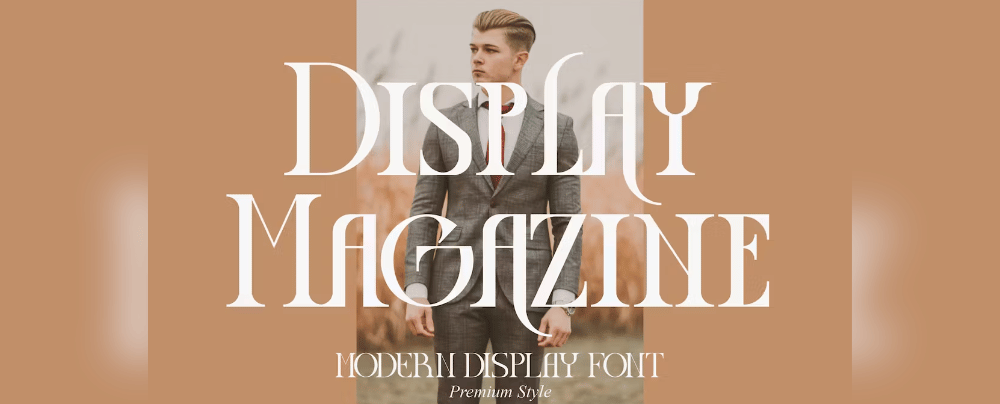
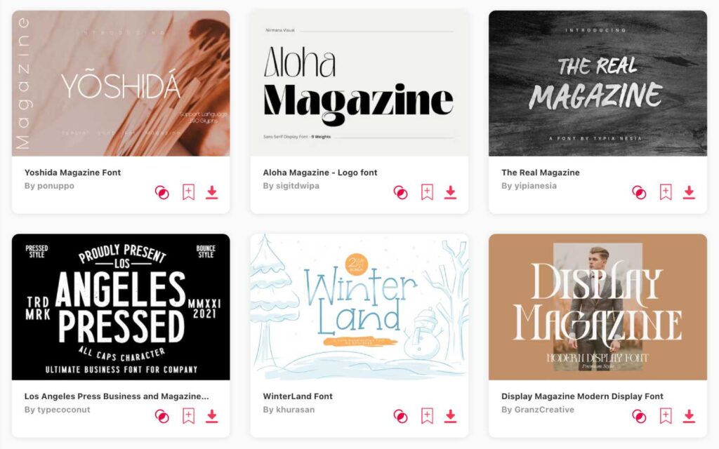
- Display Magazine Modern: Perfect for cutting-edge, trendy magazines. It's my top pick!
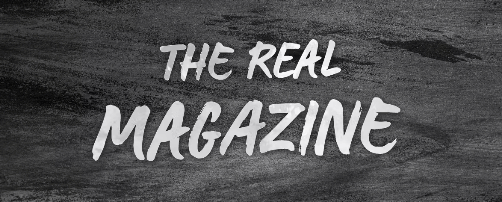
- The Real Magazine: Super readable and stylish, great for just about any kind of magazine.
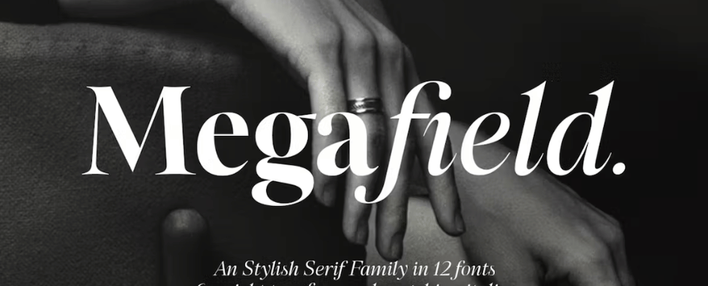
- Megafield: Versatile, ideal for magazines that have different kinds of articles and features.
Picking the right font for your magazine is like finding the secret ingredient for your grandma's famous recipe—it makes all the difference! Whether you're launching a hip lifestyle mag or a high-brow art journal, the right font can make your pages sing. So don't be shy, dig into my handpicked list and find that game-changing font to make your magazine a must-read!

Display Magazine Modern
- Licence: Envato
- About Display Magazine Modern: Tailored specifically for modern magazine layouts, this font is suitable for trendy and contemporary publications.
The Real Magazine
- Licence: Envato
- About The Real Magazine: As the name suggests, this font is engineered for real-world magazine applications where readability and style coexist.
Megafield
- Licence: Envato
- About Megafield: Offering a family of font choices, Megafield is a versatile pick for magazines with various sections and needs.
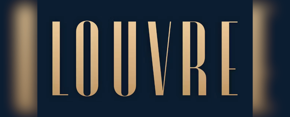
Louvre
- Licence: Envato
- About Louvre: Inspired by the elegance of the famous museum, Louvre is ideal for arts and culture magazines.
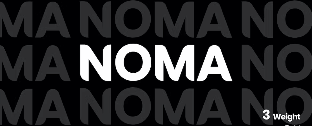
NOMA
- Licence: Envato
- About NOMA: NOMA is a clean sans-serif, perfect for text-heavy publications seeking easy readability.
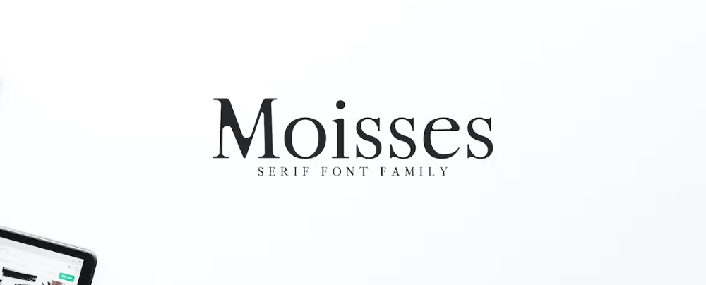
Moisses
- Licence: Envato
- About Moisses: This serif family pack is excellent for high-end editorial where a range of tones and styles is needed.
Robinson Regular
- Licence: Envato
- About Robinson Regular: This regular typeface offers a classic feel, suitable for traditional or general-interest magazines.
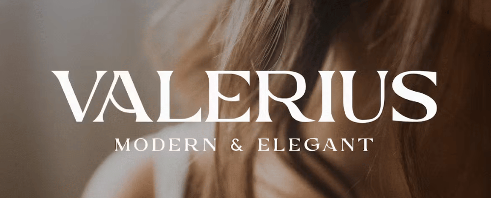
Valerius
- Licence: Envato
- About Valerius: Valerius brings an air of sophistication, ideal for luxury lifestyle or fashion magazines.
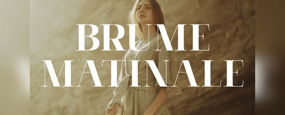
Brume Matinale
- Licence: Envato
- About Brume Matinale: A blend of modern and classic styles, this font suits a magazine that aims to reach a broad audience.
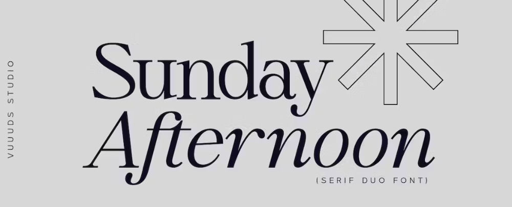
Sunday Afternoon
- Licence: Envato
- About Sunday Afternoon: This casual font is perfect for light-hearted or lifestyle-focused publications.
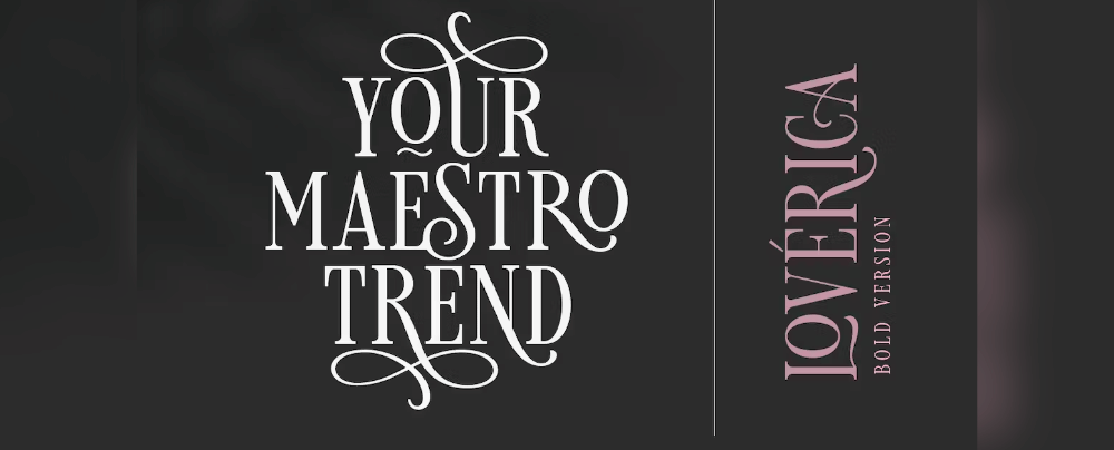
Loverica Bold
- Licence: Envato
- About Loverica Bold: With its bold styling, Loverica is perfect for headers and titles in a modern publication.
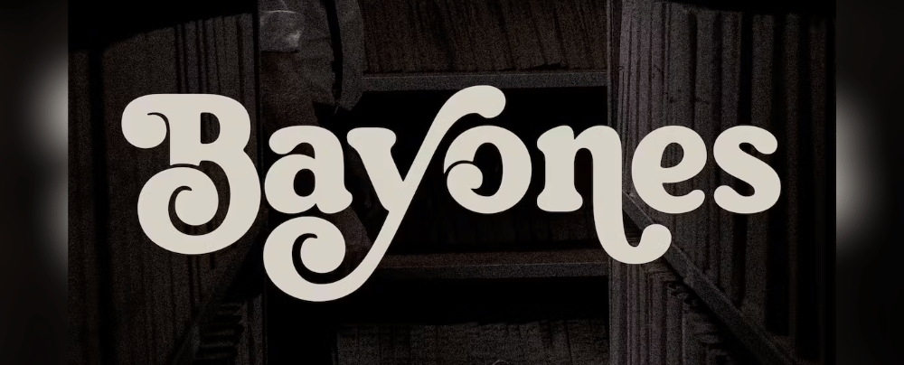
Bayones
- Licence: Envato
- About Bayones: Bayones offers a sleek and modern design, suitable for tech or design-centric magazines.
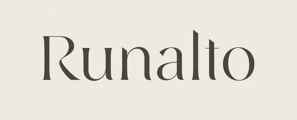
Runalto
- Licence: Envato
- About Runalto: Runalto provides an opulent feel, ideal for luxury or high-end publications.
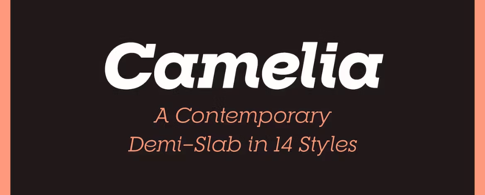
RNS Camelia
- Licence: Envato
- About RNS Camelia: With a friendly and readable design, this font is well-suited for educational or how-to magazines.
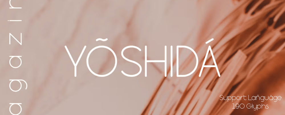
Yoshida
- Licence: Envato
- About Yoshida: Yoshida is designed for modern magazines focused on culture or technology.
Stickler
- Licence: Envato
- About Stickler: Stickler is ideal for magazines that want to appear up-to-date and contemporary.
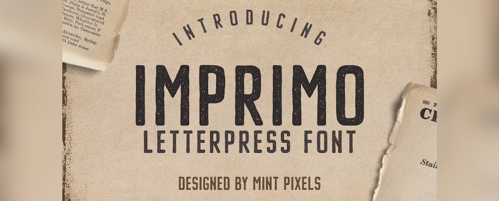
Imprimo Letterpress
- Licence: Envato
- About Imprimo Letterpress: Evoking an old-world letterpress style, Imprimo is perfect for vintage or history-themed magazines.
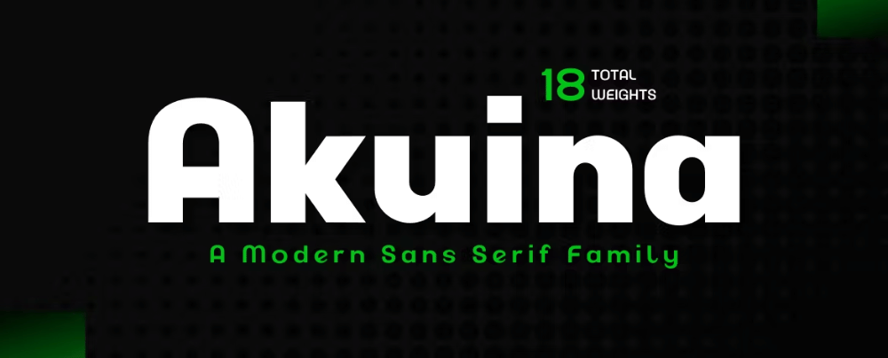
Akuina
- Licence: Envato
- About Akuina: Akuina's design is smooth and flowing, ideal for beauty or lifestyle magazines.
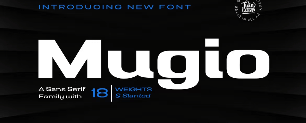
Mugio
- Licence: Envato
- About Mugio: With its clean lines, Mugio is a strong choice for minimalist or design-focused publications.
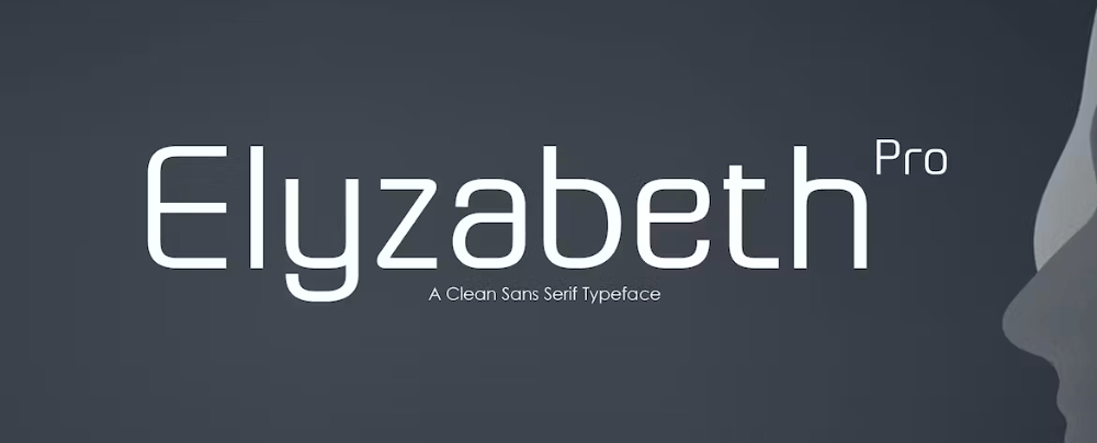
Elyzabeth Pro
- Licence: Envato
- About Elyzabeth Pro: A comprehensive family that can cover everything from headers to body text, ideal for multi-faceted magazines.
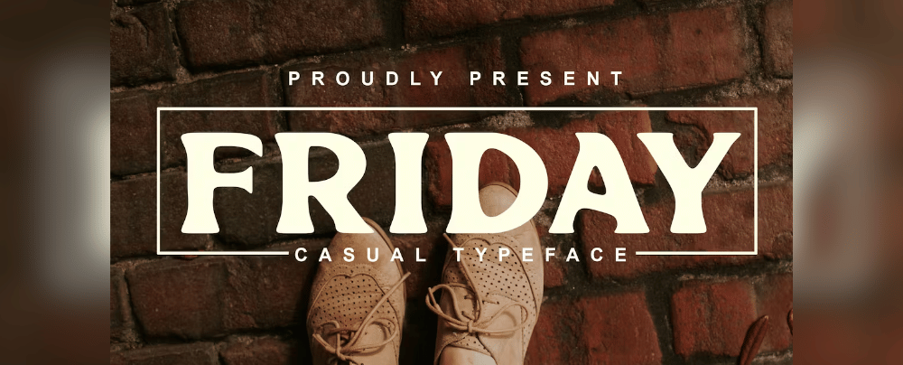
Friday
- Licence: Envato
- About Friday: Friday offers a relaxed, casual style that’s perfect for weekend or lifestyle magazines.
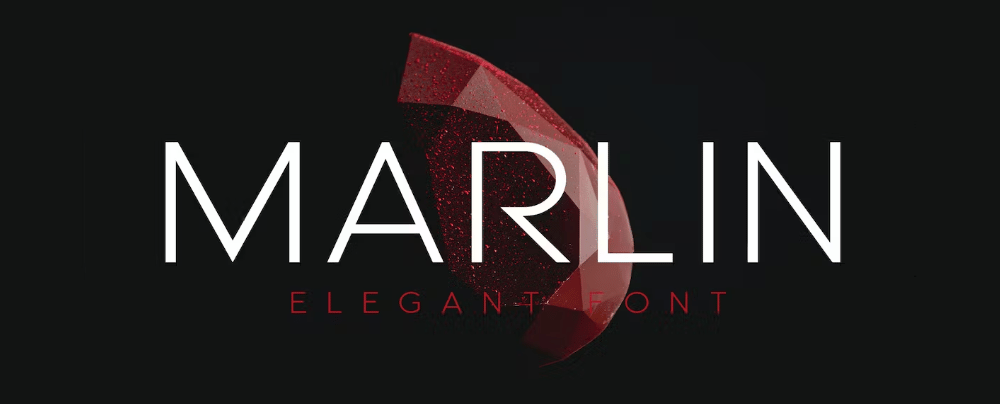
MARLIN
- Licence: Envato
- About MARLIN: Marlin brings a touch of luxury, suitable for high-end or exclusive publications.
Enertax
- Licence: Envato
- About Enertax: This font has a tech-oriented design, making it suitable for science or technology magazines.
Crocker
- Licence: Envato
- About Crocker: Crocker offers a classical design, suitable for general-interest or educational magazines.
Want more amazing fonts?
Browse tons of fonts & design elements!
- If you want to find more fonts, browse my favorite site: Envato Elements.
- On Envato, you can get unlimited downloads of thousands of design assets just with 1 subscription.
- I personally use Envato for all my designs and couldn’t be happier – it helps me save so much time.
- They have literally millions of stock photos, videos, fonts, templates, music, and much more!
How to pick the best font for magazines?
- Identify the Magazine's Genre: Pick a font that reflects the theme and audience of your magazine—whether it's lifestyle, technology, or luxury.
- Focus on Readability: Make sure the font is easy to read in both headings and body text, and that it remains legible in different sizes and formats.
- Test for Visual Cohesion: The selected font should harmonize with other design elements such as color schemes, layouts, and images.
- Check for Versatility: Choose a font family that offers a range of weights and styles, which allows you to differentiate headings, subheadings, and body text without jarring the reader.
- Assess Market Trends: Research fonts commonly used in successful magazines within your genre to gain insights into what is both effective and on-trend.
What are magazine fonts usually used for?
- Magazine Covers: In my opinion, the right font can make or break a magazine's first impression, and that's why the cover font is so crucial.
- Headlines & Subheadings: I believe a striking yet readable font here sets the tone for the entire article, guiding the reader's eye through the content.
- Body Text: For ease of reading, you should opt for a font that's not too ornate but still complements the magazine's overall design.
- Captions & Credits: I think legibility is key here, but don't overlook the opportunity to inject a bit of style consistent with the magazine's vibe.
- Pull Quotes: In this case, fonts that stand out while matching the theme of your magazine can really elevate the reader's experience.
- Table of Contents: Versatility is crucial. A font family that offers multiple weights and styles can create a cohesive yet dynamic table of contents.
- Editorials & Opinion Pieces: I find that these pieces often warrant their own stylistic touches—fonts that reflect the uniqueness of the writer's voice can be particularly effective.
- Digital Versions: If your magazine has a digital presence, it's essential to pick a font that looks as good on a screen as it does in print.
- Special Sections or Features: Fonts can underscore the significance of special articles, creating an atmosphere or setting the scene for the reader.
Conclusion
When it comes to choosing the ideal font for your magazine, think of it like the secret sauce that really makes your publication pop. Seriously, the perfect font can take your magazine from good to unputdownable. Whether you're jazzing up the cover or making sure the articles are a breeze to read, a versatile font is your best buddy. In my book, Display Magazine Modern, The Real Magazine, and Megafield are the top dogs. These fonts are pretty much the multitools of the magazine world—super flexible but still full of personality. So go ahead, choose one of these fonts and watch your magazine turn into an unforgettable piece!
