Summary: In this article, I've curated 25 carefully chosen fonts that I believe are ideal for books. Let's now explore the top picks from this selection:
- EB Garamond: Timeless elegance, ideal for historical themes.
- King's Caslon: Reliable charm for nostalgia or seriousness.
- Sabon: Versatile and timeless, enhances content variety.
These three fonts provide a solid starting point for creating visually appealing and easily readable book layouts, however, there are tons of other options to choose from. In this article, I carefully curated 22 more fonts I personally use on book projects – both free and paid options.
Choosing the right font for books is crucial as it significantly impacts readers' experience, comprehension, and emotional connection to the content. Different book genres and moods call for various font characteristics to best convey their themes.
TOP 25 fonts for books
- EB Garamond – Free: Google Font
- King's Caslon – Paid
- Sabon – Paid
- Minion – Paid
- Palatino – Paid
- Georgia – Paid
- Utopia – Paid
- Goudy Old Style – Paid
- Libre Baskerville – Free: Google Font
- Merriweather – Free: Google Font
- Lora – Free: Google Font
- Noto Serif – Free: Google Font
- Libre Franklin – Free: Google Font
- Abril Fatface – Free: Google Font
- Raleway – Free: Google Font
- Oxygen – Free: Google Font
- Eczar – Free: Google Font
- Trirong – Free: Google Font
- Spectral SC – Free: Google Font
- Adobe Jenson Pro – Paid
- Cormorant – Free: Google Font
- Quicksand – Free: Google Font
- Quattrocento – Free: Google Font
- Libre Caslon Display – Free: Google Font
- Crimson Pro – Free: Google Font
EB Garamond
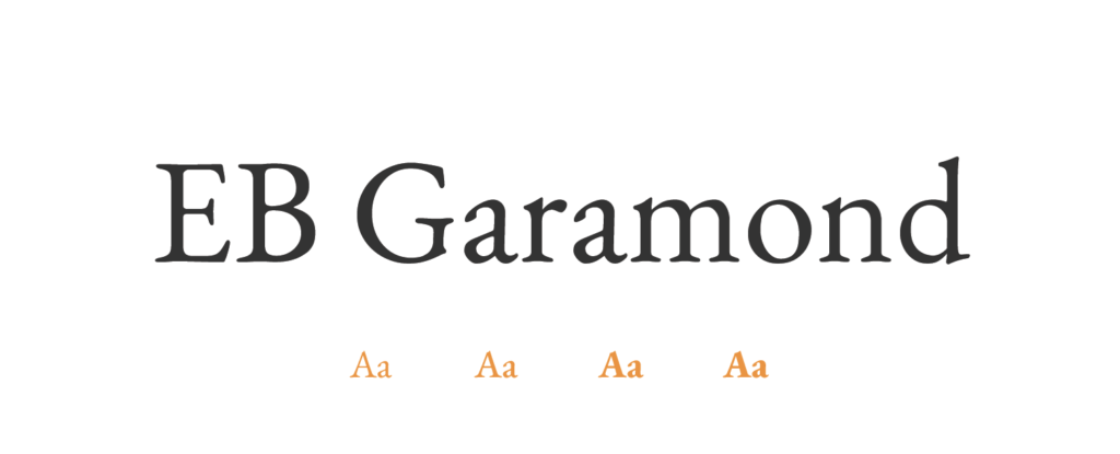
- Free or Paid: Free – Google Font
- How many styles: Total 10 styles = 5 upright weights and 5 italic (regular, medium, semibold, bold & extrabold)
- Usually used for: Formal documents and high-end print materials. Commonly used in typesetting for books and publications rather than for logo designs.
- Summary: EB Garamond is a classic and elegant choice, perfect for providing a timeless reading experience during long sessions.
King's Caslon
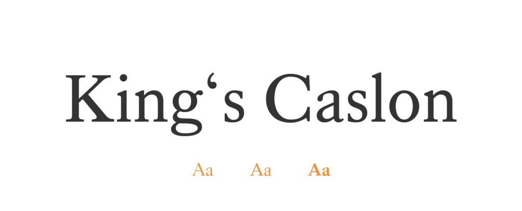
- Free or Paid: Paid – Adobe Fonts (from Dalton Maag)
- How many styles: Total 6 styles = 3 upright weights and 3 italic (regular, bold, display)
- Usually used for: Classic book typesetting and elegant book covers, evoking literary heritage and sophistication.
- Summary: King's Caslon is a reliable and readable option that adds a touch of charm to historical and serious themes.
Sabon
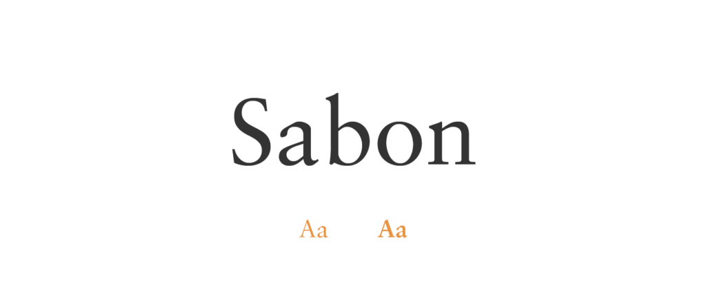
- Free or Paid: Paid – Adobe Fonts (from Jan Tschichold)
- How many styles: Total 4 styles = 2 upright weights and 2 italic (regular, bold)
- Usually used for: Book layouts and typesetting, bringing elegance and clarity to the pages of literary works. Also commonly used for corporate branding and professional correspondence.
- Summary: Sabon is a versatile font, standing the test of time and working equally well for both print and digital media.
Minion
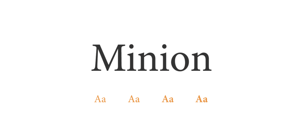
- Free or Paid: Paid – Adobe
- How many styles: Total 65 styles = it has 4 classic weights both upright and italic (regular, medium, semibold, and bold) + 4 variations of these (classic, caption, display, subhead) + some of them also in a condensed version.
- Usually used for: Book typesetting, professional documents, and editorial design. Additionally, it can be used for creating impactful and memorable business cards.
- Summary: Minion is a clear and legible font, thoughtfully designed for books and extended texts.
Palatino
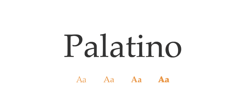
- Free or Paid: Paid – Linotype
- How many styles: Total 10 styles = 5 weights (light, roman, medium, bold, black), all upright & italic.
- Usually used for: Print media like magazines, newspapers, and book typesetting. Also suitable for creating stylish and sophisticated event invitations.
- Summary: Palatino is a well-balanced and easy-to-read choice, widely favored in various printed materials.
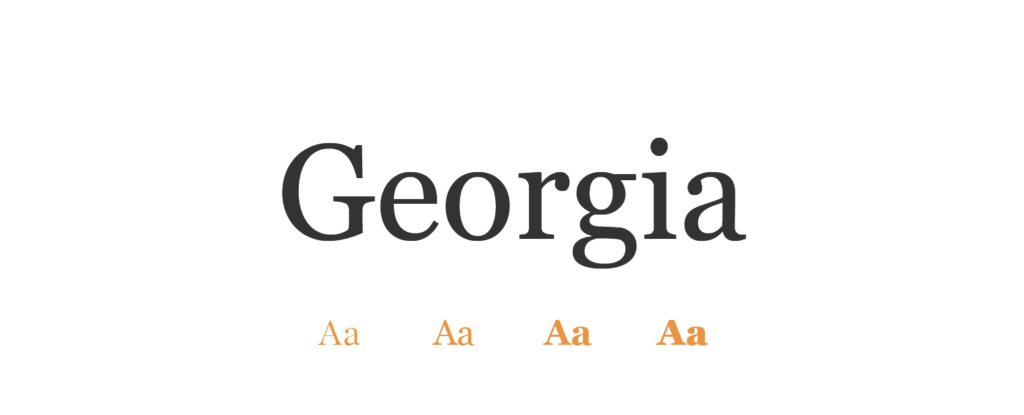
Georgia
- Free or Paid: Paid – Monotype
- How many styles: Total 20 styles = 5 classic upright weights & 5 italic (light, regular, semibold, bold, black) + all also condensed.
- Usually used for: Digital content, especially for body text and headings websites, and online platforms. It is also suitable for creating visually appealing print materials.
- Summary: Georgia is reader-friendly and web-friendly, making it a versatile option for screens and print media alike.
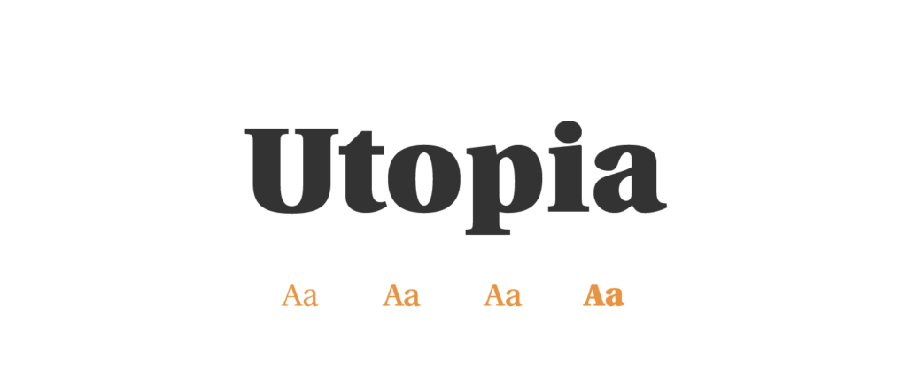
Utopia
- Free or Paid: Paid – Adobe Fonts (from Robert Slimbach)
- How many styles: Only 1 style = Utopia Std Black Headline
- Usually used for: Academic books and scholarly publications, conveying complex ideas with impeccable readability. Also commonly used in academic and scientific documents.
- Summary: Utopia combines modernity with approachability, making it an ideal fit for contemporary book designs.
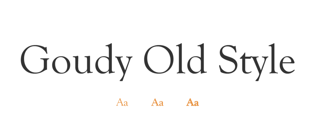
Goudy Old Style
- Free or Paid: Paid – Adobe Fonts (from URW Type Foundry)
- How many styles: Total 4 style = 3 weights (regular bold extra bold), 1 regular italic
- Usually used for: Book titles and vintage-inspired designs, adding a touch of nostalgia and refined charm. Also commonly used in print advertising and signage.
- Summary: Goudy Old Style exudes artistic flair and uniqueness, adding a creative touch to any text.
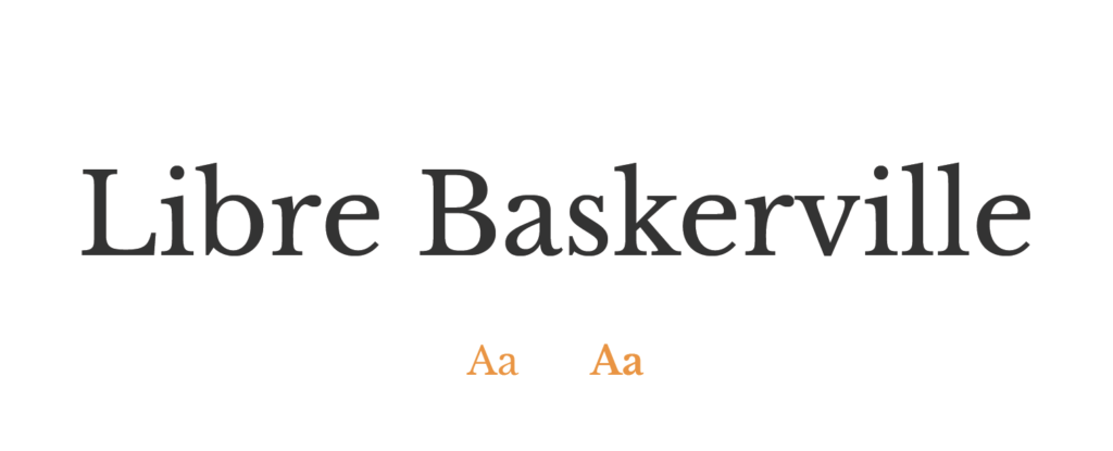
Libre Baskerville
- Free or Paid: Free – Google Font
- How many styles: Only 3 styles = regular, bold & italic.
- Usually used for: Body text for websites and professional documents. Also suitable for creating a refined look in resumes and curriculum vitae.
- Summary: Libre Baskerville offers a classic look with open-source availability, making it a good match for modern book layouts.
Merriweather
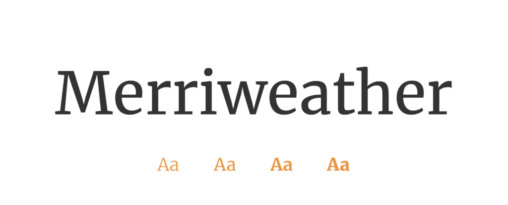
- Free or Paid: Free – Google Font
- How many styles: Total 8 styles = 4 upright & 4 italic (light, regular, bold, black)
- Usually used for: Body text for websites and long-form content. Also suitable for print publications such as magazines and books.
- Summary: Merriweather's warm and inviting character suits a wide range of book genres, appealing to diverse audiences.
Lora
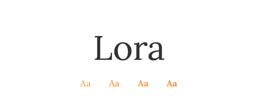
- Free or Paid: Free – Google Font
- How many styles: Total 8 styles = 4 weights (regular, medium, semibold & bold) + all upright and italic.
- Usually used for: Body text in websites, blogs, and magazines. Also suitable for a range of digital and print media.
- Summary: Lora's elegance and legibility make it a perfect choice for enhancing both headings and body text.
Noto Serif
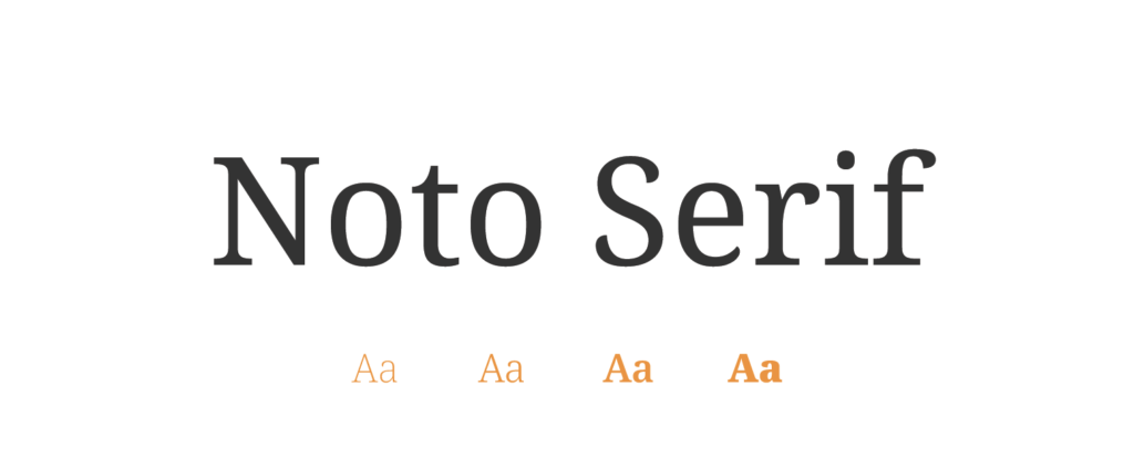
- Free or Paid: Free – Google Font
- How many styles: Total 18 styles = 9 upright weights & 9 italic (thin, extralight, light, regular, medium, semibold, bold, extrabold and black).
- Usually used for: Multilingual publications and digital content. Additionally, it can be used for creating visually appealing social media graphics.
- Summary: Noto Serif shines as a multilingual gem, ensuring simplicity and broad appeal across languages.
Libre Franklin
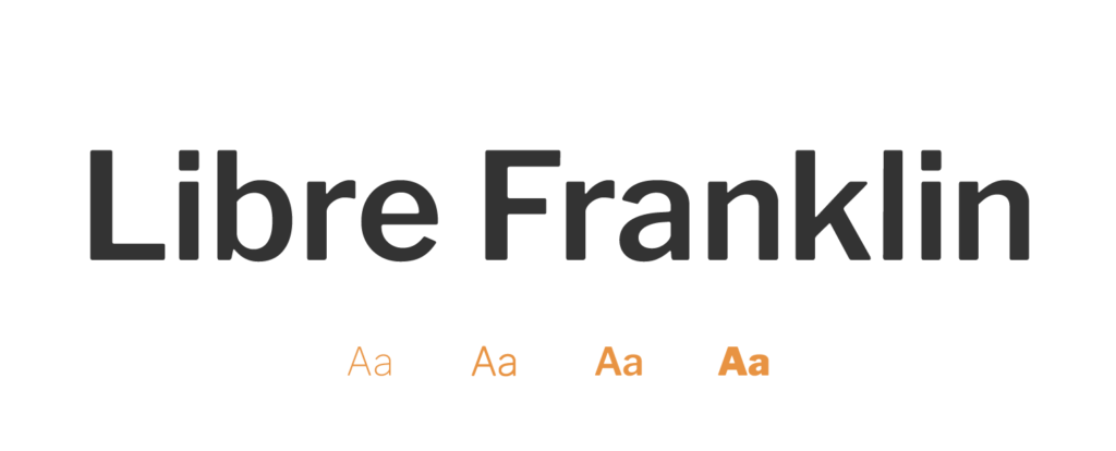
- Free or Paid: Free – Google Font
- How many styles: Total 18 styles = 9 upright weights & 9 italic (thin, extralight, light, regular, medium, semi bold, bold, extrabold, black).
- Usually used for: Modern book designs and contemporary literature, offering a clean and versatile aesthetic. Also commonly used in corporate presentations and brochures.
- Summary: Libre Franklin's clear and neutral design adapts seamlessly to various book layouts.
Abril Fatface
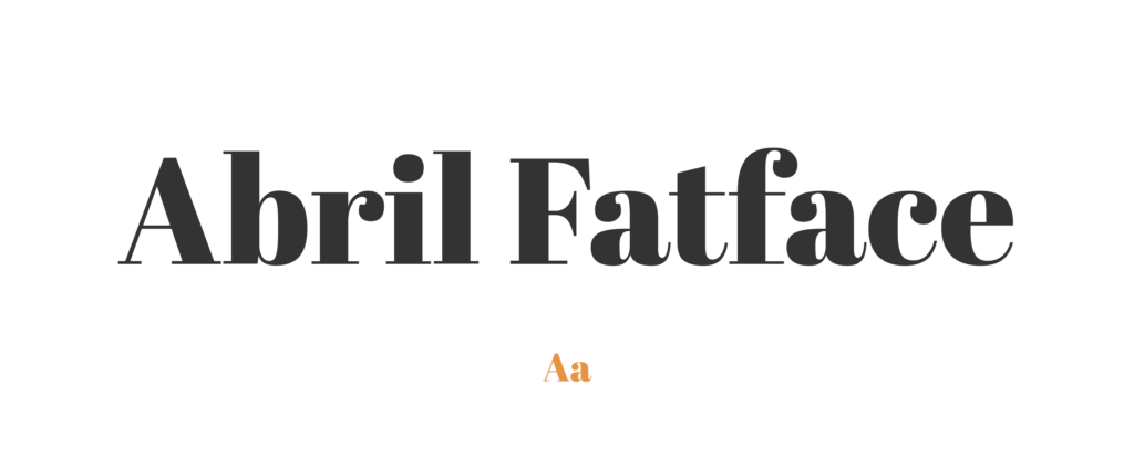
- Free or Paid: Free – Google Font
- How many styles: Only 1 style = Regular 400
- Usually used for: Eye-catching book titles and attention-grabbing covers, creating visually striking designs. Also commonly used in fashion and lifestyle publications.
- Summary: Abril Fatface's boldness commands attention, making it an excellent option for titles and headings.
Raleway
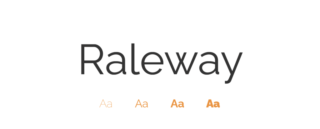
- Free or Paid: Free – Google Font
- How many styles: Total 18 styles = 9 upright & 9 italics (thin, extralight, light, regular, medium, semibold, bold, extrabold & black).
- Usually used for: Elegant and stylish headings. It is also popular for use in website body text.
- Summary: Raleway's modern versatility adds a contemporary flair to book designs of all kinds.
Oxygen
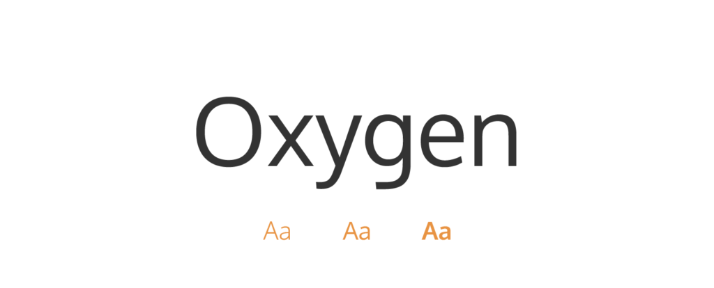
- Free or Paid: Free – Google Font
- How many styles: Total 3 styles = 3 weights (light, regular, bold).
- Usually used for: Book subtitles and digital content, ensuring clear and legible typography. Also commonly used in technical and instructional materials.
- Summary: Oxygen's clean and legible style is an excellent fit for technical or scientific literature.
Eczar
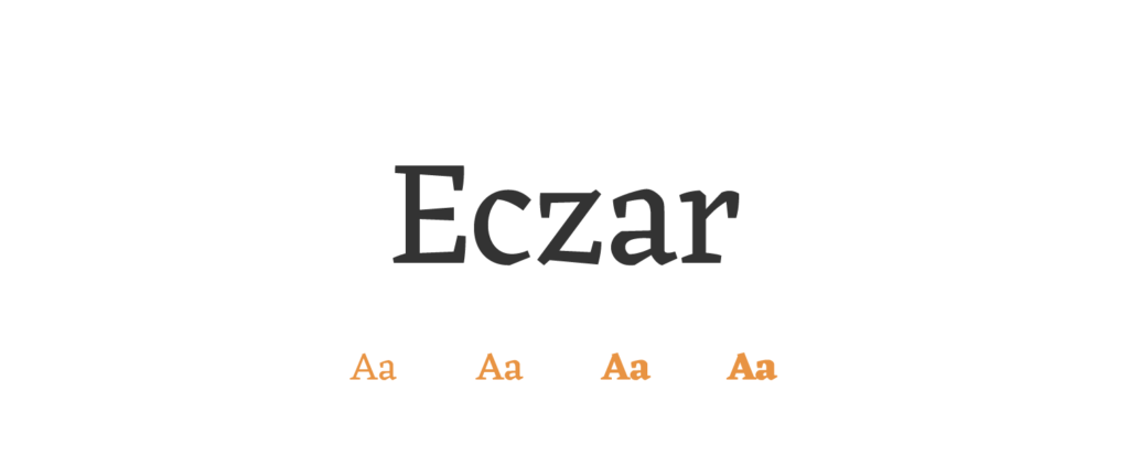
- Free or Paid: Free – Google Font
- How many styles: Total 5 styles = 5 weights (regular, medium, semibold, bold, extrabold).
- Usually used for: Book body text and extended reading, providing harmony and readability. Also commonly used in luxury branding and product packaging.
- Summary: Eczar's stylish presentation enhances books with artistic elements, adding a touch of sophistication.
Trirong
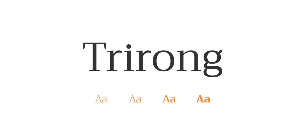
- Free or Paid: Free – Google Font
- How many styles: Total 18 styles = 9 weights and 9 italics (thin, extralight, light, regular, medium, semibold, bold, extra bold, black).
- Usually used for: A versatile font commonly found in print and digital mediums, popular for books, brochures, magazines, educational materials, and multilingual publications.
- Summary: Trirong's versatility accommodates a range of languages, making it well-suited for diverse book genres.
Spectral SC
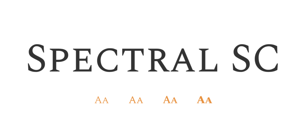
- Free or Paid: Free – Google Font
- How many styles: Total 14 styles = 7 weights and 7 italics (extralight, light, regular, medium, semibold, bold, extrabold).
- Usually used for: Book headings and typographic emphasis, adding a modern and refined touch. Also commonly used in branding for luxury products.
- Summary: Spectral SC's classic and elegant small-caps usage elevates the book's overall presentation.
Adobe Jenson Pro
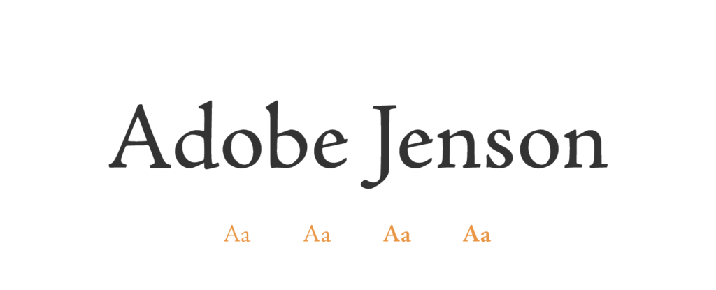
- Free or Paid: Paid – Adobe (from Robert Slimbach)
- How many styles: Total 32 styles = it has 4 classic sets of weights (light, regular, semibold & bold), in 4 different styles (regular, caption, display, & subhead), all available also in italic.
- Usually used for: High-quality print materials like books and invitations. Additionally, it can bring sophistication to luxury product packaging.
- Summary: Adobe Jenson Pro's sophisticated refinement adds a touch of luxury to high-quality book production.
Cormorant
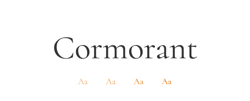
- Free or Paid: Free – Google Font
- How many styles: Total 10 styles = 5 weights (light, regular, medium, semibold & bold) – both upright & also italic.
- Usually used for: Display purposes such as headings and titles. Also works well for luxury brand identities.
- Summary: Cormorant's stylish adaptability complements various book themes, making it a versatile choice.
Quicksand
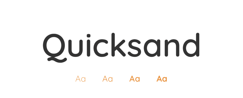
- Free or Paid: Free – Google Font
- How many styles: Total 5 styles = 5 weights – only upright & no italics (light, regular, medium, semibold & bold).
- Usually used for: Display and children's products due to its rounded, friendly letterforms. It's also often used in web design and children’s books.
- Summary: Quicksand's modern and clean appearance makes it a great fit for books targeting younger readers.
Quattrocento
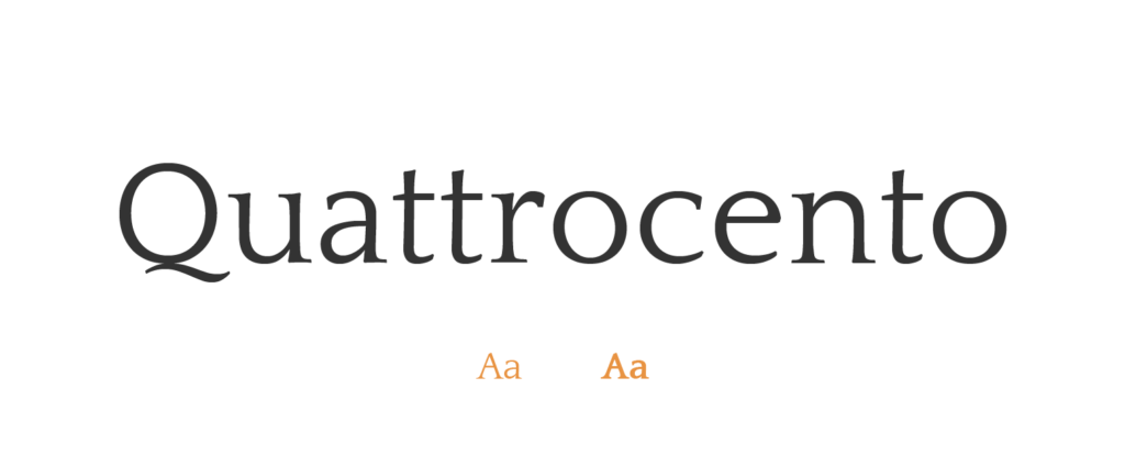
- Free or Paid: Free – Google Font
- How many styles: Total 2 styles = 2 weights – only upright & no italics (regular, bold).
- Usually used for: Book covers and chapter headings, infusing classic elegance. Also commonly used in historical and cultural publications.
- Summary: Quattrocento's classic and readable design suits historical or artistic topics with ease.
Libre Caslon Display
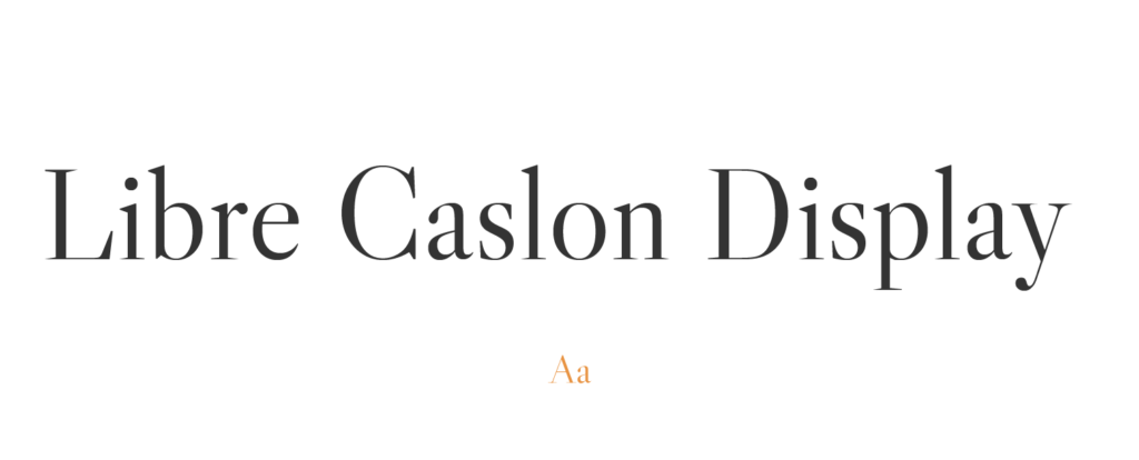
- Free or Paid: Free – Google Font
- How many styles: Total 1 style = regular 400
- Usually used for: Book chapter openings and ornamental elements, enhancing luxury and elegance. Also commonly used in logo design and branding.
- Summary: Libre Caslon Display's artistic and unique look creates eye-catching displays within books.
Crimson Pro

- Free or Paid: Free – Google Font
- How many styles: Total 16 styles = 8 upright + matching italics (extralight, light, regular, medium, semibold, bold, extra bold, black).
- Usually used for: Book body text and scholarly works, combining legibility and classic elegance. Also commonly used in academic journals and scholarly articles.
- Summary: Crimson Pro's elegant and legible style enhances both print and digital media, ensuring a delightful reading experience.
How to Choose Fonts for Books:
Selecting the perfect font for books involves considering various factors. Here are some of my personal reasons for choosing fonts in book design:
- Make readability a top priority: Ensure the font is easy on the eyes for a smooth reading experience.
- Align fonts with your book's theme and genre: Select fonts that complement the content and convey the right tone.
- Opt for timeless and classic fonts: They add elegance and refinement to your book's appearance.
- Use bold fonts for headers and titles: They grab attention and highlight important elements.
- Choose legible and pleasant fonts for the main text: Enhance the reading experience for your audience.
- Ensure compatibility with print and digital media: Make sure your font looks great in both formats.
- Mind font size and spacing: Appropriate size and spacing improve readability and prevent strain.
- Test fonts with sample text: See how they work in your book's context before finalizing.
- Limit the number of font styles: Maintain a clean and cohesive design by using fewer fonts.
- Seek feedback from others: Get opinions to ensure your font resonates with your readers.
Conclusion
Here are my top 25 font choices for books. Keep in mind that there are numerous options available, but the most critical factor is readability. You want your readers to have a smooth reading experience without straining their eyes. For instance, fonts like Abril Fatface work wonderfully for headers and titles, but for the main text, consider more legible options like Oxygen. Balancing aesthetics and readability ensures your book is both visually appealing and easy to read, delighting your readers throughout their journey.
