Summary: In this article, I picked 28 beautiful fonts that are perfectly suitable for children’s books & stories. The top ones are:
- Quicksand – Easily readable, elegant, yet still playful
- Ed's Market – Beautiful variable handwritten font
- Luckiest Guy – Bold & friendly attention-grabbing typeface
These are my top 3 picks, but honestly, there are literally hundreds amazing kids-friendly fonts out there. In this article I carefully picked 28 amazing options – most of them are free, some of them are paid.
When picking a font for your kid’s book, always keep mind the story your book tells. If you write a soft story about love or unicorns, go with something handwritten and pretty. If you write about friendship, or magic, you can go with something neutral or mysterious. And if your story is about cars, superheroes, or action, you should go with something bold and screaming.
TOP 28 fonts for children's books
- Quicksand – Free: Google Font
- Ed's Market – Paid
- Luckiest Guy – Free: Google Font
- Blambot – Paid
- Poppins – Free: Google Font
- Alisha – Paid
- Nunito – Free: Google Font
- Comic Sans – Free
- Sniglet – Free: Google Font
- HVD Comic Serif – Paid
- Bangers – Free: Google Font
- Boogaloo – Free: Google Font
- Patrick Hand – Free: Google Font
- Bubblegum Sans – Free: Google Font
- Gochi Hand – Free: Google Font
- Amatic SC – Free: Google Font
- Indie Flower – Free: Google Font
- Ribeye Marrow – Free: Google Font
- Sacramento – Free: Google Font
- Fredoka – Free: Google Font
- Archivo Black – Free: Google Font
- Cinema Script – Paid
- Voltage – Paid
- Ganache – Paid
- Smoothy – Paid
- Caprasimo – Free: Google Font
- Pacifico – Free: Google Font
- Brevia – Paid
Quicksand
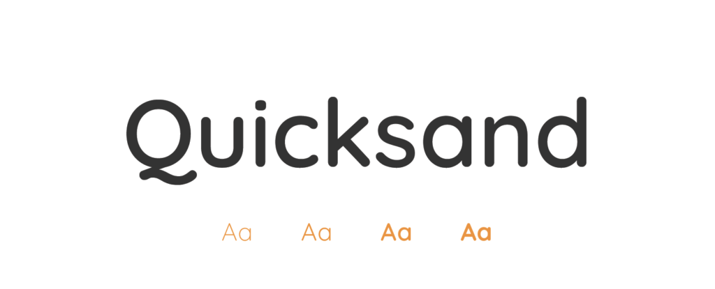
- Free or Paid: Free – Google Font
- How many styles: Total 5 styles = 5 weights – only upright & no italics (light, regular, medium, semibold & bold).
- Usually used for: Display and children's products due to its rounded, friendly letterforms. It's also often used in web design and digital media.
- Summary: Quicksand is clear, easy to read, and the rounded letters make it friendly and approachable for young readers.
Ed's Market
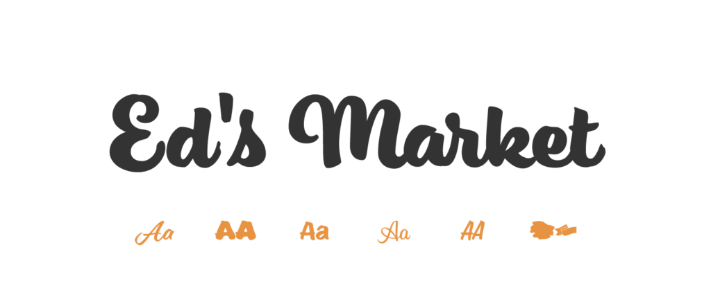
- Free or Paid: Paid – Adobe (by Laura Worthington Type)
- How many styles: Total 11 styles = each is different: main script, regular, regular slant, bold, bold script, bold slant, narrow, narrow slant, upright script, wide & design elements.
- Usually used for: Evoking a vintage, hand-lettered feel. It's an excellent choice for signage, product packaging, or any design that needs a personal touch.
- Summary: Ed's Market has a handmade, personal feel, making any story more engaging for kids.
Luckiest Guy
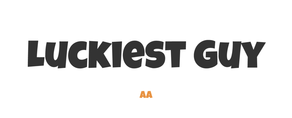
- Free or Paid: Free – Google Font
- How many styles: Only 1 style = Regular 400
- Usually used for: High impact areas like headlines and titles where a strong impression is needed. This font fits well with cartoon or comic themes.
- Summary: Luckiest Guy is exciting and bold, perfect for attention-grabbing titles and headers in children's books.
Blambot
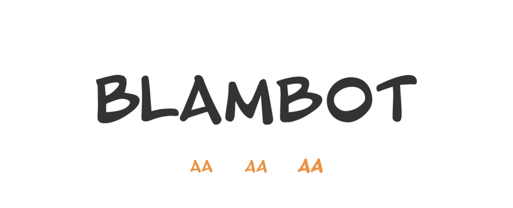
- Free or Paid: Paid – Adobe
- How many styles: 3 styles = regular, italic & bold.
- Usually used for: Comic book lettering and speech bubbles. It's a collection of fonts, so usage can vary, but the general application is in comic book art and design.
- Summary: Blambot, often seen in comic books, is great for any children's story with a lively narrative or dialogue.
Poppins
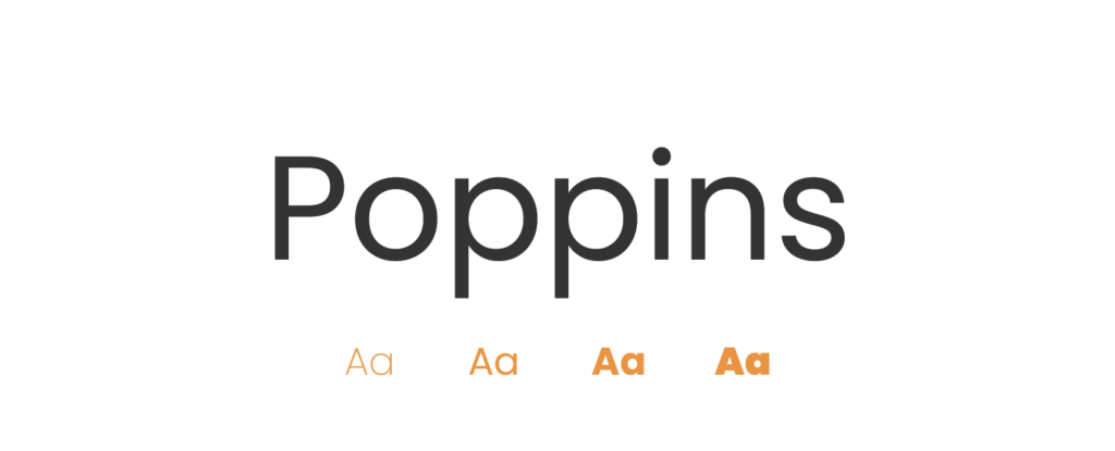
- Free or Paid: Free – Google Font
- How many styles: Total 18 styles = 9 upright weights & 9 italics weights (thin, extralight, light, regular, medium, semibold, bold, extrabold & black).
- Usually used for: Creative designs due to its geometric design and monolinear letterforms. It's also popular for children's media and advertising.
- Summary: Poppins is good for children's books due to its geometric sans-serif design which is visually appealing yet easy on the eyes.
Alisha
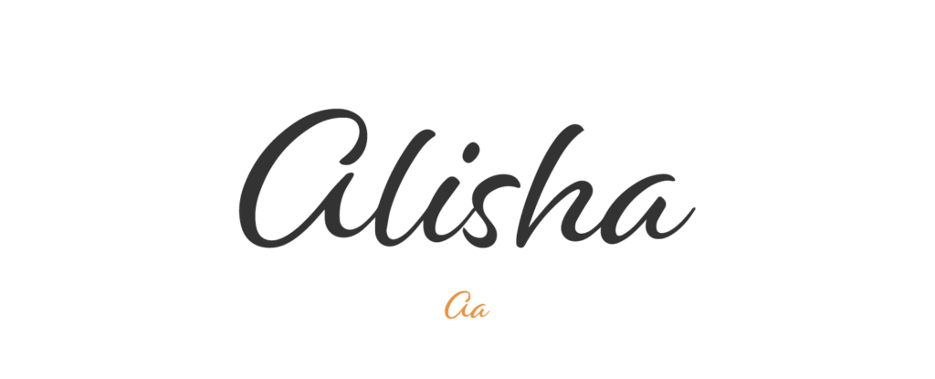
- Free or Paid: Paid – Adobe (by Laura Worthington Type)
- How many styles: Only 1 style = Alisha Regular.
- Usually used for: Designs that require a feminine and delicate touch. It works well for invitations, greeting cards, or any project that needs a sophisticated feel.
- Summary: Alisha is a stylish script font that remains easy to read for young readers.
Nunito
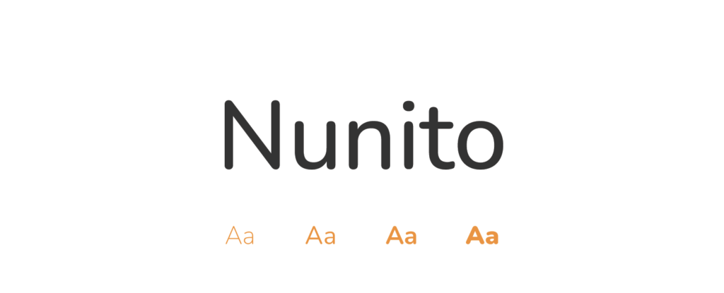
- Free or Paid: Free – Google Font
- How many styles: Total 18 styles = 9 upright & 9 italics weights (extralight, light, regular, medium, semibold, bold, extrabold, black & weight).
- Usually used for: Children's products and creative designs due to its rounded, friendly letterforms. It's also used in web and app design because of its readability.
- Summary: Nunito is playful yet readable, its rounded terminals making it softer and more suitable for kids.
Comic Sans
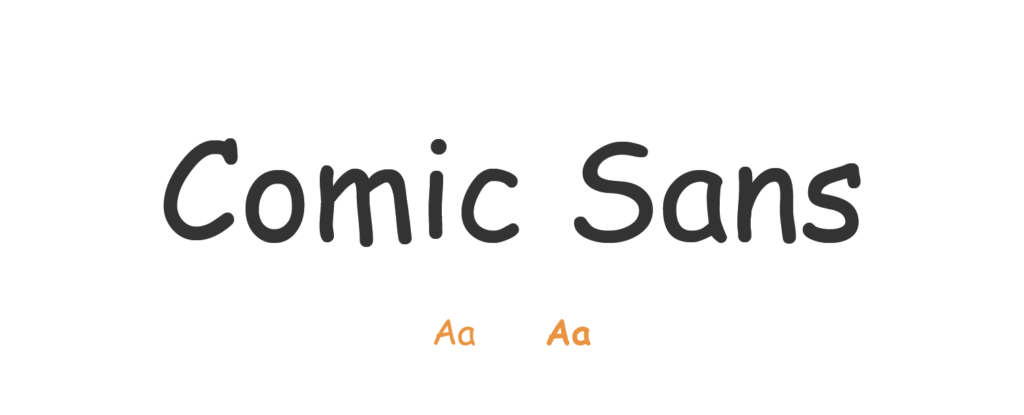
- Free or Paid: Free – comes pre-installed in most computers
- How many styles: Only 2 styles = Comic Sans & Comic Sans bold
- Usually used for: Informal contexts and child-friendly content. It's a frequent choice for school presentations and children's books
- Summary: Comic Sans, while often criticized in professional typography, has a casual, fun feel that can be appealing to children.
Sniglet
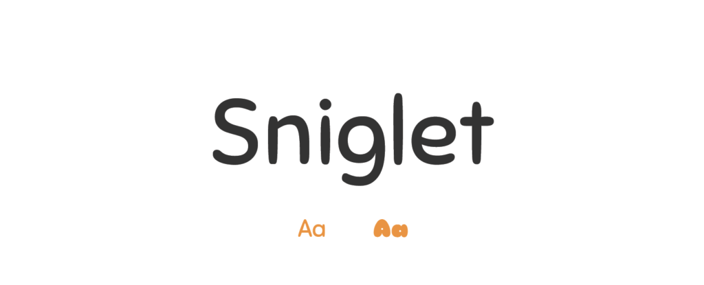
- Free or Paid: Free – Google Font
- How many styles: Only 2 styles = Regular 400 & ExtraBold 800
- Usually used for: Fun, playful, and engaging content such as party invitations or children's books. Its bold and rounded characteristics bring cheerfulness to design.
- Summary: Comic Sans, despite its reputation, is actually quite fun and casual, which kids find inviting.
HVD Comic Serif
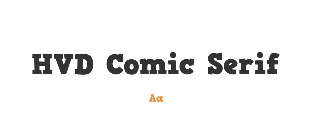
- Free or Paid: Paid – Adobe (from HVD Fonts)
- How many styles: Only 1 style = HVD Comic Serif Pro Regular.
- Usually used for: Injecting a fun, informal vibe into designs, especially in comic books and playful marketing materials. It combines the readability of serifs with the casualness of comic fonts.
- Summary: HVD Comic Serif is playful yet maintains the clarity of a serif font, a great balance for kids.
Bangers
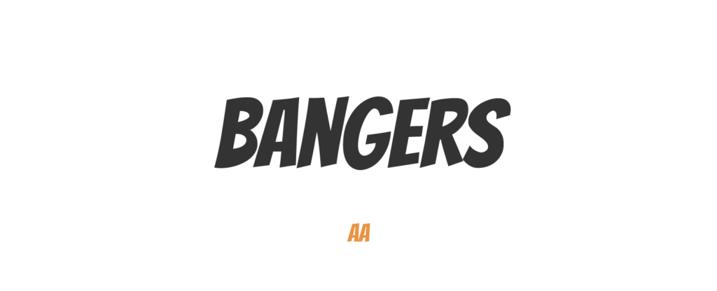
- Free or Paid: Free – Google Font
- How many styles: Only 1 style = Regular 400
- Usually used for: Comic book lettering and anything that requires a loud, impactful expression. It stands out in promotional materials and headers.
- Summary: Bangers is bold and reminiscent of comic book fonts, ideal for grabbing children's attention in titles.
Boogaloo
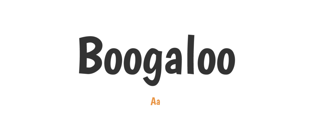
- Free or Paid: Free – Google Font
- How many styles: Only 1 style = Regular 400
- Usually used for: Evoking a vintage, fun mood. This font fits perfectly in retro-themed posters and entertainment advertising.
- Summary: Boogaloo offers a lively, energetic vibe, adding a fun element to any children's story.
Patrick Hand
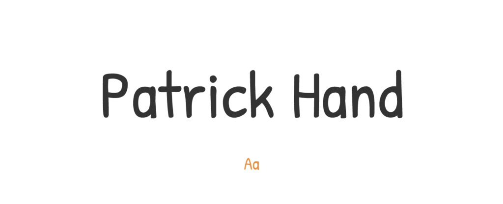
- Free or Paid: Free – Google Font
- How many styles: Only 1 style = Regular 400
- Usually used for: Personal messages and informal content that require a hand-written touch. It is often found in digital art and comics.
- Summary: Patrick Hand mimics a friendly handwriting style, making the text feel personal and engaging.
Bubblegum Sans
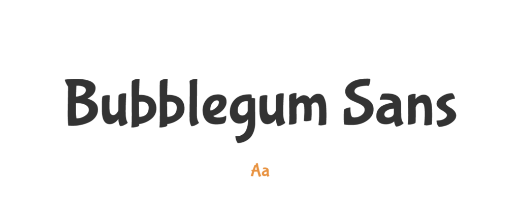
- Free or Paid: Free – Google Font
- How many styles: Only 1 style = Regular 400
- Usually used for: Casual, friendly contexts due to its bouncy and laid-back style. This font is great for designs aimed at a younger audience.
- Summary: Bubblegum Sans has a whimsical, playful quality that can really brighten up a story for kids.
Gochi Hand
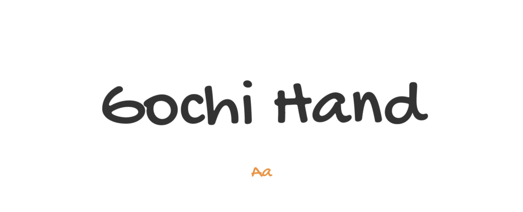
- Free or Paid: Free – Google Font
- How many styles: Only 1 style = Regular 400
- Usually used for: Emulating informal handwriting. It works well in personal blogs, invitations, or any content meant to feel intimate and friendly.
- Summary: Gochi Hand has a hand-drawn feel, offering children a warm, friendly reading experience.
Amatic SC
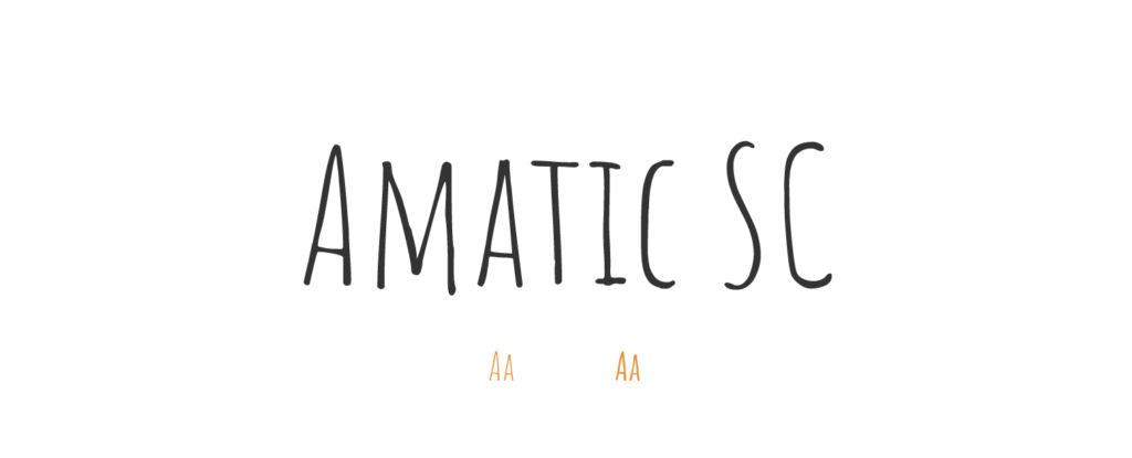
- Free or Paid: Free – Google Font
- How many styles: Only 2 styles = Regular 400 & Bold 700
- Usually used for: Captions and text that needs to stand out. It is commonly found in web design, particularly on creative or artsy websites.
- Summary: Amatic SC, with its hand-drawn charm, adds a unique personality to any text, sparking children's imaginations.
Indie Flower
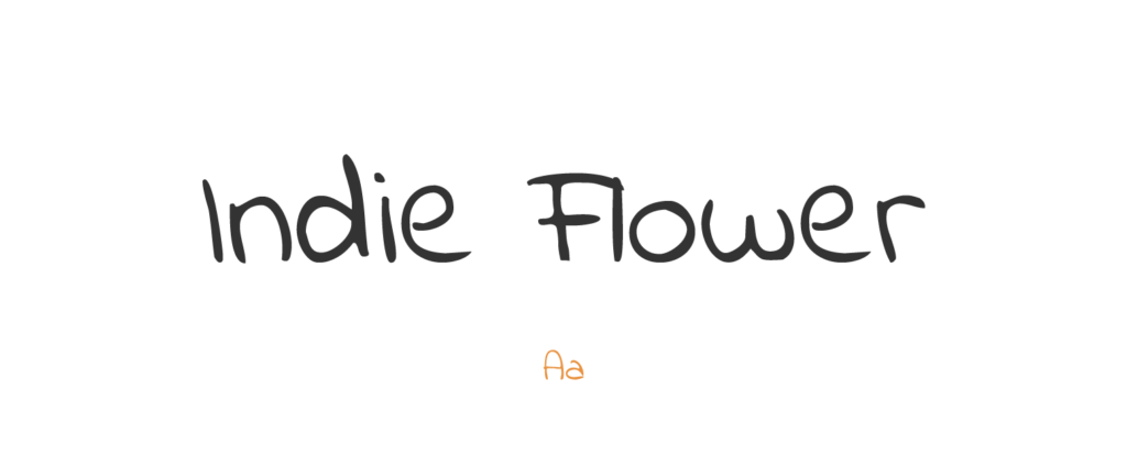
- Free or Paid: Free – Google Font
- How many styles: Only 1 style = Regular 400
- Usually used for: Projects with a casual, fun, and light-hearted feel. It's perfect for children's books, comic strips, or playful branding.
- Summary: Indie Flower has a distinctive, playful style that's engaging and encourages a love for reading.
Ribeye Marrow
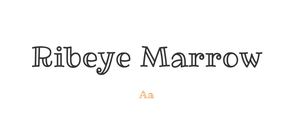
- Free or Paid: Free – Google Font
- How many styles: Only 1 style = Regular 400
- Usually used for: Imparting a playful, yet sophisticated feel. This font is great for logos, headers, or food and beverage menus.
- Summary: Ribeye Marrow's quirky shapes and fun design can hold a child's attention and keep reading enjoyable.
Sacramento
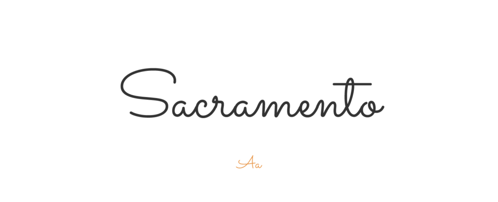
- Free or Paid: Free – Google Font
- How many styles: Only 1 style = Regular 400
- Usually used for: Elegant and creative designs. Its cursive nature works perfectly for invitations, logos, and headings.
- Summary: Sacramento offers an elegant cursive design that's unique yet still readable for young ones.
Fredoka

- Free or Paid: Free – Google Font
- How many styles: Total 5 styles = 5 classic weights (light, regular, meduim, semibold & bold), no italics.
- Usually used for: Lively, engaging designs with its rounded, bold letters. It's an excellent choice for interactive websites or children’s media.
- Summary: Fredoka is a rounded, bold font that can catch a child's eye and remain easily legible.
Archivo Black
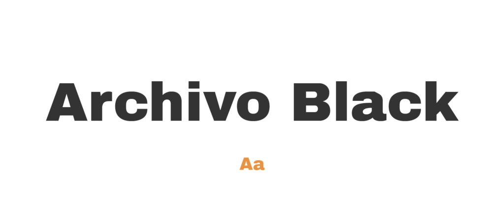
- Free or Paid: Free – Google Font
- How many styles: Only 1 style = Regular 400
- Usually used for: Strong, impactful headlines and banners. Its geometric design lends itself well to tech-oriented and professional layouts.
- Summary: Archivo Black offers strong, clear lines, making it perfect for impactful headings.
Cinema Script
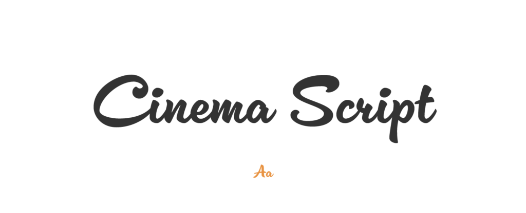
- Free or Paid: Paid – Adobe (from Dave Rowland Type)
- How many styles: Only 1 style = Cinema Script Regular.
- Usually used for: Creating a cinematic or retro feel in branding or poster designs. Its elegant curves and refined feel make it ideal for formal invitations as well.
- Summary: Cinema Script brings a playful, creative style, suited for imaginative story settings.
Voltage
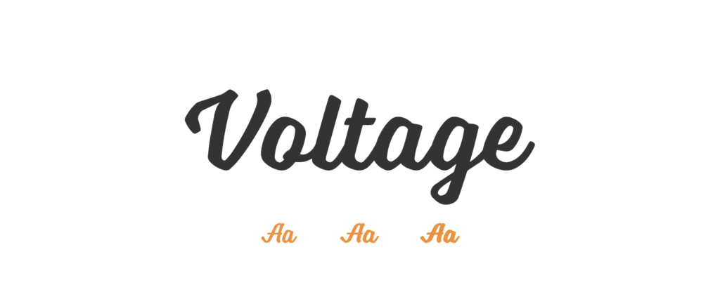
- Free or Paid: Paid – Adobe (by Laura Worthington Type)
- How many styles: 3 styles = light, regular & bold.
- Usually used for: Conveying power and dynamism, making it a good fit for bold headlines and impactful designs. Its strong appearance also makes it a great choice for logo designs.
- Summary: Voltage adds excitement and dynamic appeal, great for adventure-filled stories.
Ganache
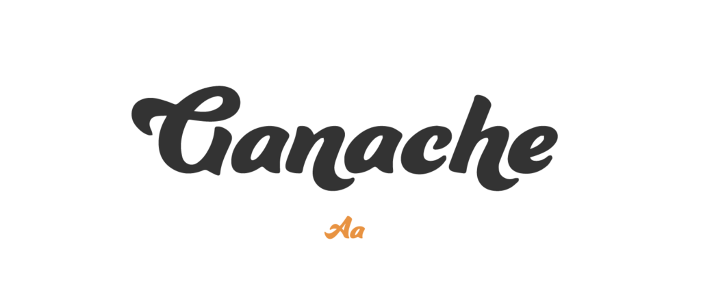
- Free or Paid: Paid – Adobe (by Laura Worthington Type)
- How many styles: Only 1 style = Ganache Regular.
- Usually used for: Projects needing a blend of elegance and fun. This font is often seen in food packaging, restaurant menus, or logos with a playful, yet sophisticated vibe.
- Summary: Ganache has a flowing, graceful design, suitable for softer, more whimsical tales.
Smoothy
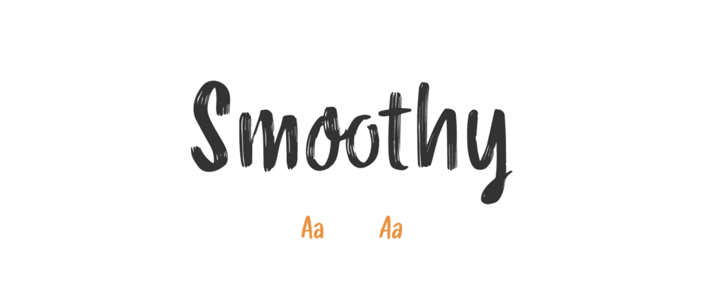
- Free or Paid: Paid – Adobe (from Resistenza)
- How many styles: 2 styles = regular & slanted.
- Usually used for: Creating a personal, handwritten style, ideal for branding, packaging, and promotional materials. Its cursive nature is also suited for children’s books or friendly web design.
- Summary: Smoothy is a fun brush-like font that adds a bit of playfulness to stories.
Caprasimo
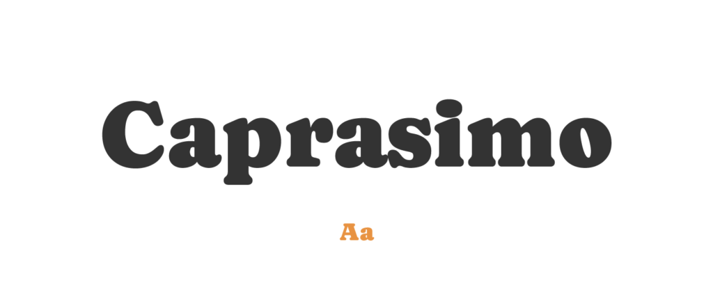
- Free or Paid: Free – Google Font
- How many styles: Only 1 style = Regular 400
- Usually used for: Sophisticated branding and high-end product packaging. It's frequently seen in upscale advertisements.
- Summary: Caprasimo is a great choice for children's books due to its elegant, easy-to-read design, which can make the reading experience enjoyable and fun for young readers.
Pacifico
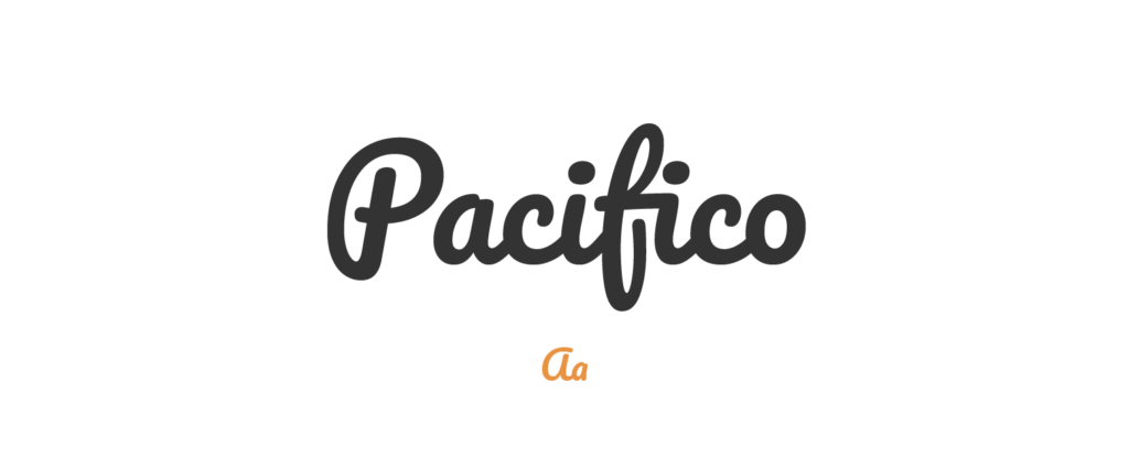
- Free or Paid: Free – Google Font
- How many styles: Only 1 style = Regular 400
- Usually used for: Casual, playful restaurant logos and fun event invitations. It's also commonly used in children's literature.
- Summary: Pacifico, with its playful and relaxed tone, is perfect for children's books as it can evoke a sense of adventure and fun, grabbing a child's interest.
Brevia
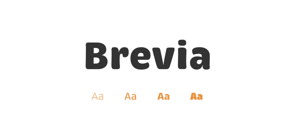
- Free or Paid: Paid – Adobe (from HVD Fonts)
- How many styles: Total 14 styles = 7 upright weights + matching italics (light, regular, medium, semibold, bold, black & extrablack).
- Usually used for: Clear, readable technical documents and instructional materials. It's a popular choice for user-friendly app interfaces.
- Summary: Brevia's clear, straightforward design makes it ideal for children's books as it aids in readability, helping children to learn new words and read smoothly.
How to pick the best font for children’s book?
The ideal font for your story depends on many factors. Here are some factors that I think are good to consider:
- Readability: When it comes to choosing a font, the top priority should always be readability. After all, we want our young readers to easily make out the letters and words without any struggle.
- Font size: Size matters too! It's a good idea to make sure the font is large enough so the kids can comfortably read without squinting.
- Keep the story in mind: I think it's crucial to align the font style with the tone of the story. For instance, a playful and friendly font might suit a fun, lighthearted narrative, while a clean, simple font might work better for more serious or traditional tales.
- Avoid Font Overload: One thing I've found is that too many fonts can be distracting. It's usually best to stick with one or two that work well together.
- Consider Special Needs: Now, if the book is for children with dyslexia, it might be worth considering dyslexic-friendly fonts like Dyslexie, OpenDyslexic, or Comic Sans. They're specifically designed to make reading easier for individuals with dyslexia.
- Experimentation: Don't be shy about experimenting. I suggest you try out different fonts and combinations, see how they look on the page, and ask others for their opinions.
- Seek Professional Advice: Lastly, if it's within your resources, having a chat with a professional graphic designer or typographer could provide some great insight. They're the experts in making text look its best!
Conclusion
I just showed you these 28 amazing fonts, but to be honest, when it comes to picking a children’s book font, there are hundreds of options you can choose from. It depends on the age of the kids, genre, and mostly on the story your book tells.
So keep that in mind when picking your font. If you write a story about cars and robots, a bold & capitalized font like Bangers might be a better option then soft, handwritten Alisha. But if your story is about fairies & princesses, then it’s the other way around.
